About
About 
Hello BC readers, it’s been a while. I’ve been off working on comics (The Freeze Vol 1 trade from Image Comics/Top Cow is in stores now…) but after
Posted in: Comics | Tagged: anthony del col, Comics, dynamite, entertainment, Hardy Boys, nancy drew, Werther Dell'Edera
Writer's Commentary – Anthony Del Col On Nancy Drew And The Hardy Boys: The Big Lie #1
Dynamite has sent us a writer's commentary featuring Anthony Del Col talking about the first five pages of Nancy Drew & the Hardy Boys: The Big Lie #1. Cover by Fay Dalton and interiors by Werther Dell'Edera.
When I first thought of putting together Nancy Drew with the Hardy Boys in hardboiled noir genre, the very first image I had was of the two brothers in separate interrogation rooms, being questioned by the police about a murder. And here we are, a year or so later, and they make up the first few pages. I think it's important for an artist to trust their instincts like this (it's happened on some of my other projects) and I'm excited to walk you through these first few pages…
Page 1
One of the best things about working on this title is the editorial team at Dynamite. The main editor, Matt Idelson, has overseen some of my favorite noir comic titles of all-time, one being the Catwoman reboot by Darwyn Cooke and Ed Brubaker. Amazing stuff. It was actually Matt, along with associate editor Matt Humphries, who pitched me the idea of starting off the issue with the old-timey comic book feel we have here. So thanks again, Matt and Matt (my nickname for him is "Chet Morton").
What I was looking to create here was a contract – what people normally think of when the Nancy Drew and Hardy brothers names come up in discussion. They're thoughts of Norman Rockwell-era America, with the small communities, picket fences, bright colors. Matt and Matt/Chet had the idea of playing that up in terms of style, and to go with the feel of a classic '60s-era comic book. Which I think really works.
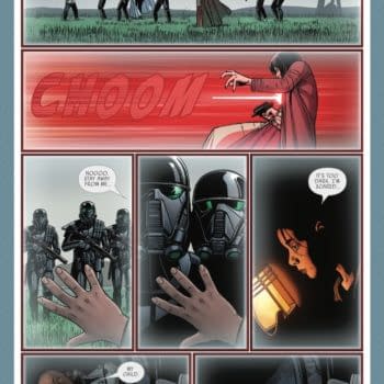
Page 2
Here it is. The first image I had of the entire series. Frank Hardy, resident smart-ass, being questioned in an interrogation room, knowing that his brother was in an adjacent room. And contrasted with what we saw on the previous page, a great entry point into the real world we find ourselves in.
I'll get to Werther's artwork on one of the next pages but I'd really like to highlight colorist Stefano Simeone's work here. I wanted a very sleek look with lots of blues and contrasting colors. And Stefano nailed this right off the bad with his work. I should also give credit to Keith Morris, who has always been my "art caddy", giving me ideas on what to look for, and helped with the original ideas for what the series would look like.
Page 3
Our first good look at Frank Hardy, as well as Police Chief Ezra Collig (who is originally a character from Hardy Boys' books). Werther's done a great job with the art here. One of the main references for Frank's look is Joseph Gordon-Levitt from the movie Brick, which itself is one of the inspirations for this entire series, a modern-day noir story.
In Panel 4, I wanted to really present Frank as the smart-ass here. He's smart and, since his father was formerly a detective, he knows how everything's done here. So it's tough to get something past him. I read a really interesting Wired article about various interview methods months ago and decided that it would be a great thing to reference here.
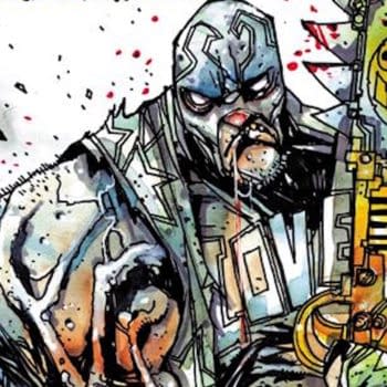
Page 4
I'd like to highlight Werther's artwork here. This might be my favorite page in the entire first issue. The old-school brutality is really captured by Werther and I almost hurt just seeing Frank get pushed around by the police chief. I really wanted a unique look for the series, something you wouldn't find elsewhere, and when the editorial team at Dynamite recommended him, I immediately thought we had the right fit.
Frank's pain also serves as a great reminder of how far he's fallen – from the squeaky-clean kid to the potential killer here. How did he get here? Well, cue the flashback sequence…
Page 5
One of the things I'm trying to do with this series is not only bring to life the Hardy brothers and Nancy Drew but also the community around them. In this case, it's Bayport, which is discussed on the first page but here we really get a sense of the community – the schools, the public events, the restaurants. All through the great life that the Hardys had.
For this, the first flashback page, I really wanted a different look for the colors and Stefano again has come through here, creating an interesting cross between old-school pastels and something slightly distorted, which is what all memories are like – things look just a bit different from what they actually were.
Cover
I know it's not a scripted page but I wanted to take a moment to reference Fay Dalton. I discovered her work with Titan Comics and immediately suggested her for the project. Her painterly technique has the perfect feel for a noir story and, as you can tell with her cover, is amazing for this book.
All of us had the vision of a silhouetted Nancy Drew overseeing the action because, well, that's exactly what this first issue is about. So I'm ecstatic with how it turned out!
Enjoyed this? Please share on social media!
Stay up-to-date and support the site by following Bleeding Cool on Google News today!