About
About 
Rare Flavours, the next miniseries Ram V and Filipe Andrade debuted in August. Kind of. BOOM! released an ashcan (black and white only comic, with lettering from Andworld Design) called Rare Flavours #1 Tasting Menu Ashcan.
Posted in: Comics | Tagged: Comics, dark horse, dr nnedi okorafor, Tana Ford
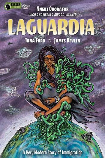
Advance Review of LaGuardia #1: Air Carrier Flight Delays
"They look in all the clever places…and forget the obvious ones. And thank god for that." Queen & County: Morningstar #3
"Those customs officers were so focused on the usual they didn't notice the unusual sneaking into the country." LaGuardia #1
LaGuardia #1, a comic from Dr. Nnedi Okorafor, Tana Ford, James Devlin, and Sal Cipriano releases December 5th. Broadly speaking, it's a good comic. $5 for 28 comics pages, three pages of design and one essay page.
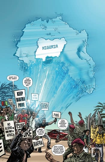
One young Nigerian college professor (Citizen Raphael Nwabara) crosses a protest into his school, and a woman whom the comic suggests is his fiancé, crosses from Lagos into New York City. Both persons belong in their destinations and don't. Diaspora doesn't fit. They're not exiled. But their homes don't recognize borders. Or those persons belong in more than one place.
I can argue dispassionately for LaGuardia #1:
-A science fiction story that feels fresh (LaGuardia Airport as a port of entry for extra-terrestrial immigration).
-Lagos, Nigeria far enough in the future for self driving cars is a new setting to me.
-Themes of alien as in extra terrestrial vs. alien as in undocumented immigrant.
-The indignity of a stranger pulling at your hair and contemptuous immigration officers.
-Relative newcomer Tana Ford executes a difficult job (on the one hand: recognizable Earth locations. On the other hand, extra-terrestrials that surprise the reader but not the characters in the story) well.
But there's so many little problems I can't look away from:
-Pouches on a guard's uniform change from panel to panel for two pages straight.
-At least two lettering errors. (See one error above.)
-Another continuity error concerning Future's clothing, her dress, and the one time the colorist (I imagine) didn't color in the design, it leaves a cleavage shot.
-A single airport scanner drawn two different ways in panels close to each other.
Those little errors drag LaGuardia #1 down. Taken as a whole, most of these are continuity errors Dark Horse will fix for the series' most durable SKU, the collection. When I read LaGuardia #1 the first couple times, I didn't know why the comic didn't congeal. In theory, the team turn in the first part of a story that carries thematic weight not only through plot, but also through character. The art always lead me along and gave me any trouble as to where I should look next.
In practice, there are errors all over this issue, and they're why LaGuardia #1 didn't congeal on my first reading. It only connected when I took a closer look. It's frustrating because the art team does so much right. They nail Future's many feelings when a white girl too young to know what she's doing pulls at Future's braids (frustration), the girl's white mother tells her daughter to stop (relief), and understanding when the mother sincerely apologizes for her daughter's behavior (understanding). In one page! Without calling attention to it!
Karen Berger (LaGuardia's editor) previously ran Vertigo, and if we believe his LinkedIn profile, Cipriano supervised lettering at DC for four years. These mistakes shouldn't appear in a first issue, any comic's best foot forward.
I suppose I could call this resonance between the airport and the comic, there's always something to fix. Or: Both entities bear the dust of the human, Sisyphean work of upkeep. Despite the construction, LaGuardia charmed me the one time I waited in a terminal. I suspect LaGuardia #1 will charm you just the same.
Enjoyed this? Please share on social media!
Stay up-to-date and support the site by following Bleeding Cool on Google News today!