About
About 
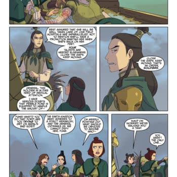
Iceman and Bishop team up to investigate a new attempted mutant massacre of the Morlocks in the tunnels under New York. Is it a good read?
Posted in: Comics, Marvel Comics, Venom | Tagged: amazing spider-man, Anti-Venom, dan slott, eddie brock, flash thompson, Gerardo Sandoval, HRL, lee price, mania, maniac, Marvel Comics, mike costa, mockingbird, peter parker, Ryan Stegman, spider-man, superheroes, venom, venom inc, venom inc. omega
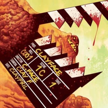
Venom Inc. Omega Review: Symbiotezilla Attacks New York
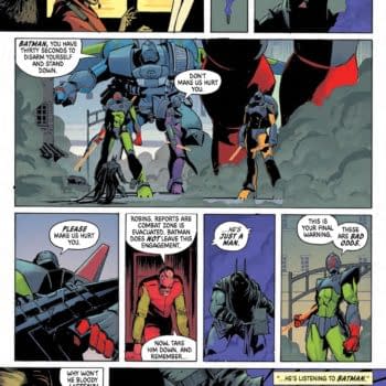
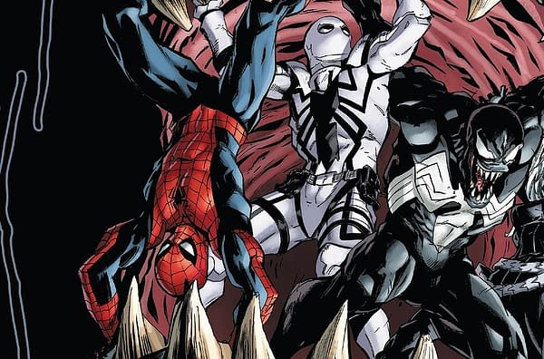
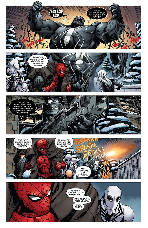
The day appears to be won, but Lee Price isn't down yet. The remnants of the people he infected as Maniac return to him, turning him into a giant Symbiote monster in the image of Venom. Spider-Man, Anti-Venom, Black Cat, Venom, and Mania still have a fight on their hands.
Like the last issue of Venom, the Venom Inc. Omega rides the wave of the more fun parts of this story just giving us a slugfest between our heroes and Lee Price. It doesn't have the same level of anarchic fun as the previous installment of the story, but it keeps the story focused and high-energy.
The main problem is the dialogue once again. The vast majority of the jokes don't even get a chuckle. There is an instance of Spider-Man trying to give Flash Thompson a pep talk, which is ruined by a bad attempt at self-referential humor. Granted, the pep talk was bad regardless. It's just that the joke at its expense wasn't funny, either.
The giant Maniac design could have been more creative. It just looks like Venom with the occasional spikes coming out of its back. A part of the appeal of Venom's design is his simplicity, but, if you're going to show us an "ultimate final form" type monstrosity like this, going over-the-top isn't a bad move.
Without spoiling anything, the finale does have some decent wrap-ups. Spider-Man and Black Cat both achieve something akin to character growth. It gives Flash Thompson something to do for after the story ends. We know where Spider-Man and Venom stand regarding one another. Also, Mania actually has a decent conclusion.
Ryan Stegman's art holds up pretty well throughout. Like I said, the Lee Price final form is a bit disappointing, but that's not necessarily is fault alone. Brock, Spider-Man, Thompson, Black Cat, and Mania all get some moments to look awesome. Gerardo Sandoval gets a couple of pages, and they look good too. Brian Reber's color art holds it all together well, though the color mixture of Anti-Venom's white and Flash's bleeding red looks odd. I'm not even sure if that is a criticism; it just caught my eye in a weird way.
Looking back on it, Venom Inc. probably could have been condensed to one mega-sized issue and I would have enjoyed it more for the expediency. That being said, Omega is a fun read. It's got action, its heroes have moments where they don't say dumb things, and the art holds together. In the end, I can recommend this one. Feel free to check it out.
Enjoyed this? Please share on social media!
Stay up-to-date and support the site by following Bleeding Cool on Google News today!