About
About 


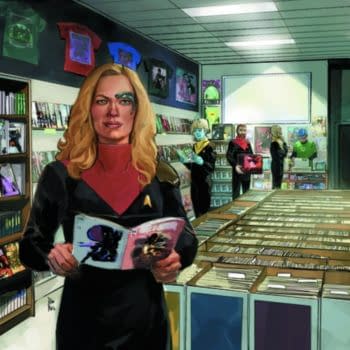
See Captain Seven Of Nine, standing in your comic store for the new Star Trek series launching in September 2026 #startrek
Posted in: Comics | Tagged:
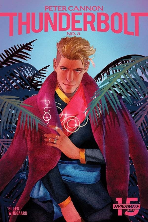
Kieron Gillen's Writer's Commentary on Peter Cannon: Thunderbolt #5 – 'Oh God, I've Written This Much On the First Page.'
Kieron Gillen has a Writer's Commentary on his final issue of Peter Cannon: Thunderbolt #5, on sale now from Dynamite Entertainment. He begins… The last set of these. Am I writing them fresh and energetic? Or am I writing them tired and broken, after a day of hitting myself in the face with a keyboard in an attempt to lure a script out of my skull?
C'mon. You know the answer.
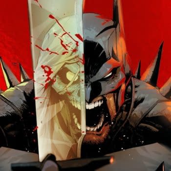
Kevin Wada's Cover
Kevin's just one of my favourite cover artists. I loved him so much that we worked out a way for him to be the lead artist on an issue of WicDiv, despite being sequentials. Doing a King Of Kings sort of cover seemed entirely appropriate.
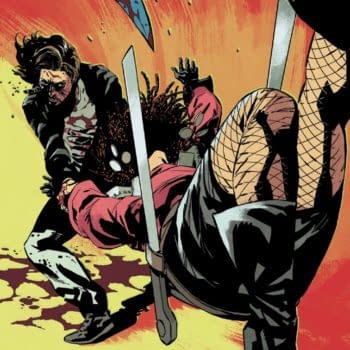
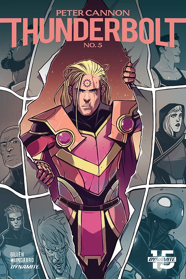
Paulina Ganucheau's Cover
Yeah, I talked Paulina into doing one of my conceptual nonsense covers rather than smouldering sexiness. Still – formalist/sensitivity mash up is 100% this book's mode this issue.
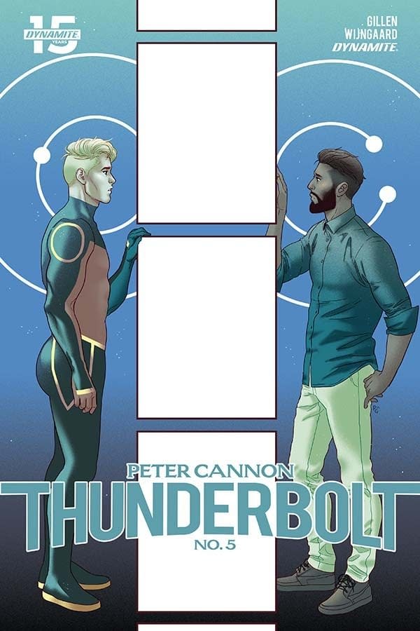
Casapar Winjgaard's Cover
Caspar, of course, doesn't need any encouragement to go all formalist. You can't control him. HE WILL DO IT.
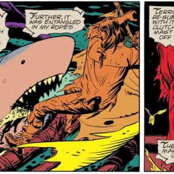
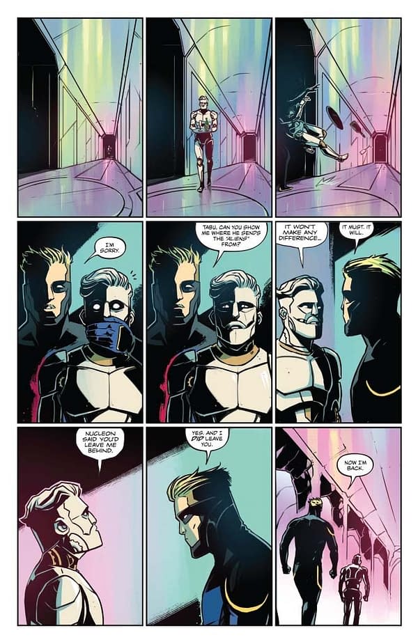
Page 1
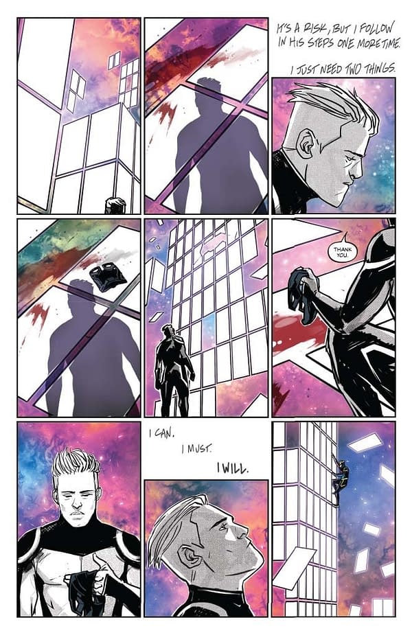
Firstly, Mary's colours are just a dream here, and I look at the page and I beam. What Caspar, Hassan and Mary do in terms of working here is just something else. It's a semiotic whirlwind, which sounds like an awful teenage indie rock band, but bear with me.
Okay – after four issues which were broadly us playing with areas of the genre (and medium in 4), it leads to what 5 is. 5 can't be a homage, at least in the same way. 5 has to be the synthesis of it, and about it, which inevitably – to paraphrase a friend's response – makes the final issue Me issue. It's trying to synthesise, but is also remixing and interesting in juxtaposition, and all that jazz. If I'm talking about Superhero comics, it leads to where I am, and then wonders where next. I can see that.
(Interesting – I just read a review of Cannon which argues it's the Alan Moore issue, which makes me smile. It's a good argument, and I can also see it. If I were to give a Hot Take on Watchmen, Moore's take there was that comics should be better. It was his and Gibbon's attempt to push the medium. Be better. That it was taken as "Be like this" by too many people is my perpetual annoyance, especially as the "Be like this" is mainly a tiny sampling of Watchmen actually did. I digress.
(But I do like the idea it's an Alan Moore issue, as it implies that Alan may not set me on fire the next time our paths cross.
(Oh – I just stopped reading the review to write this, and then came back, and see that he says it's the Kieron Gillen issue too. Oh, this is a rollercoaster.)
There's a lot of me Stuff in this first page. Take on Me. Eddie Campbell. A page of Watchmen, stripped back to a ghost. The core Peter Cannon line ("I can. I must. I will".) Galaxy print leggings. Everything!
I totally f*cked it up though not just in writing, but post-writing. I forgot I had closed up the hole in the wall back in issue 3 and had to work out a way to get a hole back into the dimension here. I was already summoning the mask in panel 3. Change the one to a two and we're sorted. I mean, go nose at Alan Moore's The Problem Of The Liver in from hell. I swear, comics at the pulpy end is just excitable vamping.
(Thanks to Editor Matt [Idelson] for discouraging me to adding any dialogue to panels 4 and 5 to hand-hold the reader. It's much better like this.)
The "Thank you" sets the tone for a kinder Cannon, of course. The continuing use of Campbellian captions reminds us of what Cannon has picked up on the way.
If I had to choose a single panel for the issue, it'd be panel 8 – Cannon doing his With Great Power Comes Great Responsibility ethical-centre catchphrase. In terms of what I took from the original Cannon comics, that's what stuck with me. The iconic phrase is such an unusual part of superhero comics. Sometimes it's just something which gets an unearned fan moment of excitement. "The character has said the thing!" Sometimes you get something else from it too, so you have the fan moment and also gets something else that speaks to the character and echoes through them. In the case of Peter Cannon, where most of the audience likely doesn't even know it's his catchphrase, it's something else.
Weird thing superhero comics.
Oh God, I've written this much on the first page.
Page 2
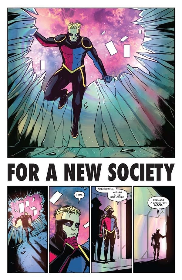 Yet more Watchmen structural homage. I always knew I wanted to homage this page, but only when writing it I noticed that it's one of the few places in Watchmen which abandons the 9 panel grid, in favour of a row of 4, which struck me as interesting. As Cannon notes, it is an argument against the perfection of the thing. The "Watchmen is in a 9 panel grid" is basically performing a rounding function on Watchmen. It isn't solely in 9 panel grid, but it's close enough you'd have to be a pedant to say otherwise.
Thing is, sometimes being a pedant is just being unwilling to accept that everyone else is lying to make it easy on themselves.
I digress.
FOR A NEW SOCIETY is a sample from Jon Cales' MUSIC FOR A NEW SOCIETY LP whose Sanctus provided the closing quote for Watchmen. I originally was going for MUSIC FOR A NEW SOCIETY as a title, which would have made it even more of my usual nonsense, but it squished the letters in an ugly way. FOR A NEW SOCIETY is better anyway, and speaks to the general thrust of the comic.
Page 3
Some steady angle action, which is always a fun time. I love steady angle stuff – occasionally I know I love it too much. Uber (no, I don't know when it's coming back) basically runs off these three panel grids, which deliberately try to leech any entertainment value in favour of a documentary approach. More usually it's for comedy – that's very much the first row here, though there's enough tension bubbling along too.
I love what Caspar did with the fourth panel – Cannon is not at all comforting here. The wide eyes of RoboTabu too. Clearly, he's the emotional backbone of the book, and this makes me feel for him. What a world the poor guy's trapped in.
Page 4-5
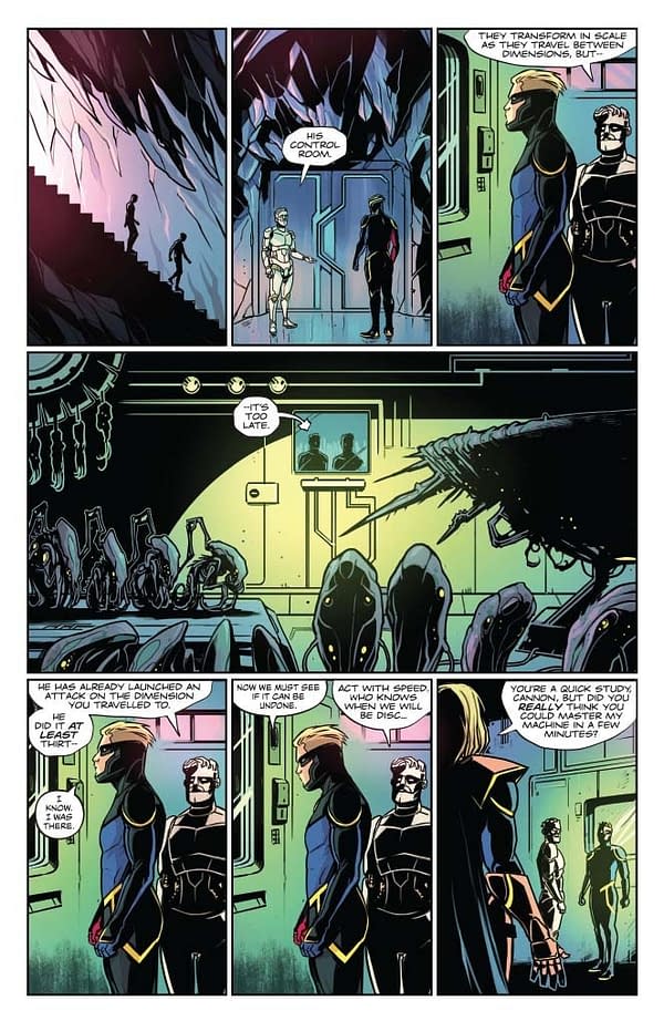
Yeah, a little more homage and a bunch of minor jokes, both explicit and formal. I mean, the "he is sending toys to invade other planets" can be read as a capitalism critique, if you wanna. I only thought of it now.
I originally wrote a whole other page of them working on this before Thunderbolt turned up. He found the spilled drinks, and then wandered around the base until he found them. This was quite fun for tension but I needed the page later to make sure a turn landed correctly, and realised that in a packed issue, him just turning up is more efficient.
Page 6
It's important to make sure we all know the crowd at the pub are fine, right?
And… the start of the confrontation. I don't think notes really are for walking through what a book is saying, especially when the book is as aggressive as its stance as it is. But if it's the me issue, it's about showing how I learned, and how I think we learn as creators and what learning even means.
Anyway, Cannon both shows and tells Thunderbolt his trick, and there's something outside his context.
Page 7-8
Formalism war! Formalism war! We're having a formalism war!
I mean, to state the obvious? Best way to beat the world's greatest boxer? Play chess. And vice versa. There's always more than one game in town, right?
Worth taking a second to talk about Hassan again, bouncing between digital and hand lettering as the formalist nonsense of this issue kicks it. That it all holds together is as big a miracle as anything else.
We did think about having the Cambellian panels in black and white, but it seemed to cut against the integration at the whole of this issue. It's different traditions metabolising together, right?
Reprising the fight scene technique from last issue, of course. Playful tone.
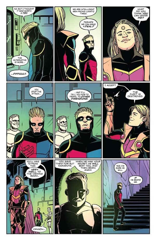
Page 9
I put this scene in the original pitch, with a note of "I suspect it's a bit too much, but I'll include it here."
This was before I realised that Too Much was our magnetic north on this project.
Mary's colour here too – the peaches, the whites, all adding stress to his emotional journey.
Page 10
Crunching pretty hard here to make sure we get the page turns right.
Love the layering effect to get the transparency on panel 5.
"Let us watch and hope I am wrong" is one of the really minor lines which I suspect don't matter to anyone else, but for me is absolutely crucial. Even at this point, Cannon's rejecting cynicism. Thunderbolt doesn't have to keep to his path.
In the end, of course, it's change or die.
Page 11
Change? Change?
Page 12
Oh.
Page 13
It's die.
Caspar and I talked about how to take this effect. I suggested originally to have move the 9 panel grid into 3D space, so we're watching him slide through it in a couple of panels. Caspar felt he could nail it with a stationary grid and the explosion of the bodies. He totally did.
There's a lot of energy here – the movement of the blood streams showing the tumbling.
This is a lot of space to spend on something like this, but the downfall of the villain seems worth it. You don't end small on a comic like this, right?
Page 14
And we return to where we started, which is – as the next page suggests – loaded. Cannon being the new Thunderbolt, observing the results of his experiments is not a happy ending.
We considered having the body parts all lying in different dimensions in the panels, but it'd have been too much. It's not a panel that you're meant to linger and puzzle over – it's a panel you take in and move on from.
Page 15
Final pun. Cannon is totally as if a 1980s Arnie character had read a few books on postmodernism.
This is page which had more space due to crunching the page earlier (it's how page turns work). I'm glad. Leaving more time to linger on the awkwardness is just important. Tabu presuming it's going to just go on as before is heartbreaking for me, and Cannon.
Splitting the "Please "into its own panel seemed key too.
Page 16
And back in our dimension. Love what Mary did with the light here. It's a wonderful time of day for this sort of scene.
The body bags seemed a key touch. It's just sad to see them laid out like that. And the shoes!
Page 17
How would you respond if an ex turned up with a robot of you? Tabu handles it better than I would.
Yes, dialogue is much loaded.
I love how the hard cut works here – I don't do this often, as I'm a page as stanza person, but the hard cut lets us just end the emotional movement of the page. It was Caspar's idea to put RoboTabu in a T-shirt, which was so good I basically wanted to hug him instantly. It's a small gesture, which instantly shows how they're treating him like a human now his ordeal is over.
Page 18
I presume you've read this after reading the issue, because I'm about to spoil the end. I'm heading towards one of the most upbeat endings I've ever written, so spending time to talk about those who died and what Cannon is trying to do going forward seemed key. To gloss over them would be to gloss over their loss and all that. They've just treated RoboTabu as a person after someone dehumanised him for years. We have to do the same to the supporting cast.
I was never planning to continue writing the book, but the stuff I describe here is the sort of thing I'd do to bring back a version of the supporting cast. I'm fond of them.
The "BEFORE THAT!" joke is a very me sort of joke.
Page 19
Awww.
Big three panel grids lend into the cinematic mode. The sunset timing means Mary gets to lean into the romance. Caspar does a great kiss – and I love Tabu's smile in panel 2.
In mainstream direct market comics of the last decade, space is meaning. Pushing up the panel size makes the kiss a bigger deal.
Of course, this segues to the Watchmen nod in the final panel of the page. I suspect if you were to make a bet on what my final panel would be, it'd be that line.
Page 20
Which of course means we can't do it, as that would be defeating the whole purpose of this endeavour.
Hmm. I probably should try to do a comic in 3 x 5 grid now, just to see if I can make an artist cry.
Pushing Tabu's last panel to the final line was Caspar's idea, and works wonderfully. There was intense discussion over what font to use in the end, and the meaning it would hold. We gravitated towards Cannon's latest lesson, for many reasons, not least it's the new thing he's exploring.
This has been fun. Thanks for reading. We've loved having you with us.
What next?
I have no idea.
Let's find out.
Enjoyed this? Please share on social media!
Stay up-to-date and support the site by following Bleeding Cool on Google News today!