About
About 


By Spencer Ellsworth Nick Roche got his start as a comics artist at IDW Publishing, illustrating and soon writing the company’s incarnation of
Posted in: Comics, Recent Updates | Tagged: Alterna, Chris Summers, Comics, Dan Parsons, David Rabbitte, Empire Of The Wolf, entertainment, Marshall Dillon, Michael Kogge
Empire Of The Wolf: Inspired By Ancient Roman Legend – An Interview with the Creative Team
By Michele Brittany, West Coast Bleeding Cool Correspondent
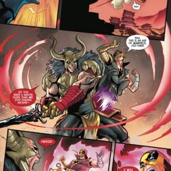
Through a life-altering event in the wilds of England, friends and fellow Roman soldiers Canisius and Lucius become the legendary wolf-brothers Romulus and Remus. In an epic story that was inspired by tales shared during a high school Latin class, author and screenwriter Michael Kogge created and wrote Empire of the Wolf, a four issue comic book series that is now available in a graphic novel from Alterna Comics.
 Kogge assembled a creative team with a wealth of talent that included: Dan Parsons, who worked on several Star Wars titles as well as a production artist on the hugely popular Game of Thrones (HBO); David Rabbitte, background artist for Anastasia, Titan A.E. and Curious George as well as on trading cards, book covers and magazines; Chris Summers, who has worked on G.I. Joe, Dungeons & Dragons, Superman, and Spartacus: Blood & Sand; and Marshall Dillon, managing editor for Devil's Due Publishing, BOOM! Studios and Speakeasy Comics and who has worked as a letterer on several comics and mangas.
Recently, I got the opportunity to conduct an email interview with the entire creative team to discuss in depth, from inception to the physical book, the creative process of this independent title.
 Michele Brittany: Michael, can you describe your journey to the story of Romulus and Remus? What alterations did you make?
Michael Kogge (MK, writer): My high school Latin teacher, Brian Hyland, loved to regale his class with tales, and one of them was the famous werewolf story from Petronius's Satyricon. That story stuck with me over the years and inspired me to imagine what would happen if pushed the story further, if werewolves took over the Roman Empire. It wasn't until I was deep into developing the story when it occurred to me that Romulus and Remus's origin of being raised by a wolf was, in essence, a werewolf story. It meant that the birth of Rome itself could be tied to werewolves! When I realized this, I thought I may have something special.
MB: How did you assemble your creative team?
MK (writer): I first approached Dan Parsons, whom I met at San Diego Comic Con many years ago through our mutual Star Wars connections. Dan's worked as an artist and inker on over 100 Star Wars comics for Dark Horse, which surely must be some kind of record. Moreover, Dan loves anything to do with ancient Rome and classical history, so a collaboration seemed natural.
David Rabbitte came on as colorist for issue #1 on Dan's recommendation, and when Dan's schedule meant he couldn't commit to penciling issues #3 and #4, David came aboard and did a fantastic job blending Dan's style with his own.
Chris Summers joined the project to color issues #2 and #3, already having been versed in painting the ancient world with his wonderful work on the Spartacus: Blood and Sand motion comic. For lettering, Dan recommended Marshall Dillon, who was a godsend in helping deliver the best book possible to the publisher, Alterna Comics.
 MB: Can each of you in the team describe what attracted you to the project?
Dan Parsons (DP, pencils): I have always been interested in ancient Rome, and history in general, but specifically ancient Rome. And I enjoy drawing werewolves.
David Rabbitte (DR, pencils/colors): When I first saw the comic Dan Parsons had already completed for some pages of issue #1, I loved the look of the art and Dan's attention to detail in order to make everything look historically accurate. Also, Michael Kogge's script was very well written.
Chris Summers (CS, colors): When Michael first contacted me about Empire of the Wolf the idea of werewolves in ancient Rome was really intriguing. I'm also a big fan of sword and sorcery stories, so it really was a good fit.
Marshall Dillon (MD, letters): I loved the elevator pitch for Empire of the Wolf. As soon as you say "werewolves in ancient Rome" I'm hooked.
MB: Dan and Michael, from the afterword, it sounds like the visual conception of Empire of the Wolf was a collaborative process between yourselves. Can you explain how important it was to strive for historical accuracy in your story?
DP (pencils): Historical accuracy was really important to me. I have always been a fan of history, particularly military history. I enjoyed doing detailed research on the armor and weaponry of the Roman legionnaires and Celtic warriors.
MK (writer): Empire of the Wolf is steeped in historical research, from the major events depicted of the characters to the details of their weapons and costumes. History informs everything in the comic, and though obviously I wasn't slavish to it, whenever I added a wrinkle or made an alteration to what had "actually" happened, I forced myself to find a way to explain it and fit it within the real historical timeline. Vespasian's battle against Caradog, Agrippina's ruthless manipulation of Claudius, and the burning of Rome are all primary story points taken from history (and given a slight twist).
Another good example is the usage in the comic of the myth of Romulus and Remus. What's related in the comic pretty much follows Livy's account in Ab Urbe Condita about two wolf-children who became kings and later were at each other's throats. This myth gave the comic a natural foundation from which to weave a lycanthropic curse—the curse of the dead brother Remus upon his slayer Romulus—into the fabric of Roman history itself.
Although werewolves and Roman emperors may seem like a wild combination, a dip into Suetonius's Twelve Caesars reveals that it isn't so far-fetched. Some Roman emperors (I won't name names so as not to spoil the fun) took great delight in prancing around in animal skins and acting like savage beasts in the arena before a crowd of spectators. I'll leave the details to the historians of antiquity.
 MB: With several of you involved with this project, please describe the collaborative process of bringing the story to life on the page, for example, panel layout, composition of the action, to color and shading.
MK (writer): I started my Empire script pages on a legal pad, writing out a rough draft, then transferring to the computer. Afterwards, when the story and panels were set, I searched for reference images for the artists, such as examples of Roman architecture or artifacts of the time. Everyone on the team worked hard to make this world as accurate as possible. For example, the famous Roman Colosseum hadn't started to be built until 70 A.D., well after the time frame of this series. But one might notice in Dan's vista shots of Rome the inclusion of something that looks quite similar—the Amphitheater of Statilius Taurus—which was the first stone amphitheater, built in Rome and used for gladiator games.
After the colorist turned in his pages, I would then return to the script and revise the dialogue and narration to match what was seen in the panels. Some panels might not need dialogue, while other panels might require a different line or two for a character, since the artist found another way to tell the story visually. Just as in prose or screenwriting, perfecting the story required revision, revision, revision.
DP (pencils): Michael wrote the script, and his scripts were very detailed in terms of action and stage direction. From that, I would lay out the pages in thumbnail sketches, then go over them with Michael to see if there were any changes, and lastly I would pencil them at full-scale. The pages would be scanned and digitally colored directly from the pencils by David Rabbitte.
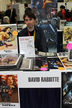 DR (pencils/colors): One of the things I was asked to do is look at some references to Roman armor and weapons and also some Celtic costumes and jewelry. As I mentioned before, the idea was to make this look like it may have happened as a part of history. Also, you see a lot of Roman architecture in the background, which is referenced from photos.
We were given quite a bit of freedom for how the pages were laid out, though the descriptions of the panels were pretty specific as to what the writer wanted. For example, I was given a scene in issue #3 with Seneca and Lavinia where Seneca suspects Canisius is dead. As they are conversing, behind them we see a fish jumping out of a fountain. Next panel the fish lays dying beside Seneca's foot as Lavinia rides off on her horse and replies, "Then so am I." In that case, I drew exactly what Michael wrote.
CS (colors): For me, with the colors, Michael did a good job with the script describing the scenes and that helped a lot when it came to making sure we were on the same page. Sometimes Dan or David would provide some notes on specific pages where they had a vision of what they wanted to see. Passing the finished pages around once they were done made it a very collaborative process.
MD (letters): As a letterer it's my job to merge the script and the art, welding them into a single thing. It's not a comic until it's lettered, and this is what I enjoy most about lettering. I'm basically stitching the two things together to make a new thing from the separate parts. That said, as far as communicating with my partners, the book was already drawn and colored when I came onboard, so I mostly worked with Michael to make sure his vision came across as clearly as possible.
 MB: Dan, I would imagine there are probably a lot of reference materials at your disposal, but did you have any challenges creating the ancient world of Rome and the wilds of Albion?
DP (pencils): I actually already had all the reference material I needed for this project. I have a vast collection of history books on the period, which I have acquired over the years from all parts of the world.
MB: Dan, your covers, with their rich marbled borders, captures the epic feel of the story being told. In particular, the cover of Book II is powerful and engaging. Can you describe your creative process and the choices you made for your covers?
DP (pencils): Michael described the general ideas for the covers to me. From those brief descriptions I designed a number of thumbnails for each cover and had Michael choose the covers he liked best. There are a number of my unused cover designs in the back of the Empire of the Wolf graphic novel.
MB: With two pencilers, Dan and David, your handoff from one issue to the next seemed seamless. How did you achieve that continuity?
DP (pencils): The fact that the book was colored directly from pencils seemed to give the art a more consistent look. And the fact that David colored my pencils from the beginning of the book, added to the collaborative success of the project.
DR (pencils/colors): Dan established the style, and I worked from what I saw in his art. I think there are some differences in how we draw and layout the pages, but I wanted to at least have the characters look the same so not to confuse the reader.
MB: David and Chris, the color palette is composed of rich choices: blues for the countryside of Britannia, greens of Ambrosia's and Caradog's Celtic markings, and the gold, purple and burgundy for Rome. Were there other specific color choices made to represent the various characters and locations.
DR (pencils/colors): With most of my work I like to use rich colors. Much of it has come from working on Don Bluth's animated features, which taught me a lot about color and lighting. For instance in issue #1, there were a lot of battles in snow scenes. I used a lot of cool colors for the ground, and warm colors for the characters. Often blue and orange will compliment each other, so working from that principle I will work other colors into the picture that won't be too distracting: forest greens, earth tones, some deep reds. I try to stay away from gaudy colors as I want to make it look like a period piece.
CS (colors): It was a little easier for me because David had established some of the main color palette so I just had to follow along. I did make a conscious effort to make each location or scene have its own color palette in order to help separate them. I based this off of the script and the "emotion" of the scene and tried to make the colors push that emotion as much as the action or the dialogue.
MB: Chris, you colored issues #2 and 3, and David colored issues #1 and #4. How did you find a balance that worked for the book?
CS (colors): Since David has a great sense of color it was pretty easy to mesh with. It took a little work to try to make a style that wasn't just a copy of what David did but still retained the flow. In the end I think it worked out pretty well.
MB: Chris and Michael, can your point out some of the special effects rendered? Can you allow us a peek behind the curtain and tell us how you accomplished them?
CS (colors): I really was happy with the transformation effects in issue #2 where the wolf-king Caradog is dying and transforms back to human. It's hard to explain how the effects are done in digital coloring, but I used some rendering techniques along with some blur effects to create that effects. I'm also happy with the lighting and storm effects from the ship scene in issue #3. I was pleased with the lighting and rain effects. Those were accomplished with some of the different layer modes Photoshop offers along with some rendering and blur techniques.
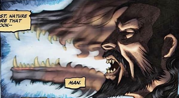
MK (writer): Transformations are the hallmark of werewolf stories, so the artists and I discussed how they could achieve this on the page. The first transformation the reader sees happens in issue #2—Caradog shape-shifts from werewolf back to man. Dan Parsons drew the snout telescoping into a human face, then Chris Summers added the magic. By slightly blurring the image and the colors, Chris was able to indicate the passage of time, and somehow lend a sense of motion to the transformation, making it appear three-dimensional and cinematic. I was stunned when I saw the final result, especially considering that Dan and Chris achieved this in a single panel.
MB: Marshall and Michael, I thought the font selected for the Celtic language beautiful. I was rather surprised that the dialogue was not translated. Why?
MD (letters): The use of the Celtic speech effect was so sparse, and used only for magical incantations, that it really didn't need translation. It was more important to get the feeling of the language than to understand the words being spoken. It's like in a film: a character from France may mutter something rather unintelligible in French, and you don't really need to know what they said, you just know it's something particular to their character, something not shared with others.
 MK (writer): Ambrosia's invocations for spells, lettered in a Celtic font, are actually a reconstruction of ancient Brythonic. I utilized the grammar that scholars have uncovered in recent years from textual fragments to create a language for Druidic magic. When I couldn't find a proper word in Brythonic, I substituted words from early Celtic languages, like Old Welsh. I actually annotated the scripts with translations, such as this snippet from issue #2 when Ambrosia clutches her amulet and calls on the horned gold, Antenociticus, to protect her from the curse-stricken Canisius:
AMBROSIA: Antenociticus dymgwares. [Horned God, deliver me.]
Antenociticus = Celtic god with horns, also be construed as Cernunnos, aka Hu Gadam.
dymgwares = "deliver me" [Old Welsh], The Celtic Languages, ed. Martin Ball et al.
Though Ambrosia's invocations remain untranslated in the comic, I believe doing so lends authenticity to the story. The unreal—magic—is grounded in the real, a semi-lost but once spoken Celtic language.
MB: Marshall, your lettering is superb. Can you explain your choice for replicating a 1970s lettering style?
MD (letters): Oh, thanks! The retro-look of the lettering was Michael's idea, honestly. He showed me the art and told me what he was looking for, then I had to find a way to make that happen in this modern digital age. One thing I love about creating modern comics is the consistency you can maintain, but trying to find ways to have your work look organic can be tricky. Hopefully it comes off as intended.
MB: There was a substantial amount of voice over and dialogue – did that fact impact your font choices?
MD (letters): For the captions in Empire of the Wolf I wanted something that looked like it might have been written on parchment centuries ago. The font I used for that really ended itself to that application. With the dialogue balloons though, I wanted an immediacy, a "first person-ness" to them and that font really helped me achieve that goal. Both fonts are by Comicraft. Though I make my own fonts, sometimes there's a font already out there that fits the bill better than one I've made myself.
MK (writer): Narration, which was a common device from the Silver and Golden Age of comics, is rarely used today, yet proved an important element in setting the epic tone of this comic. I wanted the narrator's voice to give Empire of the Wolf the veneer of ancient history, as if the Roman historians Suetonius or Tacitus were providing commentary.
 MB: What were your favorite moments to create in Empire of the Wolf?
DP (pencils): My favorite moment was when the centurions follow the Celtic warlord under the giant tree in issue #1, and it was revealed that he was a werewolf. It was also one of my favorite drawings of the book.
DR (pencils/colors): All of issue #4 I enjoyed most, because it was the payoff for the story. The battles, showdowns between the main characters, and so on were fun to conceive. Pluto and Cerberus were cool to draw.
CS (colors): I really enjoyed the scene on the ship: I had a lot of fun coloring the storm-tossed ship and also really liked the hag cave scene. I felt that was a spot where I was able to really use color to help the story along.
MK (writer): There are so many, but I say I really liked David's depiction of the legend of Romulus and Remus in issue #3 and the way Dan drew the first meeting between Lucius and his mother in the Roman taverna in issue #2. These were fun moments to write and to see them come to life as pictures was worth the arduous task of producing the comic.
MD (letters): Wow, what a question! I think I'll have to flip the question around and remake it into "what's your least favorite moment in lettering?" It's when I run across a page that's silent, or has just one balloon. This dramatic silence is very powerful, but fairly overused in most modern comics. It often leads to turning pages without digesting any real story at all. An issue of a comic costs three to five dollars today. We need to give people something substantial to read. If it takes you five minutes to read a comic, I feel you've been cheated. Note, this does not happen in Empire of the Wolf. :)
 MB: Michael, are you thinking about revisiting Rome in the near future?
MK (writer): Empire of the Wolf proved to be a multi-year adventure in the Roman world, from scripting to publication, yet I never tired of ancient Rome. The era, culture, and history are so rich that I would go back in a heartbeat, given the right story.
MB: How can people purchase their own copy?
The graphic novel, published by Alterna Comics, is available from Barnes & Noble, Amazon, and other retailers, including your local bookstore and comic shop (Diamond Order Code: JUL140774). comiXology and Amazon also offer digital versions. And check out the Empire of the Wolf homepage at empireofthewolf.net.
MB: What has been the reception of Empire of the Wolf? Will you be at any of the upcoming cons for signing opportunities?
MK (writer): The reception has been fantastic. We've had great reviews and have built a loyal core of readers who often approach us at conventions to discuss about the story. The members of the team will be attending a variety of conventions across the country this year, sometimes together, sometimes to promote our other work. I'll be at Tulare Sci-Fi Con on March 7-8, 2015 as a guest, then at Star Wars Celebration 2015 – Anaheim from April 16-19 to discuss my Star Wars work. I'll also visit WonderCon in Anaheim and San Diego Comic Con in July and perhaps a convention on the East Coast later on in the year; check out michaelkogge.com and empireofthewolf.net for details.
DP (pencils): I just returned from the Wizard World Portland, where I signed a number of copies. I will be heading up to Calgary Expo in the spring, and over to Phoenix ComicCon in May. Then I'll make my to California for Wizard World Sacramento and San Diego ComicCon.
DR (pencils/colors): It has been very well received by the public and has gotten some very good reviews. I'm real happy about that as there was a lot of work put into the project. Currently, I don't have any plans for conventions this year. But you never know what may happen in the future.
CS (colors): Everyone I've talked to or shown it to really seems to enjoy it. The idea of Roman werewolves really seems to pique peoples' interests. I am doing a few comic cons this year and I'm always happy to sign anything for fans. Right now I'm only confirmed at the Permian Basin Comic Con X in March 2015 in Odessa, Texas, but there are a few others I'm working on attending this year.
MD (letters): I don't do many conventions, one-to-two a year and haven't yet made any plans for 2015's conventions. I don't know what the reception has been like, because I'm not in the public eye as much as the rest of the team is. But again, "werewolves in ancient Rome" kind of sells itself.
 MB: I sincerely appreciate you taking time out of your busy schedules to answers my questions. In closing, can you share what projects you have coming up?
MK (writer): I'm writing books based on the Star Wars Rebels television show for Disney-Lucasfilm Press, two of which—Ezra's Duel with Danger and Battle to the End—will be published in spring and summer 2015. Additionally, I'm finishing up a screenplay and a couple TV pilots, and editing an anthology based on the Lensman science-fiction stories of E.E. "Doc" Smith for fs& Press. One can always find more details on my website michaelkogge.com and twitter feed @michaelkogge.
DP (pencils): I just finished my second batch of sketch cards for the Topps's Star Wars Master Works. I am currently inking the new Nightwing for the DC Convergence event, which comes out in April. I am also working on a new Sherlock Holmes graphic novel with Michael.
DR (pencils/colors): I finished working on some sketch cards for Topps' Star Wars Masterwork card set, which should be out in the next few months. Also, I did a cover for an online Star Wars story written by Abel G. Pena that will be going up on starwars.com soon. When I hear more I will post the updates on my website at davidrabbitte.com and my blog skyhookart.blogspot.com.
CS (colors): Right now I'm working with Space Goat Productions on some of their projects like Mage Inc., Werewolf O'Riley, Door Kickers and others. I've also been doing some graphic design work for Red Alpha Custom Prints doing things like vehicle wraps, t-shirt designs and that kind of stuff. When I'm not in art mode I play guitar in a hard rock/metal band called Rear Naked Choke, we've released three singles so far through iTunes and other digital outlets and we're working on finishing and releasing our first full length album this year. You can keep up with me at facebook.com/thechrissummers for all things art and music related.
MD (letters): I've been doing a lot of work on Image books lately. Skull Kickers, Wayward and Thrilling Adventure Hour are some of my favorites. I lettered the Street Fighter FCBD comic from Udon. It's free so be sure to pick that up. I'm lettering a lot for Dynamite: Magnus, Turok, Army of Darkness, all the Chaos books, Pathfinder, Blood Queen, Game of Thrones, Jungle Jim, some Vampirella, I just took over lettering duties on Solar, and I'm lettering the Altered States stuff. But what's been surprising is the amount of truly independent stuff I've been lettering lately. Kickstarter has changed the game and I've lettered some really cool stuff. Things like Billy the Pyro, Superiors, and Judges.
MB: Thank you Michael, Dan, David, Chris, and Marshall for your time and for pulling back the curtain to the creative process behind Empire of the Wolf.
You can find Kogge online at michaelkogge.com or on twitter @michaelkogge, Parsons at his facebook fan page, David Rabbitte resides digitally at davidrabbitte.com, find Chris Summers at chrissummersart.wix.com/chrissummersart and Marshall Dillon, who maintains a web presence at marshall-dillon.squarespace.com.
Michele Brittany is an independent popular culture scholar and semi-professional photographer and editor of James Bond and Popular Culture: Essays on the Influence of the Fictional Superspy (McFarland & Company). She regularly posts reviews and analysis on the spy/espionage genre on her blog, Spyfi & Superspies and can be followed at Twitter @mcbrittany2014.
Enjoyed this? Please share on social media!
Stay up-to-date and support the site by following Bleeding Cool on Google News today!