About
About 


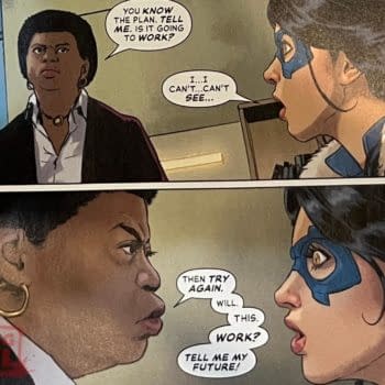
Amanda Waller plans with Failsafe and Queen Brainiac are exposed on the 4th of May for Free Comic Book Day.
Posted in: Comics, Recent Updates | Tagged: Comics, Dave Gibbons, David Leach, orbital, roy lichtenstein
Image Duplicator At Orbital – The Best Comic Art Exhibition You'll See This Year
In a couple of weeks, Orbital Comics in London will be filling its gallery with pieces below, and more, comic book artists re-appropriating the works of Roy Lichtenstein, tracking them back to their original source material and then creating a new comic book image that credits the original artist, curated by Rian Hughes and Jason Atomic.
Dave Gibbons, Rian Hughes, Salgood Sam, Steve Cook, Carl Flint, Betty Boolean, Mark Blamire, Howard Chaykin, Tony Abruzzo, Jason Atomic, David Leach and more have contributed work, which can be seen below. Some are critical, some are satirical, some are silly. But what this exhibition does best of all… is educate. That, behind every creative work, no matter how obscure, how commercial, there is a creator – and many influences beyond that. Prints of the pieces, some of which can be seen below can be bought here, with money going towards The HERO Initiative.
The exhibition opens at Orbital Comics in London, just off Leicester Square on May 16th till the end of the month.
Dave Gibbons
after Irv Novick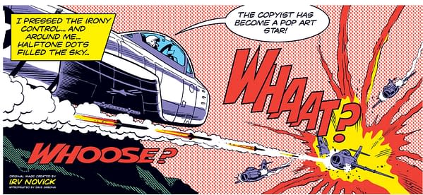
Carl Flint
after Jack Overgard

A lone figure peers out from his Low Art world into a wealthy world High Art and ponders its possibilities.
Betty Boolean
after Nick Cardy and Jack Kirby

I call the painting "Lichtenstein Pastiche #17" (after Cardy and Kirby) as I pastiche several of the motifs that Lichtenstein drew upon throughout his career and in his oeuvre into one image, specifically appropriations from comics, images of crying girls, images of a couple kissing, reflections on mirrors, and also the recurrence of a single eye or monocular images.
I feel this demonstrates that the rich visual language from which Lichtenstein appropriated his own artistic language was far from the set of clichés that the fine art world often dismisses comic art as, and that I am re-appropriating Lichtensteins appropriation 'technique' in support of comic book art.
The two sources I have used for my painting are Young Romance #150 cover by Nick Cardy and Young Romance #83 – Page 17, panel 1 by Jack Kirby.
Mark Blamire
after Jerry Grandenetti

For this piece I wanted to combine the inspiration of Jerry's original, but I also thought it important to steal something from Roy in the process (without infringing copyright, of course). I also wanted to try to do something unique or not so directly copied, and move it into a simpler graphic interpretation more in keeping with my own personal visual way of working – to give it my own particular stamp rather than to create another flagrant duplication or direct inferior copy.
BRAT!
BRATATAT!
BRATATATATATA!
AS I OPENED FIRE I KNEW
WHY TEX HADN'T BUZZED
ME… IF HE HAD…
THE ENEMY WOULD HAVE
BEEN WARNED…
THAT MY SHIP WAS
BELOW THEM…
Howard Chaykin

I knew a number of the men whose work was appropriated by Lichtenstein, and their outrage at being regarded as source material by what one of those guys referred to as ". . . A Galiziana ratfuck. . . " was at least as deep and profound as their shock and dismay at the money being made off these canvases.
I write this having just tossed this past Sunday's New York Times in the recycler, which features an advertisement for a BONHAM'S auction, the top of which was a miserable Mel Ramos painting of the Trickster, a bad copy of a Carmine Infantino drawing, estimated at between $500,000 and $700,000. Some shit never seems to go away.
It's disheartening to realize so late in life that ineptitude, with a healthy splash of condescending irony, made these cultural vampires wealthy.
Fuck them all.
Rian Hughes
after Tony Abruzzo

There's lots of talk about the "transformative power of art", and how Lictenstein and modern appropriators like Glenn Brown (Turner nominee who enlarges and repaints work by SF artist Chris Foss ond others) use this mystical power to turn base materials into high art. And dollars.
I imagine the artist in his studio preparing a panel from life, and working a real transformation on his models to turn them into the idealised Brad and Zsa Zsa of romance comic cliché.
When I closely examined the work of Tony Abruzzo and others of his generation it forcefully brought home to me how gifted they actually were. With an absolute economy of line Tony idealised reality, making women beautiful and men hunky. I think that's actually one of the core attributes of cartooning/illustrating that I admire – this simplifying down to the essentials, removing the extraneous, seeing the ideal in the everyday.
By contrast, Lichtenstein's unfeeling and inexpressive mechanically-traced linework divests the image of its finesse, beauty and lightness of touch. He actually moves the characters in the opposite direction.
FuFu Frauenwahl
after Tony Abruzzo

This is a variation of the title page of 'Run for Love', from Secret Hearts #83, by Tony Abruzzo. Roy Lichtenstein's painting 'Drowning Girl' is a copy of the lower right corner of the page.
As with similar title pages, Abruzzo elegantly lays out the story to come in front of us, using only one carefully designed climatic image, a thought balloon, and a caption, while still leaving enough unsaid to spark the reader's interest.
Lichtenstein in turn, ignoring all the medium's subtleties, truncates
the contextually relevant elements and only uses the most flashy, iconic part of the page, in a way suggesting: "Hey, it's just a comic – the actual story is trivial anyway, here's all you need to know!"
So in this version the intention was to not only re-appropriate the drawing itself, but at the same time show that there's a richer story behind it, both in terms of a possible comic narrative as well as the real history of how comic art has been treated by Lichtenstein and other copyists.
Jason Atomic
after Carl Barks

When I saw Lichtenstein's paintings for the first time, I must admit I hated them. I was a 12 year-old Bronze Age Marvelite at the time, and had been voraciously devouring American comics since discovering Gold Key's Tarzan 9 years before.
I liked the idea of putting comic art into a gallery, but couldn't understand why Roy's stuff was executed so crudely and unsympathetically. The line weights seemed wrong, and did not suggest the textures they were supposed to represent – hair and fire, for example, had heavier outlines than guns and telephones. It seemed like they had been done by someone clueless at best, disdainful at worst, of the subtleties of comic art.
It seems to me that Lichtenstein was dismissive of his source material. The fact he never
credited the artists whose work he re-appropriated backs up this hypothesis, and I fear this ham-fisted approach to pop art is one of the reasons the general public tend to underestimate the skill and craftsmanship of real comic book creators.
I really do like the idea of taking comic panels out of context and presenting them as massive paintings – I've done it myself on numerous occasions, most successfully with comics I designed myself, but even though I want to, I just cannot manage to like the work of Roy Lichtenstein. It's great in theory; the critics make him sound amazing. But even at his best, I think he could have done much, much better. If I was his art teacher I'd give him a (generous in my opinion) 5 or 6 out of 10 and a 'try harder'. I would encourage him to spend more care over the linework and to maybe have a go at emulating some of the cool off-register effects that Warhol excelled in.
Attempting to persuade me that Roy's Pop is better art than the comics he swiped from is like attempting to persuade me that elevator muzak is superior to Beethoven or the Beatles. I'm sure one could present a compelling argument to that end, but no one could ever convince me that soulless, mechanical, lowest common denominator, minimalist background music beats the years of blood, sweat and tears that went into the original work as presented by live musicians.
Salgood Sam
after Irv Novick

David Leach
after Tony Abruzzo

Tony Abruzzo wasn't as well known as his fellow artists but his work clearly inspired Lichtenstein, who used several of Tony's panels as the basis for his paintings.
I chose this image because I could mine humour from it, and it once again arrived as a gag as soon as I'd seen the image.
Steve Cook
after John Romita

I was trying to construct a human face that looked like the John Romita illustration that Roy Lichtenstein appropriated.
I never realised it could be so tricky. The more I tried to make her look like his character, the more unreal she became. I now know she can either be one or the other.
Enjoyed this? Please share on social media!
Stay up-to-date and support the site by following Bleeding Cool on Google News today!