About
About 


Lunar Distribution announces their comic book retailer alcohol meet-and-greet event for San Diego Comic-Con 2026
Posted in: Comics | Tagged: batman/superman, before watchmen, dc comics, eccc, greg pak, jae lee
ECCC: Jae Lee And Before Watchmen In The Marvel Style
Gavin Lees writes;
Jae L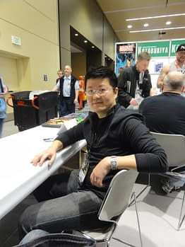 ee made a rare convention appearance at this year's Emerald City Comicon, so I took the opportunity to speak to him about his work on the controversial Before Watchmen series, and what he has planned for the upcoming Superman and Batman series for DC. Jae graciously answered my questions while entertaining a seemingly endless line of fans, queuing up to have him sign their comics.
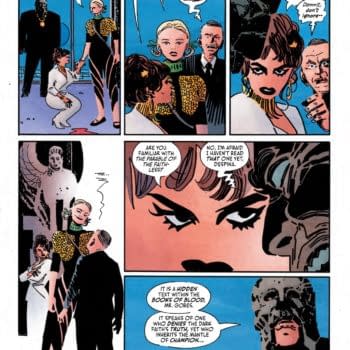
The highest profile project you've been working at the moment is Ozymandias as part of the Before Watchmen series. How did that project happen — when were you approached, who approached you?
My good friend Nick Barrucci had approached DC about me doing some stuff for them. He first mentioned Before Watchmen as something that they were thinking of me for. I didn't know which character; I didn't know who I'd be working with. It just happened organically, that they told me about the project, and I was incredibly honoured to be asked to be something with such a history. I know there's all this controversy over it, but I really don't understand what the fuss is about.
So, you didn't have any apprehensions about taking on the project?
No. Watchmen is a legendary book, so just to be considered for the project was too much of an honour to pass up. Whether we sink or swim is all up to us. I think the jury is on the fence about it — it's really up to the readers. I really thought a lot of the controversy was blown out of proportion. With me, if there's something coming out that I don't like, I don't go around talking about; I just ignore it. So, why did people make such a big deal out of it. If you don't like it — don't buy it; and if you're curious — pick it up.
You didn't anticipate that there would be this kind of backlash; that Alan Moore would be so vehemently against what you were doing?
No, to me it was no different to working on Superman or Batman.
This was the first time you'd worked for DC for a number of years. How — or perhaps a better question is why — did you make the move? Was the end of The Dark Tower a factor?
Yeah, after The Dark Tower, I wanted to get back into doing superheroes. At Marvel, I never thought I'd be considered for a mainstream book, just because of my style. DC were coming to me with projects, though — I was surprised at how open they were to letting me work with titles I didn't think I was a good fit for, including Ozymandias. I'm not the first person you'd think of for that and, accordingly, I wanted to change my style and do something brighter, more fun. I wanted to do something that hearkened back to illustrators from the past, so I was looking at a lot of Norman Rockwell, J.C. Leyendecker, N.C. Wyeth in order to do something different. I really got into the modern retro aesthetic — something that puts a smile on your face for a change! [laughter]
Working on The Dark Tower for five years, I feel that I pretty much drove that style into the ground. I really wanted to reinvent myself and have fun.
How closely were you working with Len Wein when you were coming up with this new aesthetic?
He provided me with a very loose plot breakdown, and we worked in the Marvel style. I drew it the way I saw fit, and he got the finished art, and scripted it from there. We didn't really work together on any level beyond that.
So, the visuals were all driven by you?
Yeah, unless it was dictated in the script.
 I noticed in the book, there was a lot of interesting geometry in the art, which hearkens back to the original series in many ways. How did you strike that balance between paying homage to the original, and forging your own aesthetic?
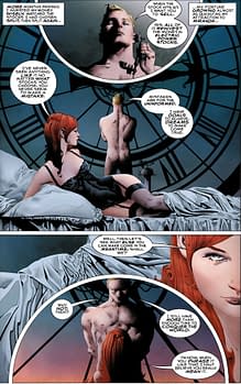
Here's the thing. When I started Ozymandias, I was thinking that here was a character who was analytical, calculating, and I wanted the artwork to reflect that. So, I came up with what I thought was a great idea at the time, but it ended up being a rod for my back! I wanted Ozymandias to be centred in every panel; I wanted the world to revolve around him. There were people commenting, "Can't you draw someone from a different angle?" — well, that was kind of the point! [laughter] You only see him in two dimensions, and he's always the centre. I never thought about how tiring that would get after five or six issues, so I eventually changed it up and didn't really stick to my guns.
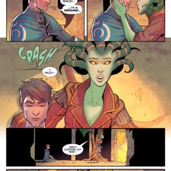
I came up with the circle motif mainly because I wanted the flashback sequences to be different from the modern day scenes. The modern day scenes didn't have any of the circle layouts – just the flashbacks. I wanted to do something that didn't just rely on colouring, because it's clichéd to just use muted colours for a flashback. That wouldn't even have worked in this case because 99% of the book is flashbacks. So, I came up with a visual clue to let the reader know they were in a different time frame. Again, that got tiresome because it limited my layouts. So, when I do my next project, there will be no circles and no circular panels! [laughter]
Did you colour the book yourself, too?
No, it was coloured by my wife June Chung, and we've been working together for a long time now.
One of the key features of the original Watchmen was that the colouring was limited — other books were moving to full colour, while it was limited to the four-colour process. Was there any attempt to limit the palette at all?
No, not at all. I didn't want to take any visual cues from the original, or try to emulate what Dave Gibbons and John Higgins did. My style doesn't look anything like Dave's, so it would be foolish to try to copy something so iconic. That would be setting myself up for failure. If we were going to do our own thing, we needed to make a clean break and not be held back by trying to copy what had already been done. There were a few instances where Len would email June and say, "Dr. Manhattan is too blue — he should be light blue like he was in the original!" So, we had to explain that no-one really knows what shade of blue he is — that was just one interpretation.
And he changes shades in the original as well.
Right! You're just limiting yourself needlessly. We were also just going by the shade of blue that Adam Hughes and Laura Martin were going with in the Dr. Manhattan series.
So, this new style that you developed for Ozymandias; is this what we can expect your art to look like in the future?
Yeah, definitely. I'm trying to tell myself not to use any shadows, but there's a few instances where I've been finding myself gravitating back towards it. It's hard for me to change my spots at this point. I'm trying, though! [laughter] My wife, too, for the longest time has been using these dark, moody colours. Now, she's purposefully trying to use a brighter palette. The perfect example of what I'm going for is a recent cover I did for Animal Man #20. I had a lot of fun with that — I felt like I was cartooning, instead of drawing dark, morose, somber, expressionless characters. It was fun, so I want to do more of that.
With this move to a more classic style in your art, you've also started doing covers for Masks — a series all about classic pulp characters. Was that a project you sought out as a result?
Not really, it was just coincidence. It actually started with Ozymandias, which was set in the '20s and '30 at the beginning, and I really enjoyed that aesthetic with the high waists, the baggy pants, the big shoes… Just visually, it's so much fun to play with. So much so, that even when the story called for the timeline to move on into the 1960s and '70s, I still kept them in ole-timey clothing.
How much research did you do to get that look right?
I have a lot of reference books from that time period. It was all there for me. Sorry if I'm not being particularly helpful with these answers — I've just pulled two all-nighters trying to get the cover done for the new Superman and Batman comic.
Oh no. Well, I'm glad you brought that up, because I wanted to ask you about this new project. Can you tell us anything about what the series is going to be like?
Well, first of all, it's called Batman/Superman because we're going in alphabetical order! [laughter] I can't reveal too much about the story — I'll let Greg do that. I'm working with Greg Pak, by the way, and this is his first project for DC, so I'm really excited about what he's going to come up with. I can't really get into details about the plot, since a) DC want to keep a tight lid on it, and b) I haven't read it! [laughter] So, I don't even know!
Do you at least know if it's going to be in-continuity, or where it will sit in the DC Universe?
Oh, it's firmly in the DC Universe, but I don't know if it ties in with the other Superman and Batman books. I'm just assuming it will.
OK, so what approach are you going to take with the art? Will this still be a light and breezy approach like Ozymandias?
I'm going to try to continue that retro look, but it doesn't really fit with these modern superheroes. So, I'm having a hard time trying to make those two aesthetics gel together.
Even tonally, they're very different characters. Superman is very bright, optimistic and larger than life; while Batman is almost the complete opposite. How are you trying to resolve that clash?
I won't know until I actually draw the interiors. I just did the cover and I had a hell of a time trying to make sense of the two. Here's the problem I ran into — when I submitted the sketch, I had Superman flying in the background, smashing through something. I didn't care what it was, I just wanted something floating around there to show his power. Then, with Batman, he was on the ground, standing on something, but I hadn't really resolved it. So, I drew the characters and I thought, "Wait, what's Batman going to be standing on? What's Superman going to be smashing through?" What am I going to do: rocks again? [laughter] I do rocks all the time. So, I wondered what I could do — I couldn't have Batman on a gargoyle, because that doesn't make any sense for Superman; and I can't have them fighting aliens, since that doesn't make any sense for Batman. What do background element can you possibly put in that will work for both of them?
So, how did you solve it?
You'll have to see the cover to find out!
Aw, you're just a tease!
Let's just say that I sent it in and the editor came back asking me, "Who are these guys? What's going on here?" [laughs] I thought it made sense at the time, while I was sleep-deprived, but who knows?
Are you redesigning the costumes at all?
No, it'll be the characters that Jim Lee designed, just filtered through my style. That was one of the hardest parts — figuring out where the seams go. Every artist seems to draw them in a different way. Even the same artist will draw them differently from book to book.
Don't DC have a really detailed bible for the characters that shows you all that?
They do, but not everyone follows it closely. I feel like I can just pick one that I like and just go with that, and take some elements from other interpretations. If anyone gives me a hard time about it, I can at least point to some physical evidence and show the editors that it had already been drawn that way somewhere.
Is this going to be a limited series? Or how long do you think you'll be working on it?
It is an ongoing series, but I don't know how long I'll be working on it — we've never actually talked about it! We need to sit down and have a talk.
Obviously your style is pretty labour-intensive. Do you foresee any problems keeping to a monthly schedule?
It's going to be tough. Ozymandias was on a six-week schedule, and this will be a monthly book. I still can't believe there's only four-and-a-half weeks in the month!
Enjoyed this? Please share on social media!
Stay up-to-date and support the site by following Bleeding Cool on Google News today!