About
About 


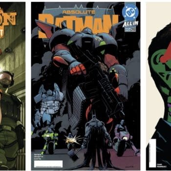
Our Three Page Lettered Preview of Absolute Green Arrow #1 by Pornsak Pichetshote and Rafael Albuquerque...
Posted in: Comics | Tagged: Comics, dark horse
Review: The Creep #1
 Mark Robert Bourne writes for Bleeding Cool;
Credits:
Written by: John Arcudi
Art: Jonathan Case
Letterer: Nate Piekos
Editors: Scott Allie & Daniel Chabon
Cover: Mike Mignola
What through me off when I initially saw the Mignola cover was that I thought it was the Spirit; the Will Eisner creation. Then as I went through the book, the main character instantly made me think of Lothar the evil henchman from The Rocketeer, whose likeness is strikingly similar. In doing research on the Lothar character, I discovered a film from 1946 called the Brute Man which featured a character called The Creeper, who also bears a striking resemblance to both Lothar and the Creep. Coincidence? In the film the story surrounds a Murderer who takes revenge on those who have disfigured him. I read that the creeper character was based on the real life actor Rondo Hatton who suffered from Acromegaly. (Google it!) Similarly, The Creep suffers from severe headaches and intense sweating.


I have always enjoyed John Arcudi's work on Abe Sapien, B.P.R.D and Hellboy and though this story rolls out slowly, I didn't feel totally cheated. I suspect that once this comes out in a TPB collection, reading it as a whole novel will solve a lot of the issues I had.
So, the story… Oxel aka the Creep is a grim private eye who's on the case of two teenagers who committed suicide; one after the other. We are teased that something from his past will play an important part in the story and a pretty big hint as to what was going on with the investigation's victims. Are they victims or something else?? Oooooh…
Issue #1 is really all about set up but somehow lacks any bit of introduction and feels like we're dropped in 20 minutes past the exposition. Information is given but isn't as clear as to whome it's directed at or for which character or what it all really means and there really isn't any inner monologue until the last half of the book. Ok, he's reading a note, from someone. Is it a personal note to him? Is it a note to someone involved in the case? Maybe it's all part of the "mystery" of the case but I found myself having to re-read a lot of the first few pages to understand what was going on after having finishing the book. Even then, I'm not 100% sure I was totally caught up. Maybe that's the point – that's a lot of "maybe's" but not a lot of drama that would make me want to wait 30 days until the next issue comes out. I suspect, as I said, when it reads as a full Graphic Novel, many of those "maybe's" will vanish.
The noir quality in the artwork, for me, lives more in the line work than the coloring. The drawing quality of Jonathan Case is fantastic and captures exactly what is needed for this story. I really enjoyed his work from Dark Horse (Eerie – Green River Killer) but in this particular story I found the coloring depressing rather than Noir-ish. But, again, maybe as the reader, we were supposed to feel depressed and hopeless. Maybe not.
Enjoyed this? Please share on social media!
Stay up-to-date and support the site by following Bleeding Cool on Google News today!