About
About 


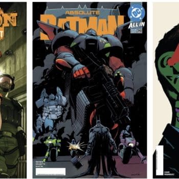
Our Three Page Lettered Preview of Absolute Green Arrow #1 by Pornsak Pichetshote and Rafael Albuquerque...
Posted in: Comics, Recent Updates | Tagged: Comics, dc, logo
DC Logo To Officially Launch This Week?
![]() After applying to register a new logo as a trademark, DC Comics have three years to actually get round to actually using it.
After applying to register a new logo as a trademark, DC Comics have three years to actually get round to actually using it.
But I'm told they aren't going to wait that long.
A relatively reliable source close to DC Comics told Bleeding Cool that the new logo was announced to DC Comics staff in New York last week by Diane Nelson vis speakerphone from Burbank. Amit Desai, Senior Vice President of Franchise Management, made the all-singing, all-dancing presentation in New York but the internal response seemed a little muted.
I'm told that the consensus is that the logo works well as an animated item, but less well as a static logo, that might appear on printed books, signage and the like. And certain editors more committed to print, found themselves in an usual alliance against the new logo.
I'm told that that the plan (at least it was, last week) is to announce it very vocally, visibly, animatedly and colourfully, on Wednesday this week.
This weekend, I did have the opportunity to show the logo in its black and white static form to designer extraordinaire Rian Hughes, who hadn't seen it until that point. He was far more positive about it than much of the online reaction to date, he shared my reaction to the idea of it working as a touchscreen animated icon that you "unpeel" but also saw it as a tight, neat simple expression of the publisher that would work well in the printed form too. His is possibly the most positive professional reaction I've seen to the logo, and it is his job.
I guess we'll see more tomorrow if, as I am told, the logo officially launches, in its full, coloured, animated form. Until then, here are some other comic professional verdicts… on Twitter;
Matt Hawkins – "Wow, the new DC Comics logo is HORRIBLE…"
Paul Grist – "I'm impressed with the (possibly) new DC logo which manages to make illegible the letter D. And C. That's not easy to do."
Jeff Katz – "Feels like a logo for a small lit management company or something."
Peter David – "Why is the new DC logo a Pokeball?"
Chris Weston – "Wifey says it looks like a pharmaceutical logo."
Camron Stewart – "The DC logo conjures to mind All Star Superman being read aloud by Will Ferrell's voice immodulation disorder guy"
Phil Hester – "Maybe I'm a self-loathing nerd, but I like logos that look like they might have started as magic marker on typing paper in a basement. Errr– I mean, IT'S GORGEOUS! #TryToStayEmployedHester"
Chris Sims – "The major problem with the new DC logo is the unconscionable lack of Go-Go Checks."
Tom Spurgeon – "I might be interested if DC went with a photoshop merging of Paul Levitz's and Bob Wayne's heads, but otherwise, ZZZZZZZ"
Enjoyed this? Please share on social media!
Stay up-to-date and support the site by following Bleeding Cool on Google News today!