About
About 


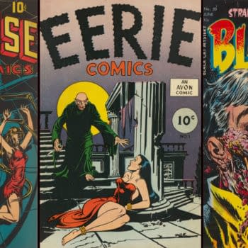
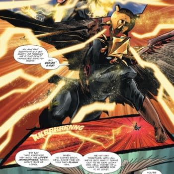
"I did corrections on things, insane corrections." Patrick Lamar complains about comic publishers and page rates in court in 1941.
Posted in: Comics, Recent Updates | Tagged: Comics, fantastic four, joe quesada, marvel
Joe Quesada's Hyper-Detailed Fantastic Four 50th Anniversary Artwork Tutorial
Marvel Entertainment Chief Creative Officer Joe Quesada just gave us a fascinating glimpse of his artwork development process step by step on twitter, featuring how he created a piece for the upcoming Fantastic Four 50th anniversary:
[blackbirdpie url="http://twitter.com/#!/JoeQuesada/status/98815685370720256"]
[blackbirdpie url="http://twitter.com/#!/JoeQuesada/status/98815981576663041"]
[blackbirdpie url="http://twitter.com/#!/JoeQuesada/status/98816177249337348"]
[blackbirdpie url="http://twitter.com/#!/JoeQuesada/status/98816826355625985"]
[blackbirdpie url="http://twitter.com/#!/JoeQuesada/status/98817062125846528"]

[blackbirdpie url="http://twitter.com/#!/JoeQuesada/status/98817391345143808"]

[blackbirdpie url="http://twitter.com/#!/JoeQuesada/status/98817713597714432"]
[blackbirdpie url="http://twitter.com/#!/JoeQuesada/status/98818221909618688"]

[blackbirdpie url="http://twitter.com/#!/JoeQuesada/status/98818376863981568"]
[blackbirdpie url="http://twitter.com/#!/JoeQuesada/status/98818816599011329"]

[blackbirdpie url="http://twitter.com/#!/JoeQuesada/status/98819150650146816"]
[blackbirdpie url="http://twitter.com/#!/JoeQuesada/status/98819421220519936"]

[blackbirdpie url="http://twitter.com/#!/JoeQuesada/status/98819625646702592"]

[blackbirdpie url="http://twitter.com/#!/JoeQuesada/status/98820410082205697"]

[blackbirdpie url="http://twitter.com/#!/JoeQuesada/status/98820481452490756"]
[blackbirdpie url="http://twitter.com/#!/JoeQuesada/status/98820785526947840"]

[blackbirdpie url="http://twitter.com/#!/JoeQuesada/status/98821044546179073"]
[blackbirdpie url="http://twitter.com/#!/JoeQuesada/status/98821223894618112"]
[blackbirdpie url="http://twitter.com/#!/JoeQuesada/status/98821573779275776"]

[blackbirdpie url="http://twitter.com/#!/JoeQuesada/status/98821931607924736"]

[blackbirdpie url="http://twitter.com/#!/JoeQuesada/status/98822485599989761"]

[blackbirdpie url="http://twitter.com/#!/JoeQuesada/status/98822919035166722"]

[blackbirdpie url="http://twitter.com/#!/JoeQuesada/status/98823148794945536"]
[blackbirdpie url="http://twitter.com/#!/JoeQuesada/status/98823453402079232"]

[blackbirdpie url="http://twitter.com/#!/JoeQuesada/status/98824031024848896"]

[blackbirdpie url="http://twitter.com/#!/JoeQuesada/status/98824342221242368"]

[blackbirdpie url="http://twitter.com/#!/JoeQuesada/status/98825016963117056"]
[blackbirdpie url="http://twitter.com/#!/JoeQuesada/status/98825379678138370"]

[blackbirdpie url="http://twitter.com/#!/JoeQuesada/status/98825642765856769"]

[blackbirdpie url="http://twitter.com/#!/JoeQuesada/status/98826344141553664"]

[blackbirdpie url="http://twitter.com/#!/JoeQuesada/status/98826703828287488"]

[blackbirdpie url="http://twitter.com/#!/JoeQuesada/status/98826962264530944"]

[blackbirdpie url="http://twitter.com/#!/JoeQuesada/status/98827296986759168"]
[blackbirdpie url="http://twitter.com/#!/JoeQuesada/status/98827703272210432"]
[blackbirdpie url="http://twitter.com/#!/JoeQuesada/status/98827968440303616"]
[blackbirdpie url="http://twitter.com/#!/JoeQuesada/status/98828188326699008"]
[blackbirdpie url="http://twitter.com/#!/JoeQuesada/status/98828717723369473"]
[blackbirdpie url="http://twitter.com/#!/JoeQuesada/status/98829059261333504"]

[blackbirdpie url="http://twitter.com/#!/JoeQuesada/status/98829565333475328"]
[blackbirdpie url="http://twitter.com/#!/JoeQuesada/status/98830105832472576"]

[blackbirdpie url="http://twitter.com/#!/JoeQuesada/status/98830482057338880"]
[blackbirdpie url="http://twitter.com/#!/JoeQuesada/status/98831058044329985"]

[blackbirdpie url="http://twitter.com/#!/JoeQuesada/status/98831210914131968"]
[blackbirdpie url="http://twitter.com/#!/JoeQuesada/status/98831541270102016"]
[blackbirdpie url="http://twitter.com/#!/JoeQuesada/status/98832309909852160"]
[blackbirdpie url="http://twitter.com/#!/JoeQuesada/status/98832507969077249"]
[blackbirdpie url="http://twitter.com/#!/JoeQuesada/status/98833041975291904"]

[blackbirdpie url="http://twitter.com/#!/JoeQuesada/status/98835087839342592"]
[blackbirdpie url="http://twitter.com/#!/JoeQuesada/status/98835542803873793"]
Enjoyed this? Please share on social media!
Stay up-to-date and support the site by following Bleeding Cool on Google News today!