About
About 


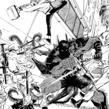
A Sneak Peek at Absolute Batman #22 by Scott Snyder and Werther Dell'Edera because of something called the Knicks...
Posted in: Recent Updates | Tagged:
The New Doctor Who Logo
Now isn't that spiffy?

You can see the full reveal here.
The DW shortening of the logo makes for a Tardis-replacement motif and it's a terribly futuristic way in which the letter 'R' isn't quite complete, isn't it? It's cold, its metal, its mysterious and someone should really stop shining that torch/flashlight in my face…
UPDATE: Okay, here's my version with the light turned off a bit…

Enjoyed this? Please share on social media!
Stay up-to-date and support the site by following Bleeding Cool on Google News today!