About
About 


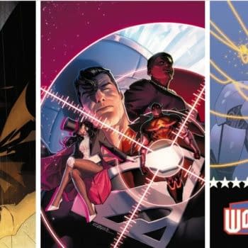
DC Comics July 2024 Solicits & Solicitations For Absolute Power, Batman, Superman & Wonder Woman
Posted in: Comics | Tagged:
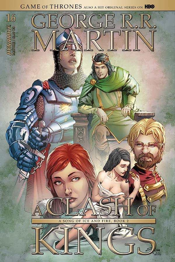
Landry Walker's Writer's Commentary on George R R Martin A Clash Of Kings #16
Landry Walker's Writer's Commentary on George R R Martin's A Clash Of Kings #16 from Dynamite, out now.
Hi again. It's time where I explain the hurdles and pitfalls of translating the works of the most popular modern-day fantasy author's most popular works into a visual language it was never intended to exist in. It's not the easiest thing, but it is fun. As always, the largest difficulty is in deciding what we can and cannot keep. Most things that don't make it to the comic page are cut due to space. I would love to have an infinite page count for each chapter of A Clash of Kings. Truly. But reality is a very tangible place where dreams often die undreamt. But some things are cut because not everything in text is best served told, as opposed to shown. For example:
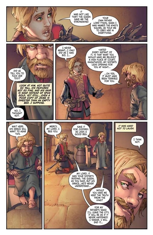
PAGE 1:
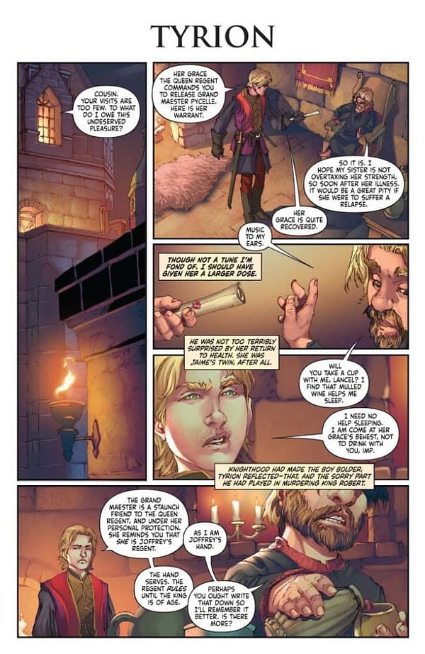
Lancel's incredibly snotty expression. Hats off to Mel Rubi and Ivan Nunes on selling that look. He's like a 9th grade internet troll who thinks he's really important. Perfect art. There's a lot written about Lancel's overestimation of his own worth. But real estate on the page is precious, and if you can show something rather than tell it… that's comics.
And of course, Tyrion is pouring cups of wine. That's what he does.
PAGE 4:
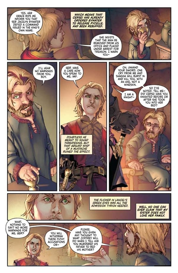
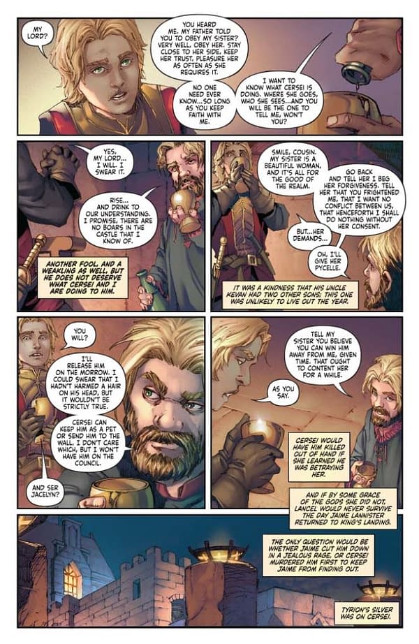
Here's an example where the lack of space injured us. We really needed a beat between panel 1 and 2 registering Lancel's shock and dawning fear. One panel, without borders to really make the moment stretch out. But instead we had to sacrifice that for content and consequently, his shift is much to abrupt. Like I said – dreams die! And you have to kill things you know a story needs sometimes. It's painful, but true.
PAGE 5:
All that said about space though… I would never have thought that the art team would be able to fit such a warm and real scene in the second panel of this page. Giving a scene life and energy – even one that is a slow-paced talking heads scene – that's the most important thing, right? Someone send Mel a gift basket for what he manages to do with every issue of this book. Ivan too. I just rearrange the alphabet until something makes sense. They create something from nothing every day.
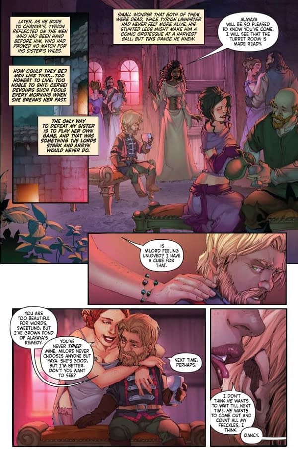
PAGE 6:
Alayaya in panel 1 is perfect. Take note of how she breaks the panel a bit, and stands in front of the tiers next to her. This is all Mel. I didn't ask for this. But this is how you keep a book exciting and energetic when nothing is happening other than talking.
The last panel, though, I was very specific in what we needed. Tyrion's descent holds a lot of symbolic value when we consider what he's hiding, and what the act of rebellion will ultimately lead to with his father. Tyrion is sinking into a situation that cannot have a healthy end, both figuratively, and literally here.
PAGE 8:
Nudity is like swearing and murder. It's more powerful when it's left to the imagination. The act of sex depicted on the page is clear and easy to parse. The one that happens just off page is infinitely more interesting and titillating. Our minds fill in the blanks with the things that evoke the most powerful reaction for us, individually. You can't write or draw for every single person. Even if you could, you can never really reach that part of their mind – and who would want to. Let them do the heavy lifting, move your imagination-provoking bits off to the side where the imagination does its best work.
PAGE 10/11:
I like to get at least one two-page spread in on every issue. Can't always. But we covered this whole "space issues" thing already, right? Anyway. This is Catelyn's smoke-induced religious epiphany moment, and it needed to be fueled by raw energy and distorted imagery. I wish we had a bit more time to pump up the special effects on Catelyn in the middle more. But it gets the message across. Everything is exhausting and disorienting to look at. That's what we wanted.
PAGE 12:
I just remembered the coloring note that came in on this bit "MORE GREEN!". Renly likes his pomposity and ceremony, and even more so, his flamboyant colors. I'm colorblind, so I have to step back on a lot of these bits.
PAGE 14:
Remember way back on page 4 where I mentioned using a silent panel to maximum effect? That is on display here in the last panel. Action takes precedence over words. Any text on this panel would have slowed the action down. In that regard, I tend to prefer to avoid text on action scenes altogether. Let the art tell the story. Text must be read and parsed and all that. It slows the mind down as it scans the page. I want things to move fast during action.
PAGE 15:
"Gh!" – I wrote that bit. Sometimes you need a bit of noise in a panel, despite what I just said. This particular panel without sound would feel like the volume was turned down. So I very arrogantly wrote a new bit of dialog – the tiniest bit – for Renly. Same with the "Hhh,.. hhhhkk" sound. I use those for guttural noises a lot in my work. That's signature Landry Q. Walker right there. I should copyright it.
Last panel. Long overhead shot of small figures. The details of the environment disappear because we don't need them, and they would ground this moment too much. This isn't reality. Break the rules of physics and have your objects disappear when they weigh your scene down and distract from the focus! Also note the borderless panel and the colors bleeding off to the edge. All of this combines to make the scene feel more impactful. Now imagine a border around it. The confines add focus, makes the scene move quicker, and pulls the weight away.
Visual storytelling is more important in comic books than words!
PAGE 16:
Panel 1 – No words! You know why at this point. But it's another example.
PAGE 17 – 19:
Note the lack of dialog in Brienne's action scenes. Again, this is a conscious choice to A: keep things moving, and B: to create a larger shift between the Catelyn panels and the Brienne panels. Shifting back and forth on visual POV is tricky, and can confuse the reader if you aren't careful.
PAGE 20-21:
Color shift helps a lot here to change the mood.
That's all this time! Hope the words I just wrote about the comic I wrote/adapted are interesting and/or helpful.
Enjoyed this? Please share on social media!
Stay up-to-date and support the site by following Bleeding Cool on Google News today!