About
About 
Hello BC readers, it’s been a while. I’ve been off working on comics (The Freeze Vol 1 trade from Image Comics/Top Cow is in stores now…) but after
Posted in: Comics | Tagged: Clash of Kings, Comics, dynamite, entertainment, george r r martin, Landrey Q. Walker
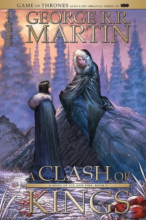
Writer's Commentary – Landry Q. Walker Talks A Clash of Kings #11
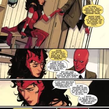
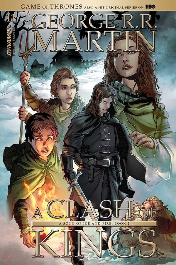
Dynamite has sent us a writer's commentary by Landry Q. Walker as he talks about George R. R. Martin's A Clash of Kings #11. The issue has covers by Mike Miller and Mel Rubi with interiors by Rubi.
Hey, folks. Here we are again with another behind the scenes look at A Clash of Kings – the comic adaptation, where I discuss the process of transforming the popular series by George R.R. Martin into a comic script.
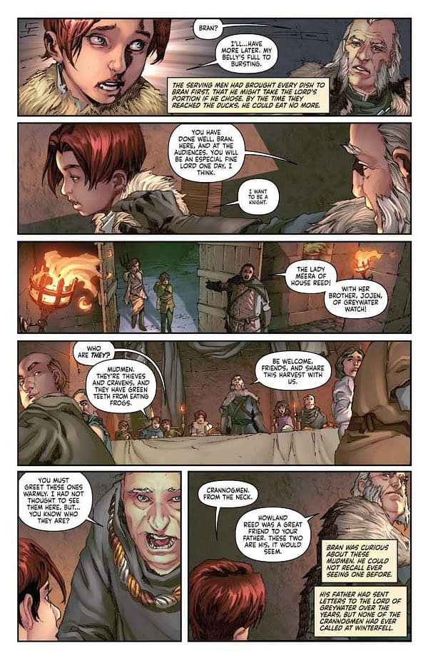
PAGE 1:
First things first, I had to ask the artist to draw a horse walking through a torch-lit hall, surrounded by people cheering him. That's how it was in the book, so that's how it has to be here. I always feel bad when I email these scripts off to our artist.
But let's talk about lettering a little bit. I'm not a big fan of sound effects in this kind of comic. It takes you out of the mood. Mind you, in a different type of book I will use them to the point of irritation. I once wrote a comic where Batman hit the Penguin with a mind-controlled seal and the sound effect was "SEAL!"
This is not that kind of book. So… no sound effects.
That said, the scene called for cheering. I hate crowd cheering bits. Unless you eat up a lot of real estate on the page with something clever, you're left with a bunch of free-floating words that – to me – always feel disconnected from the art.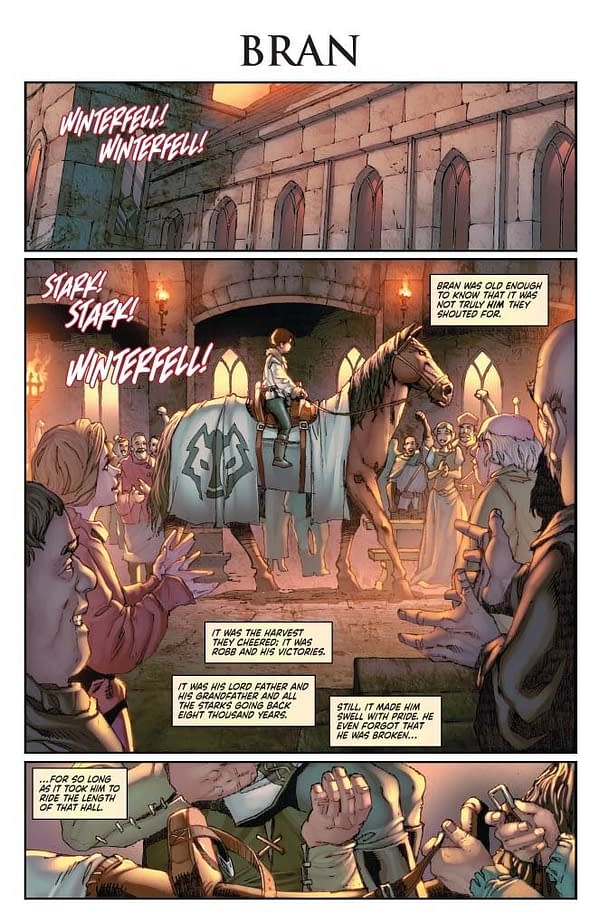
PAGE 2:
Notice the difference in lettering when Bran flashes out of his own body and see's the Godswood. It was also important to lean heavy on the special effect here. Makes me wish we were using black gutters on the page though, and we could have radiated that effect kind of through the entire background of the whole page. That would have had a more dramatic impact. Could have done something with the white panel border, I imagine. But I'm only just now thinking of the effect. Would have been cool. Note to self for next time.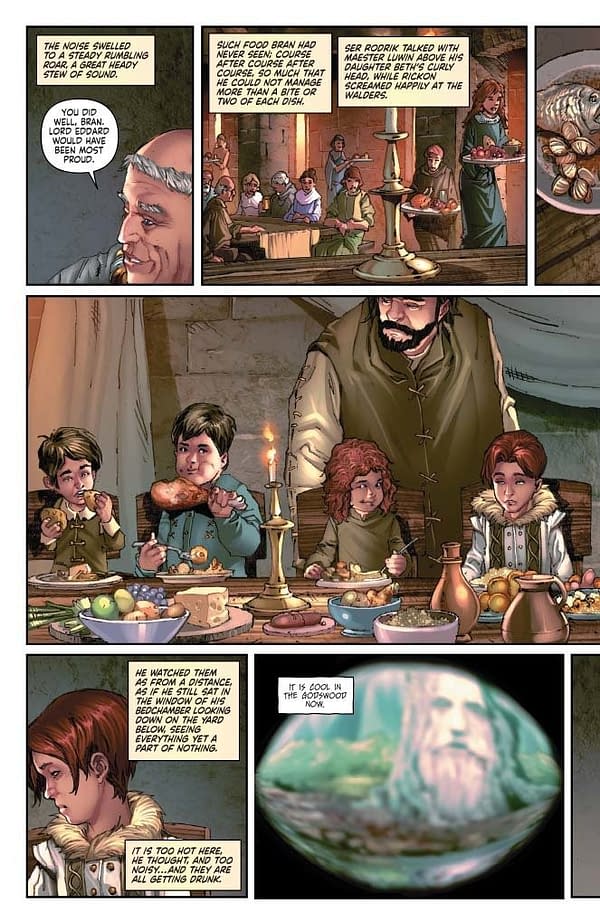
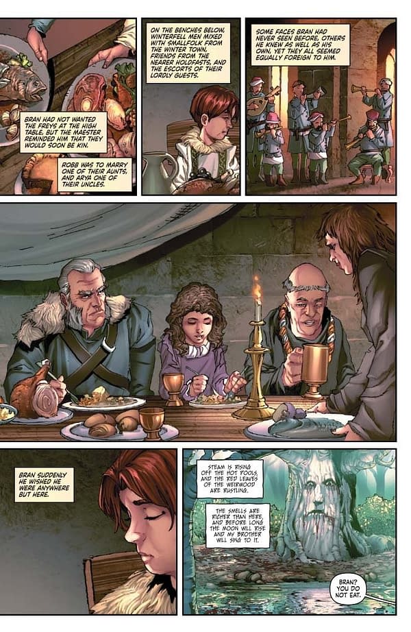
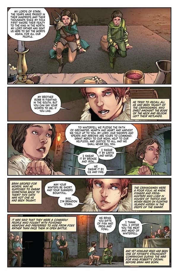
PAGE 6:
This row of child-lords, overseeing all with their judgment, is somewhat creepy. Which is good. It should be. But just look at them. All the adults go to war and we're a half-step away from a Lord of the Flies moment here. Actually, that would be a fun project. But I already wrote a medieval war comic and a superhero/Lord of the Flies style series. So…
PAGE 7:
We get to play with the most interesting and most artistic scene transitions with Bran. I mean, let's face it. His story is the weirdest. He's going through some heavy changes. We need to see that visually, not just literally. Literally would be dull.
PAGE 8:
Continuing that notion – rough panel borders and heavy filters. Probably we should have tweaked the lettering here too? Hard to stay on top of all of it. This is a complicated book!
PAGE 9:
Note the name chapter break. I mention this in these little commentaries all the time, but that break is vital for our perspective shift.
Also on this page, you can really see the beautiful pencil work in that first panel. You should all see the raw black and white stuff. It's amazing.
PAGE 11:
Boom. Color shift. Shifting colors helps scene transitions. Use them wisely, not just literally.
PAGE 20:
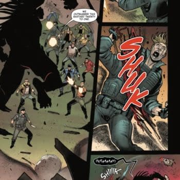
Mel drew the 4th and 5th panels just like this, and there was some discussion that it needed to be more dynamic and less repetitive. I disagreed. We want that silent beat. We need to feel a lingering pause here. This is how we play with time. Allowing panels to sit silent, using repetitive imagery to convey a long pause. These are important. If the camera shifts between these two panels, our mind imagines action rather than somber reflection.
PAGE 21:
I just love this last panel. That's all. I just wanted to point it out. I made a specific request for the caption placement on this very last beat. It needs to feel metered. Text in comics has a rhythm that is different from straight prose. It's almost melodic, because the juxtaposition of text and imagery gives the dialog a certain tempo, and you have to not just write it, but also let it fall in the correct beats for extra impact. Imagine these three captions as one sentence in one caption box. It's less impactful. Even holding the three captions closer together with make the dialog move faster. Spreading it out gives each little box gravity it would lack otherwise.
Okay, that's all today. Bye!
Enjoyed this? Please share on social media!
Stay up-to-date and support the site by following Bleeding Cool on Google News today!