About
About 
Hello BC readers, it’s been a while. I’ve been off working on comics (The Freeze Vol 1 trade from Image Comics/Top Cow is in stores now…) but after
Posted in: Comics | Tagged: Comics, dynamite, entertainment, Garry Brown, Hayden Sherman, john carter
Creator's Commentary – Hayden Sherman Talks The End Of John Carter: The End
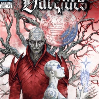
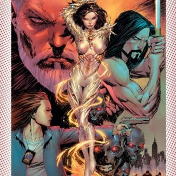
Dynamite has sent us a new Creator's Commentary by Hayden Sherman talking about the end of John Carter: The End, which is on sale today. Cover art by Garry Brown.
Hey everyone! Looks like I get to walk you through the final issue of JOHN CARTER: THE END this week. I know I've said this before, but this series really was immense fun to work on. So I'll do my best to give you some new info/insights and hopefully I won't repeat myself after anything I said for the last issue!
Here we go:
Cover: Once again, what a guy to have in our corner. Garry Brown builds such a colorful and well layered fight scene right here. I love that he uses the big broad swords from my first concept sketches. I ended up going with thinner swords later on (more in line with what I'd seen John Carter and Co. use in the book covers) but these big beefy swords still carry so much power in a cover like this.
Credits: Roll call! Look at those names. So many good dudes. In fact, on a little history side note, when I first joined on to this series I did a bunch of research into Edgar Rice Burroughs and John Carter to learn as much as I could before beginning concept work. One of the things that I found was that Burroughs, who had first created John Carter around 1912, was very bent on getting John to work as a comic character in the 30's during the high time of characters like Buck Rogers and Flash Gordon (who had taken a fair amount of inspiration from John Carter) and struggled for a good while to get a John Carter comic to work. Until his son came around and wrote and illustrated an adaptation on his own that was published in the papers in the 1940's! From there on John Carter has received numerous adaptations and interpretations in comics over the last 90 or so years. Knowing that this is something that Burroughs really wanted though, it made me want to make Burroughs proud more than anything else. Even though it might be too late for that. I hope he would smile to see the work we've done.
Page 1:
I love that this is where this issue picks up, after seeing all of the Black Martians rise at the end of #4. It's a nice kick in the teeth.
Pages 2-3:
WAR! Ah man, the script description for this spread included so much. Brian and Alex defined it as "one of those hell spreads." They weren't wrong. But I feel it was well worth it. I wanted the whole image to have the feeling of something out of Laurence of Arabia, or Lord of the Rings. A scene where there's so much to take in, and only so much is really clear, but where the battle feels immense. I don't see things like this very often in comics, so figuring it out was a good challenge. But I think a scene like this is really fun in a comic book where the image is frozen for you to look through and imagine in motion. It's also fun getting to see the "Warlord" in John in full effect.

Page 4:
Another example of Chris O'Halloran continuing to kill it. His use of purple in these night scenes is another unexpected and great choice. It's also great getting to see a younger Tars Tarkas here, which is actually the first Tars that I had concepted early on. Speaking of concepting, there a couple of bits that I introduced to the Green Martians when I started putting their look together. The most noticeable part (to me at least) being the decorative elements on their tusks. Burroughs described the Martians as being pretty Spartan in nature, so I avoided giving them anything too decorative. But at the same time, with their pride of combat, I figured they might commemorate battles or the loss of respected leaders through small pieces that could be worn on their tusks. For the female Martians I'd imagined them having strings that connect the tusks as well, since their tusks go up higher, and that each string would hold beads of some sort. One bead for every young Green Martian raised. The more beads, the more respected the female Green. Small ideas that sit in the background, but give a bit more to the world. Again, to me at least.
Page 5:
I don't know where John and Den got the two Thoats from that they've got tied up here. But I imagine they took them from some Red Generals after the big battle we saw earlier. More than anything, I just wanted to show some Thoats in this story, so this worked well enough.
Page 6:
New Helium! A lot of the design influence for this city came from a mix of Futurist style architecture, tall castles in mid 20th century fantasy paintings (no one in particular), and a little gothic architecture. The goal was to make the city feel tall, odd, old, and a bit familiar.
Page 7:
Wow Dejah's been through a lot.
Page 8:
Landscapes! And now we're reaching one of my favorite parts. I mean, what else could come out of a giant egg in the middle of the Barsoom outback but…
Page 9:
…TARS TARKAS? Alex and Brian really give their all in this story, and bringing Tars to this form after briefly mentioning his "final form" in a past issue is just such a fun and unexpected push. Can you imagine if every Green Martian aged this well? Reds wouldn't stand a chance.
Page 10:
Fun fact: The bearded man in the bottom panel? That's actually a comic shop owner who had donated some money to the Comic Book Legal Defense Fund! He (and one other shop owner that I'll show you later) got the perk of being included in this final issue. This guy in particular sent a photo of himself shouting, for any possible action scenes I might include him in. So of course I had to have him dodging explosions!
Page 11:
Drawing crowd scenes can be very time consuming, and if the crowd ends up looking a bit of a mess it can really muddle the read. Something that helps alleviate the confusion is to give one or two clear anchor points so that the reader can quickly figure out what's going on. The second panel here is a bit messy (it is a deadly Black Martian charge after all) but by including the leaping figure and the guy pulling back to stab, the rest of the image falls into place well enough. If I'd rendered out everyone in that charge it might've been more "clear" overall, but that would mean reducing the speed that the image has. Which isn't worth it to me. Comics contain images for us to imagine in motion, so all the more reason to try and bring some of that motion into them.
Also, the perspective in panel 3 doesn't exactly make sense. But it works and I like the left to right read of it.
Page 12:
This is a weird thing to talk about on this page. But let's talk about the floating orbs by the Palace door! It's a small detail that doesn't necessarily mean a whole lot on its own. Yet as a design element for this mega-structure I feel it serves its purpose quite well. The spheres and the stone-like modernist-esque Palace have a sort of barbaric or medieval feeling, which works well in John Carter's world (once again, to me at least.) Then adding a little "levitation" to those spheres outside begins to hint at something a bit more sci-fi or fantastic lying under the surface. Which I think translates pretty well to how I wanted to depict this world in general. A fantasy setting that has grown up somewhat to become sci-fi. So yeah, small touch, maybe barely noticed. Still does the job though.
Page 13:
More wicked fun from Alex and Brian! Ack, poor poor Den. Here's hoping he gets to retire when this is all said and done.
Side note: finally got a chance to bring in the little chest circle! So many depictions of John Carter (especially latter 20th century) feature him with the little chest circle guard. I almost gave it to him for the series, but I felt that John wouldn't have necessarily kept everything from his past. It also makes the Synthetics wearing it feel a bit more mocking.
Page 14:
Ah kill me. I love the color in these battle scenes. AH.
Oh, and that's the second comic shop owner in panel three! The purple one holding the sword. Fun stuff.
Page 15:
DEJAH! DEJAH! DEJAH! DEJAH!
Page 16:
If you're looking to understand how to really show scale visually, watch Pacific Rim. The massive Jaegers, as well as the Kaiju, in that film are almost always shown alongside fairly relatable objects that we can use to judge scale. In this case: dumb founded Martians.
Page 17:
That's probably my favorite bit of lettering right there. The "KEEEEEE" that leads us from panel one into panel two. Tom Napolitano got that very very right. Meanwhile, looks like the people in panel three are about to get crushed.
Page 18:
John's interior monologue here is fantastic.
Page 19:
I'm sorry, I'm just reading the monologue now. I should probably say something about the art. Hmmmm… nah. Let's just appreciate good writing.
Page 20:
Okay, I can say this here. This page has some of my favorite panel to panel transitions from this issue. Especially when we arrive in panel two and everything slows down. I had moved John's head around a lot for that shot, but ended up feeling that we shouldn't see his eyes. His whole body had to say "Please forgive me."
Page 21:
Thank goodness for Tars Tarkas.
Page 22:
—THE END—
Once again, Alex and Brian bringing us out of the story on just the right note.
This book really was tremendous fun to work on, and it's only increased my fondness for the character ten-fold. I mean, this was the first licensed mini-series that I got to illustrate for, and through it I was lucky enough to be part of a dynamite (heheh) team that gave this book their all. I couldn't ask for more, and I very much hope you've enjoyed reading it as much as I enjoyed getting to be a part in making it.
But that looks like a wrap! Thank you for taking a look through this commentary, hopefully I've imparted some helpful, or at least interesting, bits of information to you. And I'll see you around.
Enjoyed this? Please share on social media!
Stay up-to-date and support the site by following Bleeding Cool on Google News today!