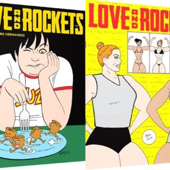
About
About 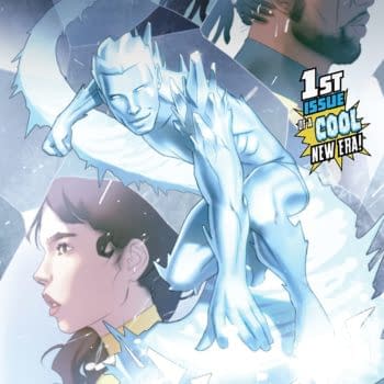
Iceman and Bishop team up to investigate a new attempted mutant massacre of the Morlocks in the tunnels under New York. Is it a good read?
Posted in: Comics, Marvel Comics | Tagged: colossus, gambit, HRL, kitty pryde, marc guggenheim, nightcrawler, old man logan, rachel summers, rb silva, sentinels, storm, x-men, x-men gold
X-Men Gold #5 Review: Surface-Level Allegory And Blocky Figures Give The Series A Misfire

X-Men Gold has been something of a conventionally good series. It's had solid writing, with the dialogue being one of the highlights of each issue, good art (not including thinly veiled hate speech), and fun action sequences. It's also really cool to see the ever-lovable Kitty Pryde leading her own team of top-tier X-Men, and the attempt to keep the team to a tight roster with occasional (or not-so-occasional) guest stars shows a level of narrative wisdom.
However, it has yet to really do anything astonishing — pun intended — or especially mind-blowing. There's nothing wrong with that, of course. I'm just glad to see Marvel actually putting their best foot forward with the X-Men again in light of their previous endeavors to phase them out.
That was, of course, until this issue.
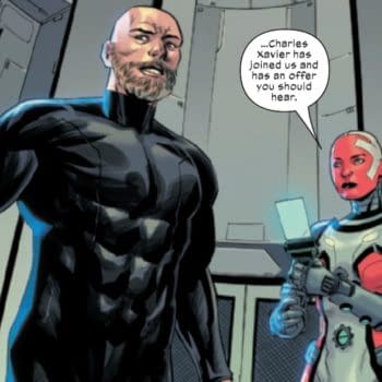
The story is that the X-Men have come to the aid of Gambit in the midst of his heist-gone-wrong that unleashed a nanotech Sentinel that has the face of Iron Man for unexplained reasons. The Sentinel gets lose and begins wreaking havoc upon New York. It begins to adapt, complicating matters, and the X-Men have to find a way to shut it down for good. Meanwhile, distaff counterpart Bill O'Reilly continues to hurl lies and slander at the premier team of mutants.
The art in X-Men Gold #5 is what caught my eye first, so that's where we'll start. It's not bad on the whole, but there are many panels that do feel off. From the first time the full team takes the scene, their figures look, well, kind of lazy. There's no detail, and they look bulgy in all the wrong places. It's not like they are that far off into the panel to warrant a light touch in terms of detail. This trend continues throughout much of the comic, with other scenes making the characters look noticeably flat. I wish I could find a decent scan of this to show you guys what I'm talking about here.
Also, Gambit looks really goofy in a beanie.
The "mutated" nanotech Sentinel isn't the worst idea ever, but it feels a little uninspired. The "twist" at the end that it's targeting "all" genetic mutations is a painfully trite attempt at the "You see? We're all the same," morale. It's a surface-level observation that really does nothing in terms of social commentary.
The femme Bill O'Reilly clone that has become a recurring adversary of the X-Men in this series isn't a terrible idea, because, you know, screw Bill O'Reilly. However, even she feels a little too simple. Humanizing even the realistically cartoonish bad guys and gals still makes for a more compelling story. I don't care how hyperbolic and ridiculous their real life counterparts are (the same goes for mayor Tronald Dump in Green Arrow).
What keeps the comic from being outright bad is the likability of the main cast. Shadowcat, Nightcrawler, Storm, Old Man Logan, Rachel Summers, and Colossus are all compelling characters. The fights with the Sentinels are cool, and when the art works, it works well.
I can't not recommend this book to X-Men fans, but X-Men Gold #5 is easily the weakest issue so far. The art has plenty of missteps, the message is almost superficial in its simplicity, and the plot is advanced very minutely.
Enjoyed this? Please share on social media!
Stay up-to-date and support the site by following Bleeding Cool on Google News today!