About
About 


The MTA suspended the 7 subway line this weekend. New York Comic Con and the BTS concert at Citi Field are both affected click for more.
Posted in: Comics, Review | Tagged: Godshaper, Review, reviews
A Comic With Kaleidoscope Eyes – Godshaper #1 Review
A bit late to the party but you need to know that Si Spurrier and Jonas Goonface's Godshaper #1 has got enough going on to definitely bring you in for more.

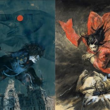
The preview (here and below) alone should actually do enough to draw you in to an alt-world where the concepts of physical science were turned on their heads, and everyone got their own god.
Goonface's kaleidoscopically coloured, wavy, line work, and hashing, are a departure for me. I've not seen something really like it in recent memory, but when I pushed back a little further Brendon Graham immediately arrived. Graham is still a slight stretch, though, he's definitely less 'scratchy', and whilst he uses the same palette, it feels like this is an inversion of that here. That, or perhaps it just never seems to be quite the colour that it should be, which makes one metaphorically tilt one's head slightly. So in that respect it way more closely resembles Fabio Moon and Gabriel Ba's style in the ICON (and back to Image) versions of Casanova.
I'd say most specifically of the two I'd lean toward Ba's work in Avaritia and Acedia (at Image). Marry this with (what seemed to me) to be some Robert Crumb character design influences in places, it really does make for a contemporary, yet respectful departure from the norm. Also this handily means that you'll look very cool reading it in your skinny jeans sitting in that café with all the exposed wood.

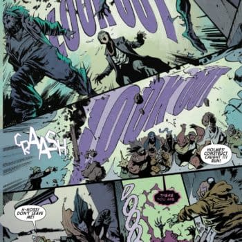
Anyway here's Spurrier showing just how well Jonas Goonface does sequential imagery, and the image shows a great montage that encapsulates *so* much about the character:
Colin Bell's lettering, by the way, really has a life of its own. Whispering, murmering, and accentuation, are all thoughtful in giving characters *way* more individuality in their patter.

It feels like the proper use of emboldening, rather than the Marvel way where it's basically just something important or a nod to the reader.
Spurrier's characterisation is natural and the players on the page flow within the world that he's created very naturally. This means that nothing felt forced here, and also nothing felt sensational, either. Perhaps the latter is a worry, but hopefully it's planned. At no point did any of it feel like exploitative storytelling, like "OMG, NO!" For me, this means that everyone on the (uber) beautiful layouts is exactly how they should be.
I don't know another book quite like this that's out at the moment, and it does feel somewhat like a Brandon Graham comic with a slightly more focused story. For what it's worth, I love Graham's style, this is just slightly different.
Godshaper is definitely worth both your time, and your cash … hipster jeans or no.
Issue 1 preview art:
Enjoyed this? Please share on social media!
Stay up-to-date and support the site by following Bleeding Cool on Google News today!