About
About 
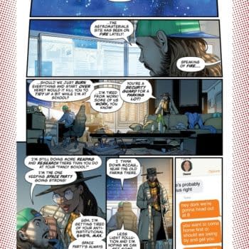
Hello BC readers, it’s been a while. I’ve been off working on comics (The Freeze Vol 1 trade from Image Comics/Top Cow is in stores now…) but after
Posted in: Comics | Tagged: alex cox, brian wood, Comics, dynamite, entertainment, Hayden Sherman, john carter
Creator Commentary – Hayden Sherman Talks John Carter: The End #4
Dynamite has sent us a creator's commentary by Hayden Sherman about John Carter: The End #4. Hayden is of course the artist for the series with scripts by Brian Wood and Alex Cox. Cover by Garry Brown
Creator's Commentary: HAYDEN SHERMAN on JOHN CARTER: THE END #4, on sale NOW from Dynamite!
Hello all, looks like it's my turn to walk you through the world of John Carter: The End! This book has been incredible fun to get to work on, and the team really let me go to town and redesign massive parts of this world. So I'll do my best to let you in on some of my choices, tell you about my teammates involved in this book, and hopefully we'll all have a good time! Anyhow, onto Barsoom:
Cover:
Okay, let's sit on this cover for a bit, shall we? Good looking piece, isn't it? Garry Brown has been churning out wonderful covers over and over again for this series. Such a good guy to have on our side.
Credits Page: Every single dude on this page here is an excellent partner in crime. Really a healthy list of good guys who all want to make the best book possible. You can't ask for anything more than that, and they definitely deliver. A specific shout out to Anthony Marques before we get going. That guy brought me onto this book and had a lot of faith in me, and I'm incredibly thankful for it.
Page 1:
Here we are in the middle of World War I. Dirty, nasty trench warfare. This was a great way to bring in Ulysses to this story, starting off with his origin and then moving back to "present" time when the story takes place. In the script the big enthusiastic soldier was described as "basically Hugh Jackman," that's probably my favorite character description in the book.
Page 2:
Mars! Home again home again. This right here is as good a time as any to talk about Chris O'Halloran. Look at that color. It's weird, it's fun, it draws you in, and looks great all at the same time. When I'm drawing I tend to do as much of the work as I can in black and white, since that's the way my mind tends to work. But as this series went on I started to find the areas where I could just let go and let Chris run with it. This is one of those pages. I could've put some tone in the clouds, or been more specific with the lines. But I would never have gotten this result right here. And that goes for the entire issue we're looking at!
Page 3:
"THEN OLD MAN ON THE OCEAN FLOOR", love that title. This is one pretty spooky old man. Also, in doing the concept work for this series, somewhere along the line I made a chart of about 28ish glyphs or letters that could be used around for the Martian language. We get to see plenty of them here, and throughout this issue.
Page 4:
The Green Martians were a lot of fun to design (as was everything to be honest.) When I was researching them, and reading the books in preparation for this comic, I remember reading that the Green Martian's eyes could move in any direction, allowing them to see just about anything around them. I figured then, it'd be odd to give them more "human" eyes that would be wedged into a socket. Instead I looked at chameleons and how their eyes move around and fit into their heads. They're real strange critters, but they work! So the basic structure for the Green Martian head came from the chameleon.
Page 5:
GREAT SCOTT! The boy has returned! Fun fact: His costume was originally intended for Carthoris. But, for a couple of reasons that changed. I still liked the chest straps though, so I put them onto this practically naked dude instead.
Page 6:
The Red Martian clothing is a lot of fun to draw. It's basically just wrapping sheets around people to make different shapes. Which keeps it fairly barbaric, as a fair amount of Barsoom tends to feel, while still giving them some class. Also, the last panel on this page is probably one of my favorite moments in this story. These guys have had a reeeeal rough time. Hug it out.
Page 7:
Den's got issues. Or at least he did. John might have acted too quickly and irrationally here, but if my little sister looked up at me like "what?" after drowning a kid… I'd at least consider passing her off to the scientist too. Am I alone on this?
On a separate note, the decision to keep Den's head shaved as a kid largely comes from the film "The Last Emperor" where the child's head in that story is shaved as well. I felt it brought an air of oddness to him, as well as a sense of separation or discipline. Little things that make Den just that much more peculiar.
Page 8:
I love all of the crazy things that Alex and Brian have brought to this story. These cloning chambers, Tars' new growth, and so on. So many cool and bizarre things to add onto the stories that already existed, and everything still really fits.
Page 9:
Let's talk about Dejah. Cool character, right? She knows what she wants, she goes out and gets it. She gets a bit in over her head here, not realizing how deep this terror goes. But she doesn't give in, she cares about her people, and really wants to be able to care for her son. That being said, she's had a rather mixed history in terms of her representation. Needless to say, I didn't want to go for just capping her boobs and calling it a day. The Dejah we meet in this story is one who has been grieving for nearly 100 years. That's horrifying. I mean just look at the impact that high stress can have on someone over the course of a couple years. These mental conditions age you and change you. So the Dejah we meet in John Carter: The End is someone who has been through all of that, and yet still gets out of bed in the morning. She's weather worn and tired, but she's not going to be stopped. With that in mind, the costuming I went with for this book just made sense to me. She's accustomed to the harsh conditions of Titan, where she would wear a bit more protective clothing (the cape and such) and she doesn't feel comfortable wearing all of the jewelry and royal get-up after grieving for a century. Instead she opts for something simple and practical, while still here satisfying the style of the palace.
Page 10:
Lay down the law, Dejah.
Page 11:
I love that this Den's got this painting down here. This is a guy who really likes his own image. Actually, I've been able to have a lot of fun with the paintings in this series. If you look at the paintings in the grand hall towards the beginning of issue #2, a good number of them are John Carter book covers or references to the old Jesse Marsh John Carter comics. I really wanted this book to be a delight for any type of John Carter fan to look at. Hopefully it is.
Page 12:
Bringing it back to Chris! This is a damn fine color palette here. You could've gone for anything in this scene, but Chris made a memorable and odd choice that really works.
Page 13:
I love drawing John surprised. He looks so cool and collected so often. When he's surprised it looks weird, like he's let his guard down and he's just a guy again. Also it's fun drawing a character who's typically "classically handsome" as just a bit average for a sec.
Page 14:
Ah, this color. Just give it up.
Page 15:
You know, there are all sorts of tools to use during inking, things like rulers, French curves, or circle and oval tracing sheets. All of which are super cool and definitely helpful. But I find that I try to avoid using them as much as possible. I use a ruler pretty often, straight lines are important, but when I can get away with it I always shoot for free hand. It gives you some wonky weird shapes, like those circles behind John's head or the rings going around his feet. They're not perfect by any stretch of the imagination, but they're just that much more fun to look at. For me anyways.
Page 16:
If there's anything art school is definitely good for, it's skeleton drawing (as well as many other things, don't get me wrong.) Thankfully I got to put some of that skeleton drawing into practice right away. Turns out everything does help everything else.
Page 17:
The friendship of Tars Tarkas and John Carter is so satisfying. These guys have been through thick and thin together, and they've still got each others backs after all this time. Thank goodness.
Page 18:
Now looks like a good time to talk about John Carter's design! While he's all mumbling and stuff. When I was figuring out how John would look for this story I wanted to draw as much inspiration as possible from his history of book covers. There have been so many classic interpretations of the character over the past hundred years, so I felt it'd be fitting that for this "last" John Carter story, to honor that past, John would be a combination of designs from his history as a character. I also really wanted him to have a solid feeling, an experienced adventurer who carried everything he needed on him at all times. So, as for the book covers, I was largely looking at the works of Frank E. Schoonover, J. Allen St. John, and Frank Frazetta. Those three names alone, John Carter has had a massive history in illustration! Anyhow, if you look at these guys' Carter covers, I get the feeling you'll see where my design came from.
Page 19:
Were this an animation (which would be incredible by the way) I imagine the Black Martians as being completely matte black. Like that "super black" that was developed recently. No indication of form except for the outlines of the figures. Imagine a mass of Black Martians on the attack and they just look like a black hole of space running towards you. Ah. Alas, for a comic that wouldn't have communicated as quickly, at least not in a way that I could figure out in time. If I get a chance to revisit the world of John Carter though, I'd love to give that a shot.
Page 20:
Another reason why I love this character, he exudes honor. He's not going to ask anything of these Martians that he wouldn't ask of himself. He's going in to fight alongside them, and he's thankful for their help. Alex Cox and Brian Wood are too good.
And there we have it! The finale approaches! I hope you found this interesting. There's a lot to talk about in regards to Barsoom, but I did my best to cover the bases! The next issue is nuts, and was a blast to draw, so prepare yourself for battle! I'll see you in the next issue!
Enjoyed this? Please share on social media!
Stay up-to-date and support the site by following Bleeding Cool on Google News today!