About
About 


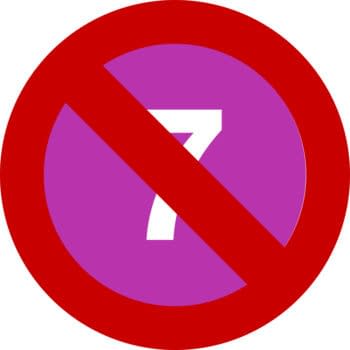
The MTA suspended the 7 subway line this weekend. New York Comic Con and the BTS concert at Citi Field are both affected click for more.
Posted in: Comics, Comics Promo, Recent Updates | Tagged:
250 Pages Of Papercuts And Inkstains
Rob Jones writes for Bleeding Cool
Good day, fans of sequential loveliness.
We're Rob Jones and Mike Sambrook, writers, editors, letterers and dreamers of comics. We're here today to talk to you about colouring (or coloring if you're of an American persuasion).
We started Madius Comics a couple of years ago and in that short time we've released 14 books and we've not done too badly, somehow scooping 3 Ghastly Award nominations, a long list nod for the British Comic Awards 2016, a Scottish Independent Comic Book Alliance nomination and a best publisher nomination along the way. And that's with the majority of our output in black and white. Now, that's not to say anything negative against black and white (and it needs stating that the artists we have worked with have excelled within that framework), but something that keeps coming up in reviews is people wondering just what our output would look like in colour.
We're at the stage now where we are looking to collect every issue of our anthology comic Paperbacks and Inkstains into a giant trade paperback, a monstrous 250+ page beast that spans two years hard graft with a multitude of exceptional indie artists. But for this release, we wanted to do something different. We wanted to add COLOUR.
We've done colour comics before, and we've done kickstarters before, most notably Griff Gristle: Here be monsters (with artist Rory Donald who also features in Paperbacks and Inkstains), a campaign which saw us end up 230% funded with over 200 backers. However, this is a different beast altogether. It's gonna be a huge comic, with widely different artists and art styles, and as such, the colouring needed to be on-point (for you hip kids, you) to match the stories within. In step our colourists, Bob Turner and Alexa Reneé, coupled with our artists who have (where possible) coloured their own stories; Angela Sprecher, Darren Smith, Rosie Packwood, Jim Lavery and Kevin Pospisil. Colour in comics, like art, is subjective, however great colouring can take an already great comic and make it incredible, take Matt Hollingsworth's work on Wytches, or Casper Wjingard's psychotropic work on Limbo. Colour can become an ancillary character; setting mood, tone, creating depth and elevating great artwork to the next leve–
*Mike barges Rob out of the way*
As Rob has said, the book we are Kickstarting is incredibly special to us and collects a mountain of work we're incredibly proud of. We're desperate to get this monster out there filled with our favourite stories that will now look even better than ever. We are giving every story the full HD remaster. Everything is being tweaked, polished, relettered and coloured. If you haven't been on board with our releases up until now, the Kickstarter is an incredible place to start. It will bring you right up to speed in the quickest and best way possible. Did we also mention it is incredibly affordable? 250 ish pages for £15. We must be crazy. Anyway, that's more than enough waffling from us two, we're going to hand you over now to our unfairly talented colourists (and in some cases artists) to tell you all about the work they have done on the book. I mean, they are the real talent after all. Hopefully this little insight will whet your respective whistles and give you an idea of the incredible pages that are going to be in the finished product. We really hope you can take a few minutes to browse the Kickstarter page and help us bring this tome to life. We've included along with the ramblings of our artists some accompanying pictures to give you an exact idea of what you can expect to be holding in your hands come June.
*Mike shoves Rob into a wardrobe and locks the door*
Rosie Packwood: "Revisiting Slaycation was as much of an adventure, and challenge, as the first time.
From the first illustration, it was hard not to think of the characters in colour. The friends, their camper and the sunshine had always been vibrant – getting to colour Slaycation felt like stripping off a heavy white sheet, revealing to everyone how it had always really looked.
The palette itself had to be flexible, as the story jumps around various settings and moods; celebratory one moment before an effortless shift into geared up violence. Sticking with bright yet earthy colours gave Slaycation an abandoned fairground feel – it's got the cartoonish face up front, but a deeper, visceral layer waiting to bite you underneath. The characters in the story have subtle traits added through the colours of their clothing, giving readers a chance to get to know them better. Each cabin in the woods had its own cheesy-chic holiday vibe with garish rugs, brightly painted walls and bare woodwork. The new colourful additions give you reminders of people you've known or places you've been, and – for a second, let you go back there."


Alexa Rénee: Working with the guys at Madius has been a truly memorable experience for me as an artist. It's given me a chance to grow by treading outside the bounds of my comfort zone as well as discover a great sense of community. Comics are pretty amazing.
Via the Paperbacks and Inkstains collection, I found myself entrusted with coloring some really fantastic art for which I had to adjust and learn how to properly handle. Up until then I'd been doing fantasy illustration pieces (for my portfolio), so I did have some developing understanding of color and light which surely has helped, but it's been an exciting new challenge nonetheless, presenting many new opportunities for growth.
Working on each comic, I'd strive to follow what the story and the artist's inks were communicating; doing my best to complement those components. Well, that and any direction/info/occult secrets I got from the guys. It's really a team effort that I've come to enjoy. Each comic, it seems, requires it's own color "signature" and it's pretty fun not only figuring that out, but getting to work on something very thematically new each time. I'm constantly learning so much from each comic I get to work on and it all ultimately informs everything else I want to do with art.
Maybe I'm a bit crazy or just a sappy creative, I'm not sure… but I'll always be grateful for this chance to work with some great folks while discovering a passion for coloring comics.


Angela Sprecher: My colouring process doesn't leave much to write about. I'm a bit of a caveman about the way in art – most of my process involves throwing things at the wall and seeing what sticks. Colouring Dice and Monotaur was no exception – throw colours around and see what works. Dice, a good ol' gunslinging western, ended up using more browns and duller tones. It fits the genre, I had a fine time colouring it, but Monotaur was a lot more fun. I felt like I had more room to play with my colour choices, depending on the setting and mood.
What made it a bit of an adventure was working around the art itself, I guess. I've coloured my own work plenty of times before, but never work quite as old as Roll of the Dice – which at that point was over a year old. It was a challenge compared to (only a few months old) Monotaur. I often found myself working on Dice and having to deal with mistakes that I know better than to make now. Issues with the inking, clarity of the art, how to handle the colouring process with it…if I had the time, I would've thrown my hands up and fixed the whole thing. Maybe for the best that I didn't, I might've still been working on it as I type this.


Bob Turner: Plain and simple, working on this book has been a joy. I was lucky enough to be entrusted with the crown jewel of the Paperbacks and Inkstains collection and asked to colour The Profits Of Doom. This is the long running story that has featured in each issue of the book up until now. Working on this has felt like I have sole access to the greatest colouring book in the world and I've honestly had a total blast bringing colour to this hilarious story. The main influences on my approach to this piece are Dave Stewart and Laura Allred. I love their block colour approach and felt that this would really compliment the linework of Mike Smith. I can't wait for people to see the finished pages. As a final note, working with the team at Madius Comics has been tons of fun and something I hope we can do much more of in the future.


Darren Smith: "So, when i started thinking about colouring the Forebearer, I wanted to get some vibrant colours and contrasts… it's a fantasy/humour story, so I wanted to bring the classic green orcs, tanned warrior and flame lit corridors to life. I wanted to make the outdoor scenes striking so used oil paint style clouds and skies to contrast against the foreground more classic, flat colours. The initial pages are quite bright and I wanted to then make things more dark for the second half, so I used some dark rooms and brought them to life with shadows from flames and beams of light on dark backgrounds. For the main villain battle section, it's mainly character based panels so I kept to dark backgrounds and splashes of red to emphasise the impending violence. I think these bright colours should really bring this story alive again and I'm hoping this colour scheme and remastering does Madius Comics collected work justice."

Wow, right? We know. So hop on over to the Kickstarter page right now and help us get this book made. Thanks for reading.
Click the link HERE.
Enjoyed this? Please share on social media!
Stay up-to-date and support the site by following Bleeding Cool on Google News today!