About
About 


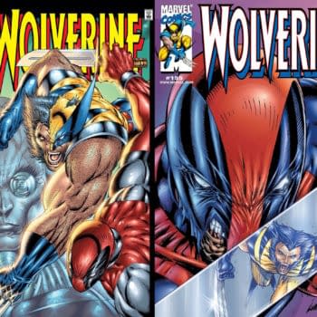
In reaction to the new Deadpool And Wolverine trailer, Rob Liefeld suggested comic speculators might want to watch Wolverine #154 and #155.
Posted in: Comics | Tagged: Comics, entertainment
Sifting Through The Dregs – A Script To Page Procedural With Eric Zawadzki

Eric Zawadzki (sign up to his mailing list here) has a new comic out, The Dregs, at the end of the month. And he took the opportunity to take Bleeding Cool through a little of the process….
Today is the final order cut-off for The Dregs #1, which is my new comic from Black Mask Studios. So today is a perfect day to talk a little about my process for approaching the creation of a page. (you can order issue #1 at any local comic shop with pre-order code NOV161210)
There are many different steps involved in the process of creating a page and I understand that almost every artist has a step that they favor. Some derive the most enjoyment out of penciling, and some love inking the most. I'm one of those artists that has the most fun when figuring out how to tell the story.
Page 6 of The Dregs, scripted by my brilliant collaborators Lonnie Nadler and Zac Thompson, is the introduction to our protagonist, Arnold. Below is what they scripted.
Lonnie and Zac are filmmakers, so they think very visually and have a very clear vision. Their scripts are pretty detailed and they also conveniently provide a lot of links and reference for me to work with.
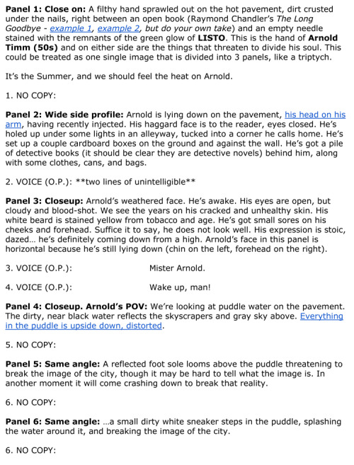
This is a 6 panel page. However, because of personal preference, I think one of the panels isn't necessary. The last 3 panels portray the introduction of a puddle and then a foot stepping into the puddle. The middle panel is supposed to portray the foot falling mid action, which I think creates a bit of a pause in what should be a swift action.
There's a similar scene in Watchmen.

While I think this panel sequence works in it's own way, I want a quicker action on my page because it's the the introduction of someone waking up our protagonist. Portraying it in only two panels creates a more violent action. So I opted to remove a panel from their script.
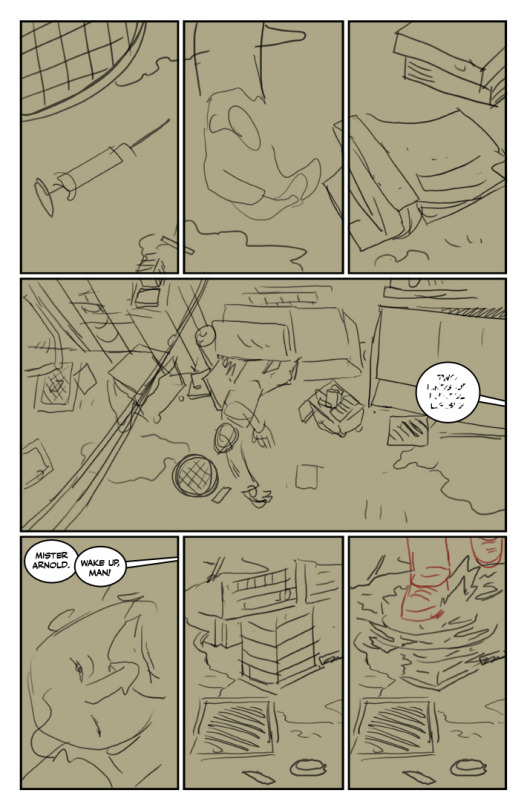
Below is my initial rough layout for the page. I always do my rough layouts digitally. There's much more freedom to experiment and play around when you're figuring out your storytelling digitally. I also like to letter my comics in the early stages because I actually want to read the comic several times before I make any final decisions.
I like Lonnie and Zac's idea to break up the first panel into a triptych. As they said in the script, the two things on either side of him are "the things that threaten to divide his soul."
I actually really like this page, but I wanted something bigger as an introduction to Arnold. So I played around and came up with what you see below.
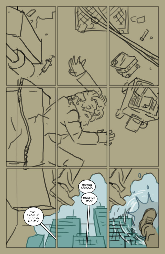
I found myself going back and forth between these two designs. In the end, I think this version has more advantages. I like that this design makes him appears more stationary as his friend tries to wake him up. I also like that this a more grand introduction to our protagonist. And I tried to make it so that each panel is an aspect of his world: his drug addiction, his withering body, crime novels, his shabby home, his addictive personality, the streets, the looming city and his fellow homeless people.
Unfortunately, this page layout made the needle and the book smaller. Zac and Lonnie really wanted a close up of the book and the needle to really drive home their importance. The novel, Raymond Chandler's The Long Goodbye, is pretty important in the story and this layout makes it too difficult to see the title of the book.
My solution was to give myself more work and add an introduction page prior to this one, in which we have a close up of the objects.
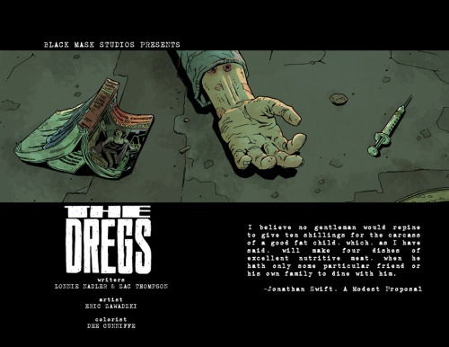
This works specifically because it places even more importance on the significance of the objects by giving it it's own page, it gives us a place to put a quote (which they had talked about in our previous discussions, but hadn't quite figured out by this point) and I love credit pages like this in comics. These kind of things are generally not done in comics for budgetary reasons and because page real estate is too valuable to waste. But this is indy comics, so we should be utilizing the freedom provided to us at every opportunity.
I initially pitched it as a one page intro, but that would have messed with Lonnie and Zac's very carefully scripted page turns. Although this is one of their first published comics, they've been studying this craft for quite a while. I was a little surprised that they didn't fall into any of the many, many traps that newer writers of the medium generally fall into.
After that was settled, I tightened up the page.
I took a lot of reference photos of downtown Vancouver because I wanted the city, a very important character in it's own right in this story, to feel authentic. (which got me in a little trouble sometimes because the people in the downtown east side understandably tend to feel exploited when they see people taking pictures) I really love getting into the gritty details of drawing backgrounds.
The next stage for me is printing this rough in blue and inking it traditionally. My last four comic projects were all done entirely digitally. Recently, though, I realized that I needed a change. I also think going more towards traditional was necessary for my development as an artist. I'll talk more about that in future blogs, though.
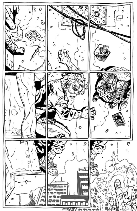
As you can see, I opted to freehand the panel borders. There's a very specific story reason as to why I sometimes freehand and sometimes use a ruler for borders on this project. I'm not to going to explain it here, though. I prefer to let some things be left up to interpretation. (and it should eventually become clear later on in the series)
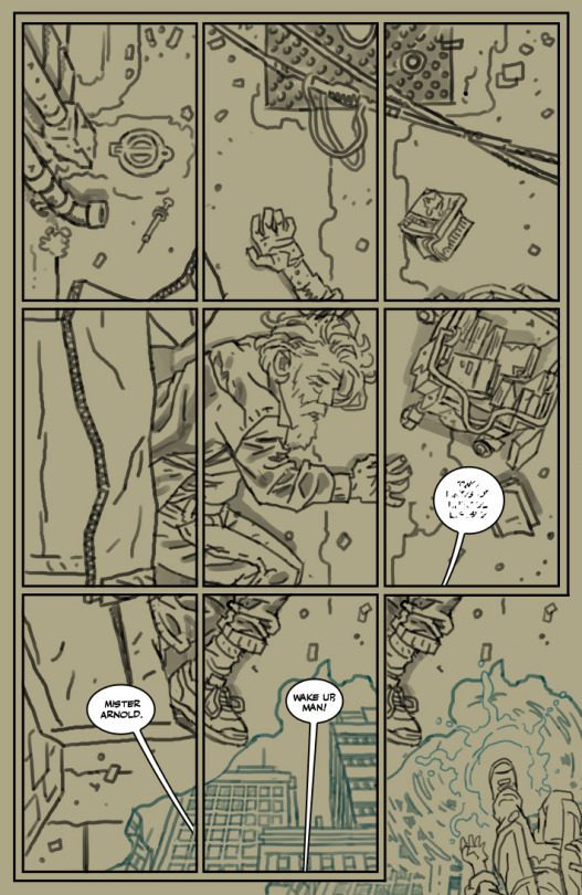
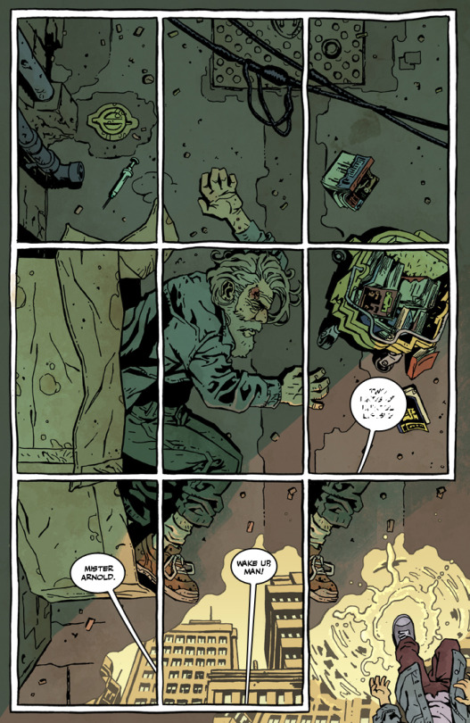
Next up, I scan the page (and sometimes make some digital adjustments) and send it over to the brilliant Dee Cunniffe. I used to color my own work, so I sometimes have a clear vision of what I want. I truly hope that I don't drive Dee mad with my many notes and requests. But I confess that I never really knew what I was doing when I was coloring. Dee on the hand is a professional and an expert at his craft. And I have to say that seeing someone else take my work and make it better has been a breath of fresh air for me.
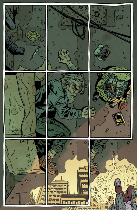
Lastly, I bring back the dialogue and it's ready to go!
I'm playing with my layouts and pacing more than usual with this project. I've put a lot of thought into these pages, so I'm planning to blog about that much more in the future. I'll also be saying a lot about my experiences in the industry and comics art in general, so please sign up for my mailing list.
Issue #1 of The Dregs will be available at the end of the month.
Enjoyed this? Please share on social media!
Stay up-to-date and support the site by following Bleeding Cool on Google News today!