About
About 

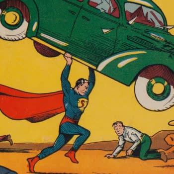
The high grade Action Comics #1 CGC 8.5 Kansas City pedigree copy featuring the first Superman has set an all time comic book record at $6,000,000
Posted in: Comics | Tagged: cgc, Comics, vintage comics
Putting The New CGC Holder To The REAL Test: Is It Social Media Friendly?
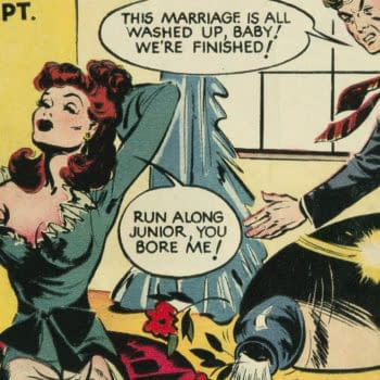
 Most vintage comic book collectors I know have a few stories that go something like this: one day a couple decades ago, I returned from Chicago Comic Con with a special prize, a very nice copy of Marvel Mystery Comics #14 which I'd spent too much money on. But, you know, I needed it. Instead of hurrying home and locking it away somewhere out of harm's way, I wanted to show it off, so I stopped at my local shop to let a friend of mine have a look.
Walking down the crowded sidewalk towards the shop, my prize clutched furtively to my chest in a backpack, I was knocked off course by a large man carrying… something big (A TV? A refrigerator? My memory gets fuzzy at this point). Recovering my senses, I finally scurried into the shop to check if my fragile comic had a corner ding or a slightly bent spine.
Fortunately, my cherished Marvel Mystery Comics #14 was fine, and is tucked away safely in my collection to this day, but if you're a collector of fragile old paper like me, you know this problem well: You want to keep you comics safe and out of harm's way, but you also want to look at them and show them to people. You want to share them.
When William Christensen told me about seeing the new CGC Holder — and was genuinely pretty excited about it, which caught my attention because that guy has been collecting vintage comics since about age 6 and is not an easy person to impress — well, I was intrigued, sure… but I still had questions that only actually seeing the thing could answer.
The preservation and durability aspects of the case which William discussed are of utmost importance, but I expected CGC to do a job in that area. They've got a lot of experience at this point, so they've got to get that right and it's what we insist from them. What I'm interested in beyond that is a bit more subtle.
Is it shareable? Will it look good on Instagram, or Facebook, or Twitter? Just as importantly: will it present well on eBay, Heritage, Comic Connect, Comiclink, and so on? If there's no link then it didn't happen, as the saying goes, and if you don't have good pics to show, then how will anybody ever know that your collection really is that great?
The 2016 version of the 1990s sharing near-mishap with my beloved Marvel Mystery #14 is less harrowing but just as important, and if you've ever taken a selfie then you know what I'm talking about: getting a good pic is a lot harder than it looks. And in the case of getting a pic or scan of a comic inside of the previous CGC Holder, there have always been some particular challenges: various seams and curvatures of inner-well configurations and materials produce shadows and glare, sometimes preventing a good, clear, uncluttered view of the underlying comic. And causing you to endlessly adjust your lighting, camera angles, scanner settings, and… again, if you're familiar with selfie culture, you know what I'm talking about. There's a difference between good enough and good.
How does the new case fare in this regard? Here's our first look:


It does look good, but how does it compare to the previous version? It's a cleaner, more flat look, and it's much easier to avoid that glare along the top edge of the comic when making a scan.

On the back, again comparing it to my slabbed copy of Detective Comics #199, you can see that the new case prevents areas of glare that can occur due to inner layers of material not laying perfectly flat in the old case. The minimal text on the back of the label is also nice, and the notation of the comic and grade on the back is handy.

But here's how I know that someone at CGC has paid due attention to the new design. It's the kind of little detail I don't like to call out because it makes people think I'm crazy (a few of you out there know what I'm talking about, I'm guessing), but… the number grade is printed in a much darker black. Not that weak near-black-actually-kind-of-gray that the old label had that did in fact used to drive me crazy when making scans.

Speaking of the label, another nice little detail is the way it actually lays flat inside the case. This is another thing that always annoyed me a bit about the old case — the label would often curl a little inside the case, leading to weird shadows and warps.

And for completeness, here's the top edge label and a comparison with the old label. The new top edge label is inside the case, which will avoid peeling and wear over time.

 And I think that about covers it. Overall, it's a major leap forward, and a much better look in the bargain. Got a good pic of your most recent comic acquisition to show me? I'd love to take a look.
Enjoyed this? Please share on social media!
Stay up-to-date and support the site by following Bleeding Cool on Google News today!