About
About 


By Spencer Ellsworth Nick Roche got his start as a comics artist at IDW Publishing, illustrating and soon writing the company’s incarnation of
Posted in: Comics, Recent Updates | Tagged: Alan Moore, avatar press, Comics, entertainment, H.P. Lovecraft, jacen burrows, providence
Dancing In Cthulhu Slippers Before The Abyss – Jacen Burrows On Providence, Plus Art Reveal
Providence is coming. With the first issue arriving the 27th of May from Avatar Press, we are starting to get a clearer picture of what Alan Moore and Jacen Burrows have been up to crafting an "ultimate" Lovecraft series that follows on The Courtyard and Neonomicon, but in many ways is quite a different undertaking. It's a 12 issue series set in 1919, the year just before H.P. Lovecraft himself really came into his own as a writer of "weird tales", and as such it evades being an origin story and is instead a series based on encounters, both illuminating and terrifying, according to Moore.
 It's a comic that pits realism and restraint against all the excesses typical of an approach to Lovecraft right now where the seen monster can wind up being the entirety of the draw. Meticulously researched by both Moore and Burrows to the extent that even looking at the recently released artwork might make you squirm, realizing that each facade you encounter is a "real" place, never has the tension and uncertainty of Lovecraft's world been so accurately represented.
Let's talk with artist Jacen Burrows who, miraculously, is still able to communicate clearly despite months of working on this series with admirable but slightly frightening devotion, and we'll find out why he's quite content wearing a pair of Cthulhu slippers to "dance", waiting for the arrival of the "abyss". He's also going to release just a taste of welcome information about Providence's protagonist, one Robert Black who works for the New York Herald and we're going to see three new pages of previously unreleased artwork featuring Mr. Black as well.
 HMS: Since I haven't actually interviewed you before, I wanted to ask about your art background and what got you into making comics. Was it a difficult decision to make? What kinds of comics do you gravitate towards as a reader and as an artist?
Jacen Burrows: I don't know if this was something only I experienced but when I was little, when I was dragged along on grocery shopping trips I would be planted down in front of the spinner rack and told not to wander. If I behaved, I would sometimes get to pick out a comic which was usually a Sgt. Rock. I liked the war books more than the superhero books, honestly. It wasn't until I got a little older and went to a tiny local convention with a comic collecting friend that I really got into comics. Kevin Eastman and Peter Laird were there signing issue 3 of the original TMNT and for the first time I realized normal people from anywhere could make these things. I had been drawing forever but now I wanted to draw comics specifically. So I was 11 when I decided I would be a comic book artist. The books that most appealed to me then were all from independent publishers. The Big 2 were just too polished and had too much insurmountable history. I was more excited about things like Badger, Grendel and Grimjack but my two favorite, most personally influential titles from those days were Scout and the Epic reprints of Akira. I do like some superhero stuff depending on who is making it, but generally I'd rather read BPRD than Batman.
 HMS: Jacen, it's no joke to say you have one of the most high-pressure job in comics working on stories written by Alan Moore. But Providence isn't your first rodeo. You adapted The Courtyard and you drew the fully scripted Neonomicon. When you look back, what do you think you learned on these projects that helps you out now on what seems to be an even more intricate book?
JB: All of the Alan Moore projects I have worked on have had unique challenges. For Courtyard we went with a vertical 2 panel format and for Neonomicon we went with a 4 panel horizontal grid which we repeat with Providence. It can make doing the compositions really difficult because you have a lot of story to convey in each panel along with limited options for where you place the characters in order to keep the dialogue flowing smoothly through the page. The more you work within these limitations, the more you improve your ability to compose the panels in interesting ways instead of falling back on certain angles and poses you've already gotten comfortable with. I really feel like my ability to visualize scenes in three dimensions has improved a lot since Neonomicon and it is because I couldn't take shortcuts. I've also felt the need to push myself to present more of a realistic style over the years because it just feels more appropriate for the material in my mind. It was a difficult transition because I feel like I used to be able to hide a lot of beginner mistakes like wonky proportions behind cartooning. But when you are going for more of a realistic style it is all there, exposed. But it is also kind of fun for me to look back and see the evolution in skill between the projects.
 HMS: For Providence, you get to draw monsters, you get to draw people, you get to draw people who are monsters. What do you think is viscerally scary for comic readers, and what are some of your strategies for affecting readers in such a way?
JB: We had some discussions about this when I visited Northampton to meet with Alan. You could take a real classic gothic horror approach like an old Universal or Hammer Film and go absolutely crazy with otherworldly stuff and atmosphere, but for this book, we wanted to focus on a tangible historical realism throughout. The hope being that when the horrific things happen or when our lead character stumbles into the darker corners of the Lovecraftian world that they will be all the more horrific in contrast. Robert Black doesn't live in a shady nightmare world; he lives in our world, which sometimes intersects with things that will horrify him down to his bones. There are definitely some opportunities to design and show some really scary stuff, but I think it is the contrast with the recognizable but still somewhat alien 1919 setting that amplifies the creepiness.
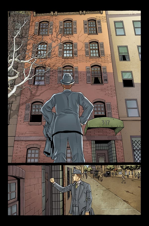 HMS: There are so many questions I could ask you about what I know to be mountains of research that's been done to create Providence that I hardly know where to start. It seems like this is most likely the most architecture you've ever had to draw, and it's very specific architecture, isn't it? What's it like recreating so many real places in so much detail? Do you have a sense of trying to do justice to the world of 1919 New England?
JB: I drove myself a little crazy with my efforts to try to be accurate when possible. Everything from locales, to props, to clothing, it all had to be researched. What does a coffee pot from 1919 look like? What kind of summer hats were popular with ladies before the fashions of the roaring 20's took over? With architecture, for example, I would get on Google Street View and trace the path of the character looking for background elements, then try to look up the specific building's addresses on real estate sites to see if they existed in 1919. And certainly in Manhattan you can do that but when you get to places like Athol or Salem, you have to take more liberties. But I felt from the beginning this was a unique book and a unique experience for me as an artist, so I wanted to go all in. Thankfully, I had help on this hunt for accurate references from both Alan's side and from Ariana [Osbourne] at Avatar. Ultimately, whether it translates for the reader or not, I can take pride in knowing I gave it my all.
 HMS: So Realism is the rule of the day with Providence—realism in locations, in clothing, and even in historical events like riots and protests. But how did you come to present your characters realistically? How did you decide on their facial features and movement? Can you tell us a little about your design process?
JB: Most of that was in the scripts honestly. Alan writes in such detail, describing not only their actions and details about their appearance but also giving me enough bits of background, personality and nuance that I would start developing a look in my mind before I ever set pencil to paper. But with Robert Black I really drew influence from the illustrations of J. C. Leyendecker. He was a brilliant, massively influential, golden age illustrator in his day who paved the way for artists like Rockwell. So I studied a lot of his illustrations in hopes of capturing that classy opulent style.
 HMS: What do you think of being the first artist to visually harmonize the majority of Lovecraft's stories into a single universe?
JB: This is really Alan's accomplishment. I know what it took for him to bring it all together and from the beginning my goal was just to deliver his vision as accurately as I could. As long as he is happy, I am happy. I'm sure once it is complete I will be able to appreciate the whole thing in more of an academic light as an enthusiastic Lovecraft fan.
HMS: Can you tell us a little bit about designing the fabulous covers we've been seeing for the series? I wondered in particular about the fantasy-driven ones and your choices there. Any favorites?
JB: Early on it was decided that there would be a running theme for each set of covers. Covers that show specific locations, portraits of major characters, the women of Lovecraft, the Pantheon and the Dreamlands. And Alan decided the subjects for each of those, but how to depict them has been largely left to me. I've really enjoyed the Portrait/Women covers because I get to show a little extra personality or show them in their element in ways I might not get to do in the narrative. And drawing the monsters is always fun, but my favorite cover so far is probably the Dreamlands shot of Ulthar with the streets full of cats for issue 5. I always enjoy drawing animals.
 HMS: Would you ever wear a pair of Cthulhu slippers? What do you make of the massive interest in Lovecraft's work coursing through pop culture right now?
JB: To think that an obscure pulp writer from the early 20th century could be affecting pop culture in modern times is truly surreal. Even beyond the handful of film, gaming and literary adaptations of his ideas, his influence has been immeasurable. At its core, I think the main theme has always been that no matter how self important mankind gets, we are ultimately nothing more than a blip in the vastness of space and time, and the horror that comes from knowing just how insignificant we all are. There can be no more universal fear than that. So why not throw on some C'thulhu slippers and dance till the abyss consumes us like the mindless pipers of Azathoth?
Providence #1 arrives in comic shops and on digital platforms on May 27th. It is currently listed in Previews with item code: MAR150952 and you can find the full solicit information here.
Stay tuned for an early review of Issue #1 this week on Bleeding Cool.
Avatar Press is the parent company of Bleeding Cool.
Enjoyed this? Please share on social media!
Stay up-to-date and support the site by following Bleeding Cool on Google News today!