About
About 


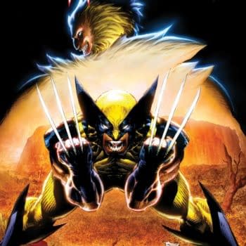
Chris Claremont takes Wolverine back To Australia for the character's 50th birthday - and probably where he should have stayed.
Posted in: Comics | Tagged: Comics, fcbd
Five Titles With Damn Fine Art From FCBD
Hannah Means-Shannon writes;
Free Comic Book Day this year brought a bumper number of surprises out of the woodwork; there were more new series represented, and many of the cult and rising artists of our day were included in the offering. With plenty of reviews out there, many focusing on stories and even some talking about artwork, thankfully, why not give the artists who most capture the attention of readers when glimpsing unfamiliar titles a little more attention? In that spirit, here are five that turned my head, from cover to page.
It was a choice with one caveat, though: I knocked three titles out of the running because they are drawn by well-known masters of the craft and really belong in a league of their own. These are not honorable mentions, but rather "superlative mentions". Those three are Charlie Adlard's WALKING DEAD from Image, Gilbert Hernandez' MARBLE SEASON from Drawn and Quarterly, and Peyo's THE SMURFS from Papercutz. If you didn't pick those titles up on FCBD, I hope it was because the shop had run out and not because you didn't notice that they were hot stuff. Superlative mentions aside, these are five titles from FCBD with simply awesome art in a mad variety of styles:
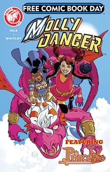 MOLLY DANGER: Jamal Igle's successful kickstarter on MOLLY DANGER made the headlines, but it was delightful to see the series leading the vanguard on all ages comics for FCBD, published by Action Lab. Igle is responsible for both the story and the art on this issue, with inking by Juan Castro, coloring by Romulo Fajardo Jr. and lettering by Frank Cvetovic. Igle's clear, versatile heroic lines have the ability to capture a certain weightlessness for characters in motion, like the frequently aerial Molly, but he's also a virtuoso when it comes to recognizable facial expressions and the creation of winning visages from lesser to greater characters in MOLLY. Those strengths help guide the reader through the fast-paced panel changes without losing a step. MOLLY's also easily identified by its striking, crisp colors that nevertheless avoid feeling two-dimensional. Definitely eye-candy for kids and adults. Start 'em young, Mr. Igle.
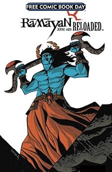 RAMAYAN 3392 AD: Presented by Graphic India, RAMAYAN is a carnival of talent with 7 stories and art by 7 teams, each individualistic despite the common elements of the linked narratives. It's a wide range of fantasy explorations founded upon mythology, and really unleashes the artistic imaginations of the contributors on the world. With a cover by Michael Avon Oeming, and the first story drawn by him, it's a eye-opener from the start. Colors by D. Seshasainan and S. Periaswamy on that first story "Rama", are particularly excellent and contribute a lot to the success of making the reader believe in a neo-mythological setting. RAMAYAN's second story "Ravan" is drawn and colored by the legendary Jim Starlin, and is a three page visual blitz of apocalyptic proportions. David Petersen's art and colors on "Hanuman" are also especially appealing, with a multi-lined, more fable-evoking style, and a softer color palette that conjures distance in time and space. RAMAYAN also contains a preview of Grant Morrison's 18 DAYS: THE ANIMATED SERIES which looks, I have to say, pretty striking with a heavy brushed look on the inks and interesting, vivid color choices in reds, greens, and blues.
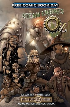 THE STEAM ENGINES OF OZ: Arcana's book is dominated by the moody, sinuous flow of Vannis Roumoulias' artwork, set off by softly blended earth tones of Chandran Ponnusamy's colors, and well-blended heroic and italic letters by Erik Hendrix. In fact, you get the sense you're viewing the story through a faint haze of steam, which serves the material well. This is steam punk gone wild, as you might suspect from the title, and there's no shortage of aesthetically appealing gears, gadgets, rivets, and clambering among them. But this is also the world of Oz, with its dream-like palaces, and Roumoulias shows an equal skill at rendering organic shapes and long-distance cityscapes. This is a book where the artwork really carries the epic, adventure feel panel by panel. Like many of these art-charged FCBD titles chosen, you find yourself reflexively turning the page, hoping for a longer book.
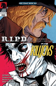 THE TRUE LIVES OF THE FABULOUS KILLJOYS: Yes, it was the fabulous Becky Cloonan's work which really made me pick up the book, despite the fact that several short comics are contained in the FCBD issue from Dark Horse, including R.I.P.D. and MASS EFFECT. The much anticipated TRUE LIVES OF THE FABULOUS KILLJOYS is coming in June, so this FCBD release was bound to spark buzz and covetous behavior in shops. This "Dead Satellites" story reveals that the style and tone of KILLJOYS is just that different and remarkable, a real coup for Dark Horse to expand even further into innovative art. Cloonan embraces just that hint of stylization that makes the visual storytelling so strikingly slick that calling it "riveting" is no overstatement. But part and parcel of that are the excellent layouts that jump, swerve, and overlay each other without losing the reader. The energy is palpable and the colors by Dan Jackson have an astonishing range that sets the tone from panel to panel, hitting different emotional notes while the classy lettering from Nate Piekos of Blambot completes the package. We knew KILLJOYS was going to be a winner, but seeing is believing.
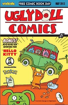 UGLY DOLL COMICS: The cover of UGLY DOLL COMICS, from the VIZ Kids division of VIZ Media this FCBD is hilarious. Much has been done with the Action Comics first appearance of Superman motif of Supe hoisting a car while people run in terror, but Sun-Min Kim and David Horvath make it wacky enough to keep you staring, and they are helped out by the rich colors you'd demand from a comic based on the dolls by Space Goat Productions. But getting inside the comic only enhances the almost overwhelming sense of the adorable, and not based on the fluffy and cute exactly, but on the odd and the almost toy-like floppiness of character movements. Ian McGinty does a majority of the UGLY DOLLS focused artwork, while Phillip Jacobson also strikes a slightly different but complimentary tone with heavier line-work that pops. Think Yellow Submarine only red bobbly rocket ships in space, and you can't help but feel that underground comics had something to do with the development of this kind of surreal storytelling. Though it's hard to weigh influences so profound, the colors may be a contender for the most important element of the book and they are kaleidoscopic. This is a book kids will go gaga for, but adults are missing out if they don't sneak a peek themselves.
Hannah Means-Shannon is a comics journalist and scholar working on books about Alan Moore and Neil Gaiman for Sequart.org. She is @HannahMenzies on Twitter and @hannahmenziesblog on WordPress.
Enjoyed this? Please share on social media!
Stay up-to-date and support the site by following Bleeding Cool on Google News today!