About
About 


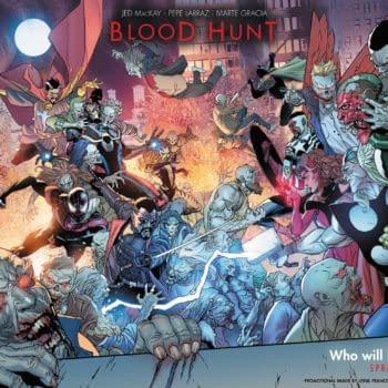
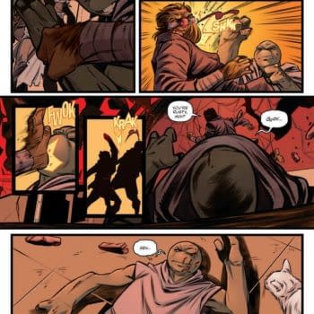
Man, Avengers #12 is a greedy comic book. It is not only an official Fall Of X crossover title but also for the upcoming event Blood Hunt.
Posted in: Comics | Tagged:
Cammy's Covers – DHP To The Manhattan Projects
 Cameron Hatheway writes "Sorry it's a day late! I was wine tasting yesterday and lost track of the time. Also, I don't know who this woman I woke-up next to is, so I had to type everything quietly so I didn't wake her. All with one hand too, for the other is in a pair of fuzzy handcuffs. CALL THE AUTHORITIES!!!"
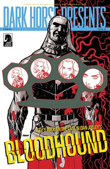
Dark Horse Presents #23 by Dave Johnson
There's two sides to every brass knuckles; before and after. Before consists of bliss, as in blissfully unaware of the pain you're about to feel. After consists of blood and that searing pain you never knew existed. That's what I take away from Johnson's rendition of Bloodhound, for it looks like either you're with him or against him. Blood veins scattering in all directions, each hole focusing in on the woman with a gun, and the shadowing on his gritty mug are what make this cover one of a kind.
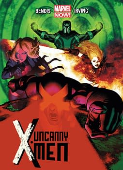 Uncanny X-Men #5 by Frazer Irving
Irving always captures my attention with whatever series he's working on. I scan the shelves, and almost magnetically I'm drawn towards a cover like this one. The contrast of the various colors fit together beautifully into a single image, while still maintaining that layered effect. The attention to detail in the hair specifically always dazzles me, leaving me wanting more. Irving could pull a Warhol and print out several different color variations of this cover, and sell them in blocks of four. I'd be the first person to buy a set, and proudly frame and display it on my wall. Beautiful stuff.
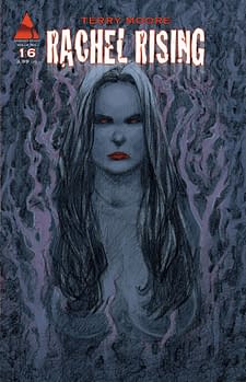 Rachel Rising #16 by Terry Moore
Speaking of beautiful stuff, Moore's women always fall under that category as well. While the woman here isn't traditionally what we'd refer to as 'beautiful,' the rest of the cover certainly is. The purples mixed with the charcoals produce an eerie yet majestic effect. The red in both eyes and lips are a nice contrast, though I find myself uncomfortable staring into them for more than five seconds. Cover, I dub thee 'Witchy Woman,' now go do that voodoo that you do so well!
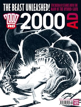 2000AD Prog 1829 by D'Israeli
Black and white done right. The ferocity of the creature is apparent as it lunges at the skinny dapper chap who tries to get a last shot off before succumbing to its belly. Just the look of the creature is reminiscent of Japanese dragons, so it adds to the creepiness factor seeing it spring forth from the traditional 2D flatness. I get a sense of wonder and excitement as I gaze upon this cover. Like a dragon, this cover is beautiful yet deadly.
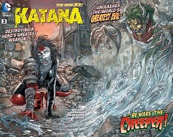 Katana #3 by Juan Jose Ryp
I absolutely hate it when my one of a kind Soultaker sword breaks, unleashing all the souls it's captured over time! And that's why you pay for the extended warranty. While it's soul-crushing to have that happen to Katana, she has bigger things to worry about now, such as that evil looking Oni wanting a piece of her (what a Creeper!). One of Ryp's specialties is detailed rubble, and we get quite the selection of it in this cover. I also love the souls emerging from the broken blade, in obvious pain and agony. Again, in a week of pretty lame gatefold covers, this one in particular blows me away.
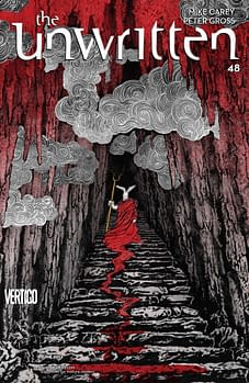 The Unwritten #48 by Yuko Shimizu
This cover was this close to getting my number one spot this week, it's that gorgeous. It almost feels like a scene out of Dante's Inferno with the Hell-like look and feel. Evil emperor bunnyman front and center with a toga dragging blood is a disturbing image, but then the dark plumes of smoke emerging from the stalactites is hauntingly beautiful. Plus the whole red fading to white effect works perfectly, because it draws the eye up or down the cover accordingly, working both ways. Shimizu continues to get under my skin in a good way, and at this point, I'd be willing to allow her to stay there for as long as she wants.
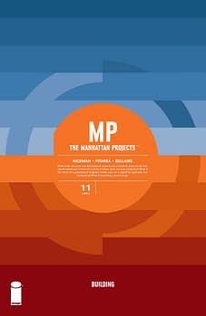 The Manhattan Projects #11 by Jonathan Hickman
This is my favorite cover of the week, hands down. Hot colors, warm colors, and cool colors. All blended together seductively and geometrically, catching you in its tractor beam and slowly pulling you in for the kill. Just when I thought Hickman had no more variations for the simple circle logos for this series, he ups his game and knocks me on my ass once again. I do hope he comes out with a The Manhattan Projects: The Covers book when the series is over, because the covers alone deserve the collected treatment.
Cameron Hatheway is the host of Cammy's Comic Corner, an audio podcast. You can make his nipples explode with delight on Twitter @CamComicCorner.
Enjoyed this? Please share on social media!
Stay up-to-date and support the site by following Bleeding Cool on Google News today!