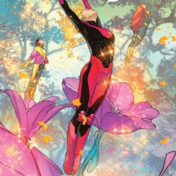
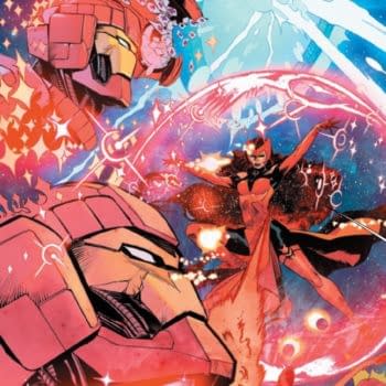
About
About 


Drawing Blood #1 is a thriller about the comic book creator of small press book Radically Rearranged Ronin Ragdolls that becomes a huge hit.
Posted in: Comics, Recent Updates | Tagged: Comics, rian hughes, shadowman, valiant
Rian Hughes Talks Through His Shadowman Logos
Yesterday, Bleeding Cool ran the motherlode of Rian Hughes alternatives for the new logo of Valiant Entertainment's Shadowman. You can see them all here, but Rian asked if he could add his own take on the logo treatments. He writes;
As with the previous Valiant logos, the first stage was to look at the vintage versions and see what could be preserved. The original logos, of which there were several iterations, have a striking "man in door" symbol. It was decided that whatever type treatment we chose we should preserve that. Shadows were an obvious theme – though as all the new logos are white reversed out, shadows would not be a viable option. Character designs, story synopsis, art and the script for issue #1 were consulted to get a good handle on the updated character – his motivations, milieu, costume, etc.
I think the "Man in Doorway" motif is very strong, and probably the only part we could salvage from the old version. I've tipped my hat to the curvy shapes on the first original logo on some of these, and played with shadow-like solidity by knocking out the counters (holes). There are some distressed "spooky" ones in there as well. The "Man in Doorway" fits particularly well into the A, as it mirrors the internal shapes. Some of these are easier to read than others.
I avoided using perspectives a la "X-Men" logo etc., for two reasons – one, they're a cliche, and we're trying to avoid clichés, and two, they leave a blank area that looks very odd on the cover. The lettering should fill the area, which is why on the missing-counter versions I used the "MAN" at the bottom to fill the area out.
I also moved onto some new ideas entirely with other drafts. Think worn/distressed/wavy spooky/voodoo/old American wooden type, with inky imperfections/gothic spiky cast iron railings. The up-and-down serifs add a bit of worn wonkiness – like graves in a Hammer Horror graveyard, or out of place slats on a decaying building. Lots of punchy and strong treatments from that round. I'd avoid the italic ones, just because we were again adding multiple perspectives to the man-in-doorway.
I think some of the others – the straight sans block type ones – are a bit ordinary. And a bit ultramodern looking when the character is grounded in history. So I have taken others in a new direction and done a customised version of this that has small spiky serifs on it. These look like the spiky shapes on the skull of the character, and also add a bit of character and make the letters more interesting and unique. Others are less successful at incorporating the man-in-door elegantly. This is why I keep coming back to some of the earlier ones – they had interesting customised latter shapes, and also incorporated the man-in-door neatly. Two things that I think are essential to making this logo work well.
Enjoyed this? Please share on social media!
Stay up-to-date and support the site by following Bleeding Cool on Google News today!