About
About 


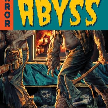
Marvel Comics is currently having a Creative Summit as their July 2023 solicits and solicitations drop, with the first of the From The Ashes.
Posted in: Comics, Video | Tagged: Comics, dc, logo
Collectors Cornered – Measuring The DC Logo "Apeel"
Collectors Cornered is a weekly video column, filmed inside Collectors Corner in Baltimore. Join us every week as we discuss comic book news from a different point of view and get instant feedback from real customers on New Comics Day, as we literally corner them and and ask questions about comic books and related topics. Unscripted, reality CC.
This week we ask our customers what they think about the NEW DC Comics Logo compared to the current and previous logos. We had a really hard time finding anyone with a difference of opinion that liked the new logo after asking and discussing now the logo for weeks and then finally recording on Wednesday.
Owner of Collectors Corner, Randy Myers had this to add : "DC Entertainment/Time Warner is well aware of the power of a Logo, and i personally feel that this New Logo was chosen to reflect their interest in merging mediums by having a unified logo that evokes the digital age. This is not an accident or coincidental! The idea behind a logo like this is to work mostly in the Digital realm or non-static (non-printed) realm.
"For anyone with even a minor knowledge of basic brand recognition that they would likely notice the intention to use this Logo digitally and across other media platforms along with print on Comic Books and collections as an attempt to blur the lines between them to the consumer. This is ideal for DC Comics as they in my opinion, believe like many other companies that Digital Comics will be a profitable and viable means of delivering comic content and this is one more step toward that goal or supplemental to this agenda.
"All that said the New Logo lacks the fluidity and soft lines of the current logo as well as the Iconography associated with the lineage of the circular emblem or oval which is now gone replaced with harsher straight lines more reflective of the corporate mimicry so abundant in the digital age. It is bland and lifeless even when infused with brand identifying colors. Lastly at first sight I honestly thought it looked like it was designed in one of those projects in a high school design class where they ask you to redesign a classic corporate logo. This would get a C- at best. Again this not a conspiracy but i believe to those less aware an attempt to intentionally move the Logo along with the company further down the disconnected roads to the digital age."
CC Bonus : The Next Issue Podcast – A Washington DC based comic books and pop culture show recorded a few months ago featuring an interview inside of Collectors Corner with Owner (Randy Myers) about the future of the Direct Market & digital comics.
I would go further into Grant Morrison land about this New Logo as a Sigil meant to invoke the Digital Age, but i'll refrain.
Continue the Collectors Cornered discussion in the forum here on BC, or on our CC Facebook and Twitter!
Enjoyed this? Please share on social media!
Stay up-to-date and support the site by following Bleeding Cool on Google News today!