About
About 


By Spencer Ellsworth Nick Roche got his start as a comics artist at IDW Publishing, illustrating and soon writing the company’s incarnation of
Posted in: Comics | Tagged: Comics, entertainment, Marvel Comics, Secret Wars
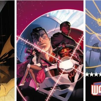
Thor's Comic Review Column – Civil War #1, Star Wars: Lando #1, Invader Zim #1, Justice League United #1, Archie #1, Invader Zim #1, Secret Wars, And More
(You guys went to Comic-Con and… we didn't)
THIS WEEK'S REVIEWS:
Civil War #1
Star Wars: Lando #1
Invader Zim #1
Justice League United #11
Archie #1
Strange Fruit #1
The Tomorrows #1
Venture #1
Secret Wars #4
Secret Wars: Squadron Sinister #2
Secret Wars: A-Force #2
Secret Wars: Where Monsters Dwell #2
Secret Wars: Age of Ultron vs Marvel Zombies
Civil War #1 (Marvel, $4.99)
 by Graig Kent
2006's Civil War seems like it was the last BIG Marvel event. Sure there was Secret Invasion and Age of Ultron and Original Sin and more than a handful of other events over the years, but until this year's Secret Wars (which recycles Marvel's first big event title for the dual marketing boost of nostalgia and name recognition) few, if any, of the other events felt as monumental, a definite touchstone in Marvel's publishing history.
The conceit of that Civil War event found Iron Man and Captain America at odds about Tony Stark's demand for a Superhuman Registration Act in the wake of a series of devastating superpower-related calamities, with various Marvel heroes taking sides. As a Mark Millar-scripted story, it was of course a wonderful, inspired BIG IDEA. They're what Millar excels at. The execution was equally typical Millar, ham-fisted, always looking for the big, cool fight sequence rather than exploring themes, digging deep into the character drama, or going beyond the superficial with the divisiveness of the extreme Right-versus-extreme Left political allegory. Millar tends to avoid nuance and subtlety like he's allergic to them. Even though the event remains a watershed moment — one that left ripples in the Marvel landscape in the years that followed — and a massive success commercially (one still paying dividends in part because of the forthcoming Captain America: Civil War cinematic sequel), the mini-series itself is largely seen as a disappointing read, one that failed to capitalize upon the great ideas it brought to the table.
With this year's Secret Wars event bringing this "Battleworld" conceit to the table, it permits Marvel the authority to dole out a wide variety of What If…?-style stories, but to make them part of continuity. It gives them another crack at Civil War, allowing it to live beyond the original's abrupt ending, Captain America's death, and the requirements of an ongoing publication universe. This new Civil War mini-series posits "What If the Iron Man/Captain America rift over the Superhuman Registration Act didn't heal?"
Writer Charles Soule rewrites the ending of Civil War as the set up for his dystopian Marvel future in which America is divided into two separate factions, "The Iron" and "The Blue". The Iron is the product of both Tony Stark's industriousness and his belief that he, above all else, is right. It's a moderate police state where the SHRA is obviously law, but it's also a productive country, recognized internationally and its population largely contented and growing. The Iron's propaganda machine keeps its citizens wary and afraid of the Blue, calling it a lawless gun state, full of fanatics prowling at the border. The Blue, meanwhile, is internationally deemed a rogue nation (no doubt a result of Stark's influence), but Steve Rogers sees it as a free state, where people are allowed to do what they want and be themselves. His only two laws, "Hurt no one, and help when you can."
Along with establishing the Iron and the Blue, and the broad strokes of their status quos, this first issue finds the two factions sitting down to see if they can't resolve their differences. We learn the Iron is in desperate need for room to expand, while the blue is starting to choke with minimal resources and trading partners. But these aging men have battled for too long, built up their hatred too much to come to any mutual acceptance.
Though the creation of the Iron and the Blue is a broad stroke tactic devised to move the Civil War story to a science-fictiony future, and creating an unrealistic, over-simplified this side-versus-that side is a flawed (and somewhat senseless) reality, Soule manages to inject a lot of subtlety, allegory and character that was missing from the original series. The Iron and the Blue can allegorically represent any cultural or political divide, the Czech Republic and Slovakia, East and West Germany, but especially Israel and Palestine. The meeting of Stark and Rogers this issue is to attempt to bury the hatchet after all these years for the good of the people, but both attend with no misconceptions about their objective, and Stark's vie for the Blue's land in exchange for resources which the Iron has been responsible for cutting off has the makings of a contentious Gaza Strip terrain.
Where Millar's original story should have been about political and ideological differences, it instead wound up being the story of two grown men punching each other in the face as a means of resolving their issues. Likewise, Millar in theory wanted to make both sides a viable protagonist, however he clearly made Stark's side the enemy, malicious and fascist. Here Soule scales back the evil machinations of the Iron and instead presents cases justifying both sides contention, with neither being the clear good or bad guy.
Joining Soule on this extra-sized issue is Penciler Leinil Francis Yu (with longtime inking partner Gerry Alanguilan), a veteran of illustrating big books and events, like Secret Invasion, AXIS, Avengers vs X-Men, Bendis' New Avengers, and Hickman's Avengers. Yu knows how to deliver a book with scale, his tight linework allowing him to deliver grand images in a panel that some other artists would need an entire page to render. Able to establish richly detailed settings on such a small scale allows him to accentuate character moments by giving them more space on the page. A 2-page spread of the divide, a crack in the land that separates the Iron and the Blue, is majestic and awe-inspiring, but it's just as important an establishing shot as the first appearance of the aging Tony Stark and seemingly ageless (though obviously weathered) Steve Rogers.
Colorist Sunny Gho could so easily paint this world deep and dark, or oversimplify the Iron and the Blue with obvious color highlights, but instead he opts for vibrancy, the bright sun bouncing it's rays off everything, giving everything a sheen that presents it as shiny and new… even if both sides are fraught with tension, neither is truly bad. It's this brightness, as well as the use of open landscapes and futuristic technology that gives this Marvel future a similar sensibility to Hickman's East of West, mirroring as well its feel of political and territorial conflicts in an alternate reality where the United States is divided. That it feels more in league with that Image-published book than with Millar's source material is a definite plus. There's both independence from the larger Marvel U that the Secret Wars event affords it, as well as the extrapolation of ideas that failed to be properly utilized the first time around.
Star Wars: Lando #1 (Marvel, $3.99)
by Graig Kent
 The all-new, all-real, keepin'-it-in-the-Disney-family Marvel Star Wars comics have been a mixed bag so far, with Darth Vader being the best of the lot. It's the monthly title we didn't know we wanted but are more than happy to have, capturing the spirit of both the original trilogy and the intent of the prequels, but more importantly, capturing the spirit of the character without demystifying him in the least, while also contributing exciting elements to the mythos. The main Star Wars monthly is decent but feels like a mere comic book continuation, not always keeping the tone of the films and pushing the limits of even the most rabid fan's credulity with its overt fan service (Boba Fett versus Luke) and additions (Han Solo has a wife?). Kanan: The Last Padawan, as an extension of Star Wars Rebels is more than ok as it doesn't have as much history or expectations to live up to. The Princess Leia mini-series, which ended last week, was the first big failure of the bunch, sporting a dull story (Leia bringing together all the surviving Alderaanians should have felt more important a journey than it did), as many out-of-character moments as there were good extrapolations of character, and art that didn't feel in sync with the tone of Star Wars.
With Leia's ending, Marvel has taken notice of that spare $4 in your wallet and now thrusts another character-centric solo mini-series in your face with everyone's favourite card player, gambler, and scoundrel, Lando Calrissian. Billy Dee Williams didn't have a tremendous amount of screen time in the trilogy, but he made a huge impression. With his very first appearance Williams imbued in the character with effortless charm, an exceptionally smooth talker that can soften women, men and droids in equal measure. Beneath his handsome, stylish exterior and deceptively harmless loquaciousness is a pool of deceit, and yet, even knowing it's there, Lando always makes it hard see.
The opening moments of this first issue capture that aspect of the character perfectly, as Lando completes his long con on an Imperial Moff, a notoriously hard woman whom he's softened like room-temperature butter. Charles Soule's dialogue between Lando and the Moff is note perfect, as he Lando outs himself as a thief, announcing his intention to steal one of her possessions, but, he also reminds her that although he is a thief, he is foremost a lover and that he doesn't want bad blood between them. Reading the exchange, as a reader, we know it's a con, and yet, even in 2-dimensional comic book form, we still believe that there's genuine sentiment and emotion behind his words. A good con artist convinces themselves first before they convince anyone else.
Lando takes the trinket to pay off a debt, only to find it's not enough. He has to take another job. His partner, Lobot disapproves, but what choice do they have. It's a big job, Lando promises, enough to pay off the debt and come out ahead. Has he convinced himself again in order to convince Lobot? The duo assemble a small team, and proceed quickly with their mission. I was half expecting this to be the Star Wars version of Oceans 11 but by the end of the first issue Lando and crew are successful, however, their heist has reverberated all the way back to the Emperor, so things are about to get real hairy, real fast.
Already this feels like the first act of what could be a Lando solo movie. If there's ever a good benchmark for a film's comic-book tie-in, it's that it feels like it's not just a story set with the same characters or universe, but that it feels like it could be another cinematic installment. I'm not sure if I'm sold on this talkative Lobot as Lando's pre-Cloud City partner yet (I always assumed Lobot came with the City), but then again, I am so ready for more Lobot (a favourite peripheral Star Wars character of mine). He doesn't feel out of place in this story so much as out of my long-held perception of the character.
Alex Maleev is on art duties here and I couldn't be more excited, or think of a better fit for a Lando story. Maleev's scratchy, Seinkiewicz-inspired art has long maintained an odd balance between impressionistic and photo-real. Maleev is able to capture his pre-existing characters (Lando and Lobot) with the actors' essences, while also crafting new characters that are filled with just as much individual personality and life (Sava Korin, for example, is an Ugnaut but not just a generic representation. He has his own unique wrinkles, facial hair, expressions and mannerisms). Paul Mount's atmospheric coloring (using the eccentric lighting of various Star Wars environs to illuminate the scenes) adds both an alien and cinematic quality to Maleev's work. It's a very handsome book for a very handsome character. There's still four issues to go and I'm already hoping for a sequel.
Invader Zim #1 (Oni Press, $3.99)
by Graig Kent
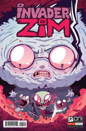 Before Adventure Time and the Regular Show, before Sanjay and Craig and Uncle Grampa, before Angry Beavers and Breadwinners, before every irreverent/annoying kids and tween comedy cartoon on today there was…well, Spongebob, and before that Space Ghost: Coast to Coast, and before that Ren and Stimpy. But sometime between all that, there was Invader Zim, a singularly unique, and weird, and cute, and hilarious, and gross, and delirious, and wicked cartoon as ever existed. You could say the show married the kid-friendliness-wierd of Spongebob with the grown-up mindfuck weird of Adult Swim, but that would neglect the fact that its creator, Jhonen Vasquez was creating similarly styled comics (notably Johnny, The Homicidal Maniac and Squee) outside their sphere of influence before Invader Zim hit the air. Zim was truly the product of Vasquez's deliriously warped sense of humour far more than it was the byproduct of any sort of Cartoon Network or Nickleodeon focus testing and market research. That Zim made it to air at all, nevermind lasted three utterly insane and endlessly quotable seasons (and a Hot Topic licensing bonanza), was to everyone's good fortune. When it was not renewed for a fourth season, I was less sad and more grateful to have gotten what we did.
That it's now come back in comics form, over a dozen years later, no less, is a mad blessing. That it's under Vasquez's pen is akin to a miracle.
Zim operated like most cartoons, with a reset button at the end of each episode. Like, say, The Simpsons, Zim operated with a marginal amount of continuity, but overall each 11-minute segment (or the odd 2-parter) would put its characters through extensive amounts of traumatic rigors or irreversible physical or emotional changes, only to find them back to what constitutes normal for them at the start of the next 11-minute segment. Like the best cartoons, Zim built a broad supporting cast of eccentric, barely-there peripheral figures who would crop up for sometimes no better reason than the writers wanted them to. Here the book opens with a brief recap of the show's premise (the titular Zim is from a race of world conquerors and he's the unlikeable fuckup who has been given Earth as his assignment), and acts as if there has been extensive passing of time (such as the years between when the show ended and the start of this book). Yet, Zim and Dib (his chief nemesis) and Gaz (Dib's apathetic sister) remain unaged (and by the book's end, unchanged). Of course, Gir is back too (Zim's dumber than dumb robot who dresses in a zip-up dog costume) and mini-moose (a hovering, balloon-like, tiny moose) makes an appearance because why not.
The specifics of the story at hand aren't important, except to say this issue is the first of multiple parts and that it feels EXACTLY like an episode of Invader Zim. Coming from Vasquez, I was hoping there would be no loss in translating from screen to page, but I was worried without all the masterful voice acting/shouting that it would lose something integral along the way. Well, when a writer captures the tone and feel of a series so exact, the voices arrive in your head fully formed. Seriously, it was like Richard Steven Horvitz, Rikki Simons, and Andy Berman were doing voice readings in my brain. Of course Vasquez can capture the show perfectly, he created the bloody thing.
If I had one initial disappointment, it was that Vasquez wasn't illustrating as well. But his art style was adapted for animation and art team Aaron Alexovich and Megan Lawton, with colors from Simon Troussellier, captures the animated Vasquez-style in a way that I'm not sure even Vasquez could replicate so purely. The artists deliver animation-quality art but without looking like still-frame fumetti. They brilliantly render the characters perfectly with all their their wild gesticulations and crazy facial expressions. They capture the grim undertones of the series, that bubbling of horror that was perpetually underneath, so well (managing to do so without the wonderful Ed Wood-esque soundtrack Zim used), the reveal of stinky, sick-smelling Dib was teased so perfectly and revealed with just the right amount of horrifying hilarity. The angles, the shadows, the workout montage, it may be flat on the page, but any fan of Zim will find it coming alive in their mind.
It'd take another miracle for Zim to make it back on television (or web series or whatever) but all it will take for this series to stay alive is decent sales and enough interest. If it remains this good, it could live forever. LIIIIIIVE ZIIIIM, LIIIIIHIIIHIIIHIIIIIVE!
Justice League United #11 (DC, $2.99)
by Graig Kent
 In a recent article on this site, our own esteemed colleague Devon Sanders lamented the absence of joy in DC's New 52. It wasn't a screed about the books not having fun, but about a DC Universe that doesn't feel like a whole, that doesn't entice the reader to jump between books and follow a character's appearance from one series to another. In recreating the DC Universe, Dan Didio, Geoff Johns and Jim Lee lost the values of legacy and interconnectivity along the way.
With the move to California giving DC editorial some time to pause, and plan and take stock of their publishing portfolio, they've come back in June (and July) having dropped "The New 52" from their covers, and launching a broad spate of new titles that aim to capture the diversity of an Image Comics amidst their superhero empire. "DCYou" they call it, with all the pleased-with-themselves smugness of their marketing department blazing like headlights behind it. It's telling the reader that everything they could want or hope for from comics can now be found in their new publishing slate. Something for everyone! Customize your reading experience! I admit I'm sounding a lot more cynical than I should be. It's actually a good thing, freeing up creative, taking more chances, diversifying their look, but at the same time, it's at the further expense of that interconnectivity Devon was talking about. Individual comics may be fun, but is the DCU as a whole any fun?
If writer Jeff Parker has his say, yes, yes it will be.
Parker takes over from Jeff Lemire on Justice League United, a series that struggled to find its identity between "the Canadian Justice League" and "space Justice League" and "lest we forget the Legion of Super-Heroes". As witnessed in the 8-page preview released during the tail end of Convergence, Parker wants to operate in the DC Universe in its entirety, and not limit his team's roster to any specific set of characters. Everyone, hero, villain, alien, rogue, or mercenary is fair game for conscription into the JLU.
 Issue 11, Parker and artist Travel Foreman's debut gets to the heart of this set-up immediately. The opening splash features this issue's rather irreverent assembly of Equinox, Poison Ivy, Swamp Thing, The Demon and Mera in media res before jumping back a moment to Adam Strange, lost/trapped in the Zeta Beam somewhere, narrating how this team came to be assembled.
Mera is on the hunt for Arthur Curry, only to be interrupted by Animal Man. Batgirl makes a cameo as she helps Alanna Strange corner Poison Ivy. Stargirl finds the courage and wits to get Swamp Thing's aide, and Jason Blood says he will follow an elemental like Equinox anywhere. Their goal is to figure out how to defeat a tumorous island growing in the ocean, a thing come to life from the dredging of decades of chemical pollution. It's an ugly mission with an off-kilter assembly of DC's pantheon, and it's pretty wonderful.
Foreman is an exceptionally unique artist in the field today. I have a hard time placing his influences, as he frequently uses forced perspectives giving his figures a very surreal but equally dynamic appearance. It's in technique alone like anime, but any other Japanese influence is absent from his figure and settings. Foreman's allowed to cut loose quite often here, visualizing Adam Strange's awkward existence in the Zeta Beam, devising a wonderful effect for Animal Man's powers (different than the one he used while illustrating that series), crafting a brilliantly detailed Swamp Thing and a likewise upsetting biomass for the heroes to encounter. Much praise on the artistic side has to go to Jeromy Cox as well, whom I assume was responsible for all the wonderful water, space, ethereal, bog, and thunderstorm effects. This is literally the best water has looked in a comic that I can recall, plus, his lightning and clouds are extremely imposing (and lest I forget to reiterate how effectively icky that biomass looks).
Parker seeds little nods to the ongoing DCU, like Mera and Aquaman's torrid status, utilizing Batgirl's modern costume, and denoting they're "with a different branch" of the League. It's different and yet feels like an old-school Justice League book. It's thrilling, it's fun and it utilizes the DCU to its maximum capacity in a way few other DC series do, with the aim of putting things back mostly the way they've found them once their done. I love it, unexpectedly and genuinely.
Archie #1 (Archie Comics, $3.99)
by Graig Kent
 I don't know what to make of the cancellation of the traditional Archie Comics line and, effectively, the disposing of the Archie house style (although it will continue to persist in the checkout line Digest titles). On the one hand, it is the total revoking of a decades old, traditional, familiar storytelling and art style, one that has made Archie continually accessible to generation after generation of pre-teen. It's that accessibility that is a huge part of why Archie and the Riverdale crew has remained such a well recognized brand. On the other hand, it's that same familiarity, that same steadfast sameness that results in inability to dynamically change, rapidly evolve, or dramatically adapt to the market or the times and take any real risks. It's the reason why most of us tend to stop reading Archie when we hit puberty, it just doesn't offer us anything exciting or new. So the question is really whether Archie should evolve, or should it just stick to what it's done so well for generations?
In recent years Archie Comics had already made great strides to do things differently. Kevin Keller was the first stab at showing the company can change and adapt by introducing an openly gay character to Riverdale High. It was met with some outrage from the usual conservative types, but overall it's been a highly positive and progressive addition (although Riverdale still remained really, really white). Even more recently there was the split-universes of Archie Marries Betty and Archie Marries Veronica, the breaking of the house style entirely with the zombie horror Afterlife With Archie, and of course last year's "the Death of Archie" event. Using their characters and universe to tell different kinds of stories rather than just short, juvenile comedy and teen romance skits has met with much success. The Archie Comics line's reboot is a very natural extension of all that.
For these new launches, Archie Comics is bringing in some of comics most prestigious names, looking at quality talent who the casual reader would react well to, rather than angling for the biggest names or the current superstar at the big two. While the publisher's attempt at Kickstarting their relaunch was met with near-Zach Braff-level outrage and was quickly rescinded, it was a gaffe that's already been forgiven, if not virtually forgotten. And so, with the announcements long since made and the time passing, we're getting our first look at the all-new Riverdale with Archie #1 by Mark Waid and Saga's Fiona Staples.
With 21 variant covers hitting the stands, the publishers seem well aware of how momentous this occasion is. Even though this volume of variants is indeed excessive, it somehow seems like an earnest celebration of the company's new mission statement instead of a flagrant cash grab. Most of these covers are fantastic, new interpretations of Archie Andrews in vibrant, richly detailed settings, sometimes in casual pose, sometimes in action or swinging a guitar. With such a game changing effort, the hopes are that it will draw as many, if not more casual and new consumers into comics shops than "the Death of Archie" did. By utilizing such great talents it's likewise the hopes that the end product will be both entertaining and attractive enough that it will not only keep them coming back but perusing the shelves for more to read. Even if I was vehemently opposed to the stylistic change, a drastic Archie relaunch should only mean good things for the industry.
But all that goodwill will only come if the product is any good. Frankly, it is, it is quite good.
Waid is a versatile writer who can jump genres with the best of them, from superheroes to pulp fiction to sci-fi to fantasy to teen romantic comedy, 9 times out of 10 he nails it. Here he plays with the narrative form by having Archie break in and out of story to address the audience. Instead of captions, he's literally looking out from the page at the reader, talking directly to them. It immediately, and effectively, creates a personal connection with Mr. Andrews. From there we learn that he and his childhood sweetheart, Betty Cooper, have just broken up over "the Lipstick Incident". In this teen romantic comedy, Waid injects a little innocent mystery. The denizens of Riverdale High are shocked, shattering their belief in true love, and working every angle to try and reunite them. It's very much an Archie story Waid's working, having all the touchpoints of a classic 8-page story, but Waid backs off the punchlines and slows the pacing, allowing for genuine character and relationship building. Archie, Bettie, Jughead and crew have been their own archetypes for so long they ceased to be people, the same way sitcoms deep in their runs stop servicing their characters, instead forcing them to service a story. So Waid's putting the focus on them as people, and how they relate to each other and their world is, in the context of Archie history, kind of earth shattering.
What really brings it home is Staples' modernization of Riverdale and its people. In Archie past, Riverdale, Riverdale High, Pops and other locales all seemed rather perfunctory. They existed as sets, not places where people lived or wanted to spend time. In Staples' hands everyone's unique, their own style — fashion, hair , the way they carry themselves– and where they are seem like actual places they would be, and have been for some time.
If it weren't Archie, it would still be an enjoyable, entertaining, cinema-quality teen romantic comedy, but it wouldn't be quite so momentous. But since it is Archie, it's quite possibly the biggest release of the year. Definitely worth a look.
Graig Kent was a broken man after covering Convergence for 8 weeks straight. He took a little break and threw his little girl a wicked Star Wars themed birthday party with a rad homemade Death Star pinata. He's back with five reviews to make up for his time off. If this week's any indication, he kind of in love with comics again. He tweets sometimes @thee_geekent and does other stuff elsewhere
STRANGE FRUIT #1 (BOOM! Studios, $3.99)
By Devon Sanders
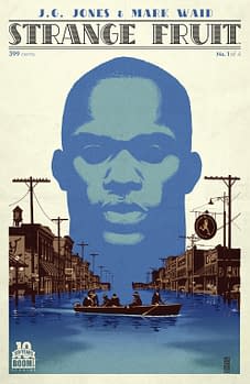 Two pages into Strange Fruit #1 and I could practically hear the slow strains of slide guitar being played. You know that music; that musical score that's become movie shorthand for the Old South and inward and outward racial conflict.
If you don't know what I'm talking about look on Netflix for any movie with burning crosses in the background and the heroic heads of white men gazing out onto some unseen horizon.
Now the thing about those movies is that while the focus is on racial injustices, black people and the atrocities against them are used to stir good and previously reluctant white men or women to action. Now, here's the thing about Strange Fruit #1; those things are there and much like those movies, we know who the bad guys are because they're the ones shouting the racial epithets and breaking up dances in the "colored" juke joints. And yes, they eventually don Klan garb just in case you didn't quite get it before.
Strange Fruit #1 takes place in the rural South of 1927 and of course, racial tensions are high and so is the levee. The levee is a metaphor, again, of course, racial tensions and both are about to break. Entering into all of this is an insanely muscular, mute butt naked black man from outer space and yeah, the first thing he encounters is The Klan. Soon, he is told by another black man that his masculinity is too much and made to wear the Confederate flag around his waist.
(sigh)
I want to go on but I can't lie, Strange Fruit #1 just left me tired. I don't hate it. I love the creators. Writer Mark Waid (Daredevil) is hands down one of my favorite creators and series painter J.G. Jones (Final Crisis) is a personal favorite. In my interactions with him, he has been nothing but sweet and sincere and totally giving of his time and effort but I just don't like this one book. It is well-intentioned but just weirdly handled and just makes me wonder if anyone somewhere down the line did it ever occur to them to get input from anyone of color. Seriously.
This comic is one that makes me wish for things.
I wish the main protagonist was introduced with dignity. I wish I didn't have to face again the perception of the black male body as something to be feared or something to be in awe of. I wish the writer knew that readers are smart enough to know that white people can be the good guys without being seen holding a shotgun to a Klansman's head. I wish the first black man we saw wasn't presented as shiftless.
I wish I could find a handhold or something that feels greater than my experience watching Crash or Mississippi Burning within this comic.
I'm not saying that two white men can't tell this story but their storytelling never transcends their shorthand of "black Superman crash lands in the racist South." Considering the talents involved I sincerely hoped for better.
Strange Fruit #1 is a well-intentioned but deeply flawed first issue. It aims to make you feel but unfortunately, never truly connects.
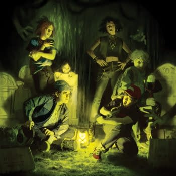
The Tomorrows #1 (Dark Horse Comics)
By Bart Bishop
 It's appropriate that The Tomorrows comes out the same week that Grant Morrison has become the Editor-in-Chief of Heavy Metal magazine, because it's a pretty authentic imitation of the Scotsman. I've never read Curt Pires before but here he's managed to approximate the kind of off-the-wall gonzo storytelling in terms of voice and surreal goings-on that Morrison has been pulling since The Invisibles, whilst generating yet another dystopic backdrop. This is a story as old as time, the divide between generations as the elders in power try to keep the youth from eating them alive. It's also a story about colliding arts, and the power of fiction to help people build empathy. For that reason I give this cyberpunk distillation a lot of credit, as it dramatizes a long-held philosophy of mine of the important role of the art. There's also the dynamic line work of Jason Copland and the audacity of being weird for weird's sake. Any comic with the gall to have a literal mic drop should be given some credit, even if its kitchen sink modus operandi can be a little wearisome.
So in the future art is illegal and the masses are on the verge of having their very thoughts controlled literally rather than subliminally. Things have been reduced down to the metaphorical level as well, apparently, as the enemy is Atlas Inc. (not-so-subtle jab at Ayn Rand?) which in the tradition of Weyland-Yutani and Umbrella is essentially The Corporation. Led by the petulant and decadent Mr. Hughes, they control the money and the media, and the people buckle at their influence. The only thing standing in the way is, of course, The Tomorrows, the last vestige of counter-culture, complete with their own Andy Warhol artificial intelligence. Zoey, a young woman marked for termination due to her proclivity for painting, is recruited via action scene into this ragtag group of anarchists who dwell in an underground bunker. There's also a surreal bit involving entering the astral plane via bank vault and communing with a chimp.
So Pires has a knack for dialogue. This is a six-part series with a new artist each issue so I'm not sure if they each stand alone, but these characters all have unique voices that immediately pop. If this issue is a complete story, as it certainly feels that way in the last few pages, then I have a good sense of the individual agencies and histories. Zoey in particular is nicely diverse in that she's not only the lead and is a strong character but her lesbianism is portrayed as straightforward and unblinking. There is a sense that Pires is trying a bit too hard at times to be quirky, and the iconography here is aping everything from Brian Wood to, seemingly, DC's recent Grayson series but nothing is new under the sun. It's a rollicking romp with a breezy attitude. It's permeated with the naiveté of youth, but mostly that stems from the idea that all life's problems can be personified as one threat that can be opposed and eliminated, and even more so that things will stay great after that. But that's comics, and really fiction in general. Mostly I respect the message that art has a purpose, to help people walk in other's shoes, and camaraderie is always better than the singular.
Copeland does justice to the urban sprawl we would expect of the future by way of Blade Runner and Akira. It's crammed with detail to an overwhelming degree, but there's also a nice bit of retro feel to it. The robots with the Arnim Zola faces that try to kidnap Zoey are elegant in their simplicity, and the ensuing action beat is viciously choreographed, although one has to wonder if the lightsaber will ever be surpassed in terms of coolness. Speaking of familiar, more than one character wears a domino mask, which is hilarious in its impracticality and strangely ubiquitous in the comic book world and only the comic book world. It's a visual language exclusive to the sequential art medium communicating heroism, and I'm not sure whether or not I should love it here or roll my eyes. Regardless, Copeland has a keen sense of the hip, with fashion and hair styles that feel anticipatory, and milks the medium for all its worth. I especially liked the keyword tags in the bottom margins, the kind of thing that seems so obvious in retrospect and so exigent in execution.
A bit too cute for its own good, but The Tomorrows goes a long way towards staking a claim in an oversaturated market. It's cyberpunk, it's dystopic, but it's also a bit hopeful in a weird way.
Editor and teacher by day, comic book enthusiast by night, Bart has a background in journalism and is not afraid to use it. His first loves were movies and comic books, and although he grew up a Marvel Zombie he's been known to read another company or two. Married with a newborn, he sure hopes this whole writing thing makes him independently wealthy someday. Bart can be reached at bart.bishop@cincinnatistate.edu and on Twitter @BartLBishop.
Venture #1 (Action Lab, $3.99)
By Cat Taylor
 A lot of times I'll lament the way an ad blurb gives away a plot point that would have been better enjoyed as a surprise. In the case of Venture, however, the ad blurb/press release is probably the sole reason that most people will pick up this series. That plot, as simple as it may be, is that a "down on his luck" reporter/photographer named Reggie Baxter discovers the secret identity of a superhero and plans to get rich by blackmailing him. It would be easy to dismiss that plot summary as sounding like a recurring plan by the Penguin on the old Adam West Batman TV series, and I probably would have done so if this hadn't been such a slow week for new comics. Fortunately, it seems that the writer, Jay Faerber, has a story in mind that is deeper and more intricate than a run-of-the-mill cartoony product. For starters, Faerber has a bit of reputation as a trusted indie comics writer with titles such as Noble Causes and Dynamo Five. Second, even though the first issue isn't earth-shatteringly unique, it's also not a piece of hackwork. Faerber does an effective job of showing Baxter as a sort of Fox Mulder of the reporting world. While Baxter does write about the paranormal and photographs things like Bigfoot, he truly believes that these things are newsworthy and attempts to report with integrity by first taking his work to legitimate newspapers. When they reject him, he sells his work to a tabloid but pushes back against their attempts to exaggerate, exploit, and make a mockery of his stories. In the end though, Baxter has to make a living.
Although there is some superhero and supervillain crimefighting action in the first issue to give it a little excitement, the real plot doesn't even get started here. As I mentioned earlier, it's only thanks to the marketing summary that I know what this book is going to be about. However, the fact that the character of Reggie Baxter is pretty well developed in these pages lets me know that when he does attempt to blackmail the title's resident superhero, he won't be doing it out of complete malice. I imagine he'll have some soul-searching and self-justification for his action when it takes place. Likewise, the hero of the story is going to have to figure out how to respond. Will he make two wrongs a right and threaten Baxter, or worse? Will he give in to the bribery or take the legal route even if it exposes his secret identity? How Faerber handles these matters can easily make or break this series, and I have no idea how effectively he'll deal with things in the next issues. I wish I could get a better handle on it but evidence from this issue is so middle-of-the-road that it leaves me squarely in the undecided column.
Similarly, I'm right in the middle on my opinion of the art. It's technically done very well and looks as good as something you'd see in mainstream Marvel or DC comics. Of course, since Jamal Ingle has drawn for big names like Dark Horse and DC, you should expect no less. Then again, while it is easily good enough to appear in major publications, it doesn't really stand out either. On the plus side, one thing that did catch my eye is that Ingle seems to handle large scale and action scenes effortlessly. He also has a knack for making each character look distinct, which is something a lot of the best-known comic book artists don't do well. Speaking of the distinct appearances of the characters, I couldn't help but be amused that that the superhero in this story looks a lot like the Dude from the Big Lebowski. Also, none of the super-powered characters in this book wear costumes. At least, they don't wear them yet, but the main and variant covers clearly depict a character in a super-suit who either hasn't shown up yet or he's the Super Dude with a makeover.
Ultimately I don't know whether to recommend this or not. Considering that the real meat of the plot won't kick in until at least issue number two, who knows what we're really dealing with? At this point, I say wait for the trade paperback to come out and let a flip-through make your final determination.
Cat Taylor has been reading comics since the 1970s. Some of his favorite writers are Alan Moore, Neil Gaiman, Peter Bagge, and Kurt Busiek. Prior to writing about comics, Taylor performed in punk rock bands and on the outlaw professional wrestling circuit. During that time he also wrote for music and pro wrestling fanzines. He's now been without a paying job for almost two years. He's not happy. You can e-mail Cat at cizattaylor@hotmail.com.
It seems thematically appropriate that Jeb D's Secret Wars/Battleworld reviews are running late.
Secret Wars #4
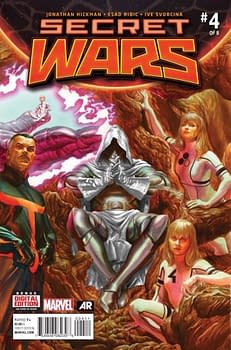 Those waiting for things to get epic should be satisfied with this halfway point in Secret Wars: not only do we see Thanos and the Cabal in action against the Thors, and a showdown between God Doom and the Phoenix, but we get more of the grandly ambitious backstory to Doom's creation of Battleworld. What's particularly interesting about Jonathan Hickman's plotting is the way it highlights the downplaying of the Fantastic Four everywhere in the Marvel Universe but here: Ben and Johnny may be out of the picture until the relaunch, but the backbone of Secret Wars is the Marvel Universe's ur-conflict: Doom vs Reed Richards, the engine that drove the FF to eventually earn the bragging rights to its aspirational designation as "The World's Greatest Comic Magazine." The stakes of that conflict have never been higher: Doom may have co-opted Reed's family, but they're just trophies; the God-Emperor's quest to best Reed Richards intellectually remains unfulfilled, and he's now being goaded into action. Greatest Doom story ever? If Hickman sticks the landing, yes. Hopefully, after Secret Wars, Doom, the FF, and their supporting cast will wind up being filed away for only a short time, till Marvel and Fox stop hitting each other with bricks.
By now, people have decided whether or not they find Esad Ribic's idiosyncratic facial design an impediment to their enjoyment of his storytelling; for those in the latter category, this issue's increase in scale brings an increase in excitement. It would also be very hard to overestimate the contribution of colorist Ive Svorcina: Doom's world really doesn't resemble anything else we've seen in the Marvel U before (there are hints of Asgard and Atlantis, but doesn't actually look like either), and the color palette looks like what you'd expect from what is, in effect, a personification of Doom's mindscape.
Squadron Sinister #2
 Apart from the oddly mixed cast of characters (this month, we add WWII-era Fury and the Howlers, Captain Savage, and more of the New Universe characters), this is as tightly focused a series as Secret Wars is offering: Hyperion is being plotted against, plotters and co-plotters intersect, border incursions become bloody battles, supervillains collide (I got a warm glow of nostalgia that this version of the Frightful Four's gadget guy eschews the tony "Trapster" nickname for his original "Paste Pot Pete"), and only the fact that no one in the cast is particularly appealing on a personal level keeps this from being a top-shelf recommendation. Carlos Pacheco makes the most of his opportunities to cut loose, and while I know some find a disconnect between his old-school approach and the darker tone of Marc Guggenheim's script, I rather like the contrast.
A-Force #2
 This continues to be a perfectly entertaining superhero book whose Avengers team just happens to be all-female. There's a Sentinel attack, Atlantean alliances, punching, smashing, flying, and a new character whose mysteries can be viewed as either an opportunity or a threat: you could easily rewrite the arguments between She-Hulk and Medusa for Steve Rogers and Tony Stark without missing a beat. This is not a specific criticism of the script by Marguerite Bennett and G Willow Wilson; it's more an issue of context: most of the other Secret Wars tie-ins have taken imaginative leaps of greater or lesser degree, juxtaposed familiar characters with unfamiliar, reimagined historical and/or future versions of the Marvel Universe; A-Force is solidly serviceable, but disappointingly conventional (particularly considering the way that Wilson's Ms Marvel continues to burst with ideas). I'm also not particularly won over by the mysterious new character, Singularity: that enigmatic childlike demeanor is pretty much a cliché for strange visitors from other worlds, and the idea that there's gender fluidity in its future is more vaguely interesting than compelling: genderswapping a character who lives in the messy world of modern relationships is one thing, but in a fantastical environment, with same-sex relationships already established as normative, it feels as much a headline-grab as anything. Jorge Molina's art continues vivid and enticing, highly expressive and supporting the book's pro-female vibe by focusing on attractiveness rather than sexploitation. It's not as though I don't recommend A-Force: it's just that, as I said in my review of issue #1, it'll still be here when the other craziness subsides.
Secret Wars: Where Monsters Dwell #2
 There's a fine line between subverting genre tropes, and just taking the piss out of them, and Garth Ennis' Where Monsters Dwell is kind of tiptoeing around that. Issue #2 of this (decidedly entertaining) series spends most of its time pretty much where issue #1 ended: our mismatched protagonists are stranded in a dangerous world of prehistoric beasts. That's not to say that there's no action in this issue—hey, T-rex gotta eat!—but thematically, we haven't advanced much past the idea that digging beneath the surface of the roguish charm of a rascally two-fisted hero will reveal something unpleasant. There's kind of a sour inversion of the African Queen in Karl's relationship with Clemmie; it's not enough that Clemmie is the more capable of the two, but at least Bogart had his boat: pulling Karl from the sky pretty much emasculates him, and I don't see much evidence that he's going to somehow locate Hepburn-style grit of his own to compensate, making him an even less appealing character.
There's also something a bit retrograde about the tropes Ennis is playing with here: like a rockabilly revivalist ignoring the racism in "Ubangi Stomp," just because it's authentic to the period, his portrayal of the indigenous folk that Karl encounters could come right out of a 1930's movie serial, with not much sense that Ennis is offering any commentary beyond his recognition of the fact. Similarly, with only a couple of issues left to go, I don't have much expectation that the inversion implied in the last-page reveal will be explored beyond its titillation factor.
Where Monsters Dwell continues to be colorful, visually exciting, and Russ Braun and Dono Sanchez Almara appear to share cover artist Frank Cho's love of dinosaurs (and not to get too spoilery here, but his love of something else, too). In an ongoing or extended series, with time to unpack some of the implications Ennis has introduced, I could be savoring the measured pace of this series (lots of action, incremental plot advancement), but as a four-issue mini, I suspect its pleasures are going to remain on the surface.
Age of Ultron vs Marvel Zombies #1
 The previous Battleworld series involving Marvel Zombies has been set up, so far, as an Elsa Bloodstone solo (more or less) adventure. Adding the Ultrons into the mix brings quite the reverse, as the wide-ranging cast here features, among others, Tigra, Michael Morbius, Sentinels, some Ultrons, an assortment of zombies who seem to be composed exclusively of supervillalins, various Torches, and a version of Henry Pym that has evidently wandered in from the (delayed) 1872 version of Battleworld. The casting somewhat reflects the storyline, as this is one of the more meandering debut issues of the lot, covering Tigra's exile beyond the Shield, the degree to which the sloppiness of the zombies offends the Ultrons, flashbacks to reimagined versions of some vintage Avengers storylines, and the potential of a 19th century "clockwork man" to evolve and become self-aware. That kind of laconic plotting is familiar to James Robinson readers, as is the dense approach to exposition (Pym's introduction is a two-page spread with no fewer than 36 word balloons shared among three characters). Hopefully, future issues will let Steve Pugh and colorist Jim Charalampidis cut loose and have fun playing in this wildly-assorted sandbox of characters; they bring a nice nostalgic sheen to the classic flashback sequences.
Enjoyed this? Please share on social media!
Stay up-to-date and support the site by following Bleeding Cool on Google News today!