About
About 


By Spencer Ellsworth Nick Roche got his start as a comics artist at IDW Publishing, illustrating and soon writing the company’s incarnation of
Posted in: Comics, Recent Updates | Tagged: Alan Moore, boom studios, brian k vaughan, Comics, entertainment, Giant Days, idw, jem and the holograms, Nemo River of Ghosts, powers, Star Trek/Planet of the Apes, The Private Eye
Thor's Comic Review Column – Jem And The Holograms #1, The Private Eye #1-10, Giant Days #1, Star Trek/Planet of the Apes: Primate Directive #4, Nemo: River of Ghosts, Powers #2
This Week's Reviews:
Jem and the Holograms #1
The Private Eye #1-10
Giant Days #1
Star Trek/Planet of the Apes: Primate Directive #4
Nemo: River of Ghosts
Powers #2
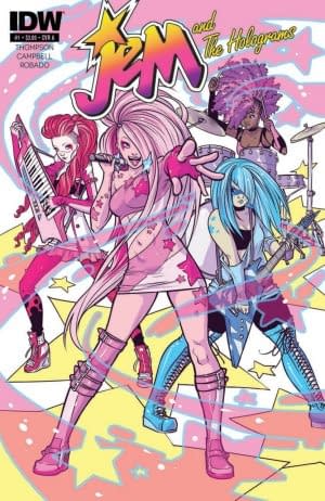
Jem and the Holograms #1 (IDW Publishing, $3.99)
By Devon Sanders (@devonsanders)
 Bear with me… I'm going to talk about The Benny Hill Show and somehow bring it back to a review of Jem and The Holograms #1…
OK, so when I was a kid in the 80's, there was nothing I hated more than to be told not to do something.
"Leave your brother alone" was taken by me as "Swat him one more time."
"Don't let me hear about you doing anything stupid" somehow was taken as license to jump from a first floor window on to a pile of thrown out mattresses.
"I'd better not catch you watching Benny Hill again!"
……..
"Dear mom…. challenge accepted."
For those of you who don't know about Benny Hill, it was basically a lowbrow British sketch comedy show filled with slapstick gags and female nudity and for some reason on the local UHF channel, after 11 p.m. breasts were a thing on regular television.
I was a teenaged boy. I liked to laugh. I liked breasts. When you're twelve, The Benny Hill Show is all "WIN."
Weekend nights, I would sneak into the living room, turn down the sound, suppressing giggles into hands clasped tightly over my mouth, reveling in what I was getting away with.
Fast forward, nearly 30 years later and I'm flipping channels and up appears The Benny Hill Show and this time around, I don't need to sneak around in order to see it and guess what?
It wasn't quite as much fun or as good as I'd remembered it.
In that moment, I realized the nostalgia attached to the thing left behind is more often than not, better than the actual thing.
Thirty years later, I find myself writing about a Jem and The Holograms comic and not finding myself nostalgic but pleasantly surprised at what this comic has to say right here and now to new audiences.
Armed with an incredible voice, Jerrica Benton is the lead singer of the band, The Holograms. There's only one problem. Once onstage, Jerrica just… disappears. Wracked with anxiety and self-doubt, she literally just can't. The Holograms are supportive but the big battle of the bands against The Misfits is tomorrow and unless Jerrica decides to share that incredible piece of herself with the world, they'll have to forfeit. At home, in a quiet moment, Jerrica lets her true self shine and out of nowhere, Synergy, a hologram programmed designed just for her by her late father, appears. Jerrica is gifted by her dad with a pair of star-shaped earrings that possess the power to create life-like holograms. With the battle of the bands just hours away, Jerrica makes a bold decision to use the earrings to become a new more powerful persona. Jerrica, one more time, allows herself to disappear, unleashing Jem into the unsuspecting world.
Writer Kelly Thompson does the incredible within twenty pages, taking what we know of Jem turning it on its head and making into somewhat of a horror story. Under Thompson, Jerrica's decision to become Jem feels more like a massive moment of self-doubt than of triumph and in that, I found myself ready for more. Thompson's writing makes you want Jerrica to find herself and more important to the story, balance within the Jerrica/Jem integration. Ultimately, this first issue reads as a true quest for self. Didn't expect that from a Jem comic.
Bringing it all together is artist Sophie Campbell. Campbell is a gifted storyteller who gives life to these characters through the use of beautiful body language and facial expression. Especially great is Campbell's wonderful displays of so many different female body types. In that little extra thing, Campbell helps build a world that's as diverse as it is beautiful.
This is a comic ready for the here and now.
Jem and The Holograms #1 is a great comic that pays heed to what the well-versed Jem reader paid for while pushing the characters and concepts forward into the future.
Devon Sanders just finished writing this. He will write other things; he hopes you will read them soon. You can find him on Twitter at @devonsanders.
The Private Eye #1-10 (Panel Syndicate, pay what you want webcomic)
By Graig Kent
 I imagine that most kids — teenagers and twenty somethings, basically — live their life immersed in technology, well versed in navigating all the different apps that make many things in life more convenient. Teetering perilously close to 40, I'm reaching that point I never thought I'd reach, where I'm out of synch with technology, where some of the things the kids use with little thought or effort seem frustrating and cumbersome, if only because of the learning curve. I have a mobile phone, but I don't live on it. I don't text all that much, my most used apps are games, and most the things I'd intended to use it for (including catching up on movies, tv shows, and comics while commuting to work, nevermind keeping connected with my peers) I can't be bothered with. I don't even have any mp3s on there even though it replaced my iPod I have a hard time watching movies or TV shows on my phone, and an even greater difficulty reading comics. So used to reading them physically am I that reading them digitally is still an alien experience.
Conversely, I imagine that for the average, say, 17-year-old, not looking at one's phone every few minutes is an unusual experience. Reading a comic book or putting on a DVD movie must seem like an archaic process (never mind buying them), when either can be done with finger swipes on the device they're already using. Likewise, I imagine that not taking a picture, or posting a status update, or downloading a song, or texting a friend, or Googling something (do the kids even Google or is it all voice controlled "SIRI"-like stuff now?) must seem somewhat isolating, like they're disconnected. Our phones aren't feeding directly into our brains yet (Google Glass is the latest approximation, and even that's probably an outdated reference on my part); regardless, our society is becoming increasingly and dependently wired.
It seems like virtually every communication or interaction is recorded in some way, stored in the cloud and ready to be dissected. What we deem unique about ourselves is carved into all manner of configurations, profiling our habits for targeted marketing or watching for criminal activity. We scream out into the ether (or rather internet) hoping to be noticed, through tweets and tumbls and blogs and reviews and comments and message boards, all to establish at once our uniqueness and our sameness, and as much as people bicker and argue and "like" and retweet in response, it's almost like only the system itself is taking note.
The Private Eye is a highly entertaining series set in a brilliantly realized future of 2078 where, decades back, the cloud had burst, and all those personalities people carved out for themselves online were exposed for who they really were. Every secret was revealed and the world was never the same (think if the recent Sony hack was in fact the internet at large, everyone's private emails made public, all our records – medical and financial – disclosed, all our photos in a shared album for anyone to find). Many decades later, the internet is long dead. Privacy is the primary concern, very few people go out into public without some sort of mask to guard their identity. The press has become the police, such that anything that happens is filtered before reaching an audience. Technology boomed, for a time, and there's a sense of harmony to this future, but it's not utopia, it's just the new reality. It's a fantastic setting for a hardboiled detective mystery to take place.
Writer Brian K. Vaughan crafts a story that could be described as Blade Runner meets Chinatown if it didn't feel so reductive. In the first few pages Vaughan unveils our protagonist, known as "P.I.", as a bit of low-down, shaky character, skirting the laws of privacy for his own gain. He's fleet-footed and agile, smart and street savvy, but not a flawless individual,(but then what P.I. is?). After succeeding in his case, he retires to his agency in the Chateau Marmont (not quite the same upstanding facility it once was) where he's visited by a client asking him to dig into her own past just to see how private her private life really is. When she turns up dead shortly thereafter, it's up to P.I. (with her insistent sister ever at his side) to not just find the killer but reveal what it was about her past she was hoping to hide.
Writing up that one paragraph synopsis, it's evident how formulaic the story really is. It's indeed your standard private dick potboiler, but to paraphrase that hoary old adage, there are no new stories, just new settings to put them in. The setting here is the key. It's through P.I., his investigation and his relations — his circle of associates and his grandfather (a delightful representation of what a 90-year-old hipster would look and act like) — that we learn about this world, not just how intelligently conceived it was (both past and present, as well as the nefarious plot for its future), but the examination of modern day society by way of removing key elements and postulating the effect.
There's so much to love in Vaughan's future Los Angeles, one part futurist dreamscape, with flying cars and a massive breakwall protecting the city from the ocean, and one part retroist fantasy, where the newspapers and libraries are not only relevant but dominant institutions, and pneumatic tubes are the communication transport of choice. This future wouldn't be worth the paper it isn't even printed on if not for Marcos Martin's brilliantly realized and detailed world. Martin takes Vaughan's concepts and brings it to reality, mashing the various aesthetics together with surprising harmony. Martin clashes various eras of L.A. architecture with his own futuristic visions, as well as creates a style for the city's population that at once represents the individual while feeling like a uniform era all its own. His designs for everyday wear as well as the more theatrical costuming that people use to disguise themselves in public borrow from all different sources, but none more precious than his own imagination. I think back to various designs by Moebius or Syd Mead, and Martin handily sits as their equal.
Beyond just his immaculate design sense (which includes entire neighbourhood layouts, housing architecture and room decor), Martin has a particular proclivity for unique page design, tiling panels of random imagery around or beside a central image a particularly common one. Each of those tiles shows a random detail of the characters or their surroundings, what could be a mess turns out to build a larger picture in one's mind than what Martin is actually showing. This is not to say that Martin cannot show a larger picture, because when he does a large, full-page spread the reality he's presenting is crystal clear with impressive detail. I stop short of saying Martin is a genius, but I shouldn't, because his work is genius. Like the punk ideology of Jamie Hewlett mixed with the mastercraft of Chris Ware doused with the action philosophy of Jock, Martin handles every aspect of storytelling and world building with seeming ease. Beyond just his incredible visuals, Martin's work benefits from the vibrant colors provided by Muntsa Vincente. Where the story and Martin's work really could lend itself well to noirish black and white with only hints of muted color, the team instead burst expectations with bright colours all over, eye-popping wardrobes and a city full of sun during the day and a neon glow at night.
The Private Eye was released as a digital-only series, self-published by Vaughan and Martin through their own Panel Syndicate website. They have stated that The Private Eye will not be made available in print, with more than a wink of irony given that in the story most digital archives have been completely lost. They offer each issue (and the collected volume 1) at a "pay what you want" price (which includes not paying anything at all). It was a gamble, considering the obvious time, effort and care they've put into this world, and by any accounts from the letters column it seems to have been at least modestly successful. It was a series designed for reading on a computer or tablet, the page oriented in a widescreen manner rather than the traditional 7×10-ish upright manner. That even on my netbook I could read the entire page with minimal difficulty and no scrolling or zooming was particularly appealing. As a result, I note that my reluctance to adopt digital comics is due in large part to the nuisance of scrolling/zooming when reading them. It's an eminently readable and thoroughly enjoyable series: I read the entire extra-sized 10-issue run in one 2-ish hour sitting with voracious appetite and hope for nothing less than a follow-up series to return to this world once more.
Graig Kent is the author of the superhero-ish novel Quarter City, free to read on the Wattpad app right now. He consumes a lot of pop culture and writes about it. He occasionally tweets (@thee_geekent) and tumbls pictures of his corgi (tacomblur.tumblr.com).
Giant Days #1 (Boom! Studios)
By Bart Bishop
 That Disney look is certainly distinctive, and it's always fascinating seeing it in the graphic novel format. With Boom!'s new release, Giant Days from writer John Allison and Lissa Treiman, it's translated to the page with a uniquely young adult, female-centric feel that is a blast to read and a pleasure to look at. There's been a surge recently with comics for girls, from the mainstreaming of the trend with superheroes like Captain Marvel and Batgirl to the indie comics like Boom!'s very own Lumberjanes, but it's the breeziness and immediate familiarity of Giant Days that makes it so great. Allison's background in webcomics is clear, as the episodic feel and emphasis on set pieces and punchlines comes across on each page, but it's never clunky and the pacing keeps things moving at a breakneck pace that demands a second look. These college girls are like old friends and more importantly their own friendship is perfectly believable, and it doesn't hurt that they're British.
The story follows three best girlfriends that, although they've only known each other three weeks because their dorm rooms are adjacent, have been through a lot in a short amount of time. Daisy Wooton is the bookish, homeschooled introvert that always looks on the bright side. Esther de Groot is a provocative Riot Grrl type whom drama follows everywhere. Susan Ptolemy, the narrator, rounds out the cast with her good-intentioned cynicism and strong leadership skills. After a quick flashback that establishes the heightened nature of their adventures so far while injecting a bit of worn-in history to this world, the plot kicks in when the three ladies run into their friend Ed Gemmell. Ed, of course, has a crush on Esther but in tow is his new roommate McGraw, who as it turns out has a bit of history of his own with Susan. She burned a few bridges on her way out of her home town, and isn't at all pleased to see him. It's a fairly basic setup, but the execution is where it shines.
So John Allison is a man, obviously, so he has to be given credit here for capturing the female voice. I know I, at 31, am so far from how an 18-year-old speaks that I would even attempt it. He also gets props for avoiding the "cool girl" cliché, something that's existed for a while now but was popularized by a particularly biting monologue from both the book and the movie Gone Girl. The idea is essentially a man in a woman's body, someone that eats hotdogs, loves football, never complains and must, above all, be smoking hot. Just one of the guys. On the flipside Daisy, Esther and Susan could be Mary Sues, perfect wish-fulfillment characters for girls, but they're complex and character-driven and that's such a breath of fresh air. Esther in particular, the model of the manic pixie goth dream girl, starts off seemingly as all veneer with the gimmick of her drama cloud, but is very quickly shown layers of toughness and self-awareness.
The art is a lot of fun, with the Mouse stamp clear as Treiman worked on Wreck-It Ralph and Big Hero 6. The rounded, cartoony style is exaggerated enough to allow for the magical realism of the events taking place, and there's a fun bit where Esther accidentally fusses a piece of paper into the letters DOOM that reminded me of Will Eisner's manipulation of sound effects. The ladies themselves have very unique body types, certainly defying stereotypes of comic book center folds but more importantly unique from each other. Daisy is skinny as a beanpole and is all hair, Esther has wide hips contrasting against her sloped shoulders and Susan is compact and tough. The expressions are great, with little moments like Susan's hair covering her angry expression and Daisy's freak out when Susan catches her on the computer, really standing out. The fashion is also very distinct and of the moment, although I have to say, regardless of the accuracy of its existence, that I can't take McGraw's mustache serious at all.
A real hangout book, these are female voices that are the new face of comics. Allison rides a fine line making them reactions to the past while still making them relatable, and Treiman's pen results in lush eye candy.
Editor and teacher by day, comic book enthusiast by night, Bart has a background in journalism and is not afraid to use it. His first loves were movies and comic books, and although he grew up a Marvel Zombie he's been known to read another company or two. Married and with a newborn baby girl, he sure hopes this whole writing thing makes him independently wealthy someday. Bart can be reached at bishop@mcwoodpub.com.
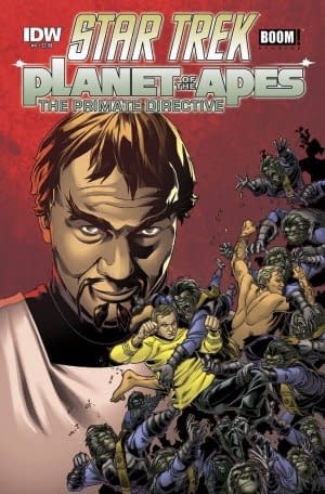
Star Trek/Planet of the Apes: Primate Directive #4 (IDW/Boom!, $3.99)
By Cat Taylor
 Here I am, late to the party and picking up this Star Trek/Planet of the Ape mini-series as it nears the end. Fortunately, this issue is written in such a way that a reader familiar with the general settings and characters from both licensed properties can pick up in the middle of this story and not feel lost. Between the "Captain's Log" intro and the generally simple plot, I felt like I had already read the previous issues, even though that wasn't the case at all. So, I'll give the writers, Scott and Dave Tipton, as well as the editors, Sarah Gaydos and Dafna Pleban, credit for constructing a story that works in a single issue while still being part of a larger arc. I'll also give them credit for handling the licensed properties "fairly" effectively but I do have some mixed feelings about that part. On the one hand, the Tiptons have written enough Star Trek stories to know what they're doing, and this really does seem like the obvious adventure that would have occurred, if these two properties had ever come together for a movie or television special back when they were in their prime. On the other hand, it's a little TOO obvious.
I've often said that competently translating a licensed property from another format into a comic book isn't as easy as it seems. In this case, that difficulty revealed itself, not so much in the general story, but in inadequate use of the many characters. As I mentioned earlier, this is the first issue that I've read of this series. It is entirely possible that earlier issues gave the crew of the Enterprise more time to shine. In this comic though, with the exception of Kirk, the central characters from Star Trek are given as little to do as the "red shirts" that the writers threw in. It's pretty much the Kirk, Cornelius, and Zira show for the "good guys" in these pages. Even with as little time as the non-Kirk Starfleet officers get, they still fare better than Planet of the Apes' Taylor though. Taylor does absolutely nothing of significance in this issue. Any warnings he gives to Kirk and crew could have been just as easily been conveyed by Cornelius and Zira. Furthermore, his personality seemed a little off from the way he was portrayed in the movie. It felt like the character was force-wedged into the story simply because he was in the original Apes film.
Rachel Stott, the artist for this issue, was apparently on the same wavelength with the writers since she captured the appearances of all of the characters quite effectively, with the exception of Taylor, who looks less like Charlton Heston in his prime and more like a fit version of Kenny Rogers. Otherwise, her pop-art style works well for the settings and environments. Stott's art looks like she was very careful to use stills from both the first Star Trek TV series as well as the first Planet of the Apes movie for all of her panels. Needless to say, this is imperative if you want to stay in the good graces of the fanatics who like to nit-pick this stuff to death. She even used the original Klingon design, which is something that everyone who has told a Star Trek adventure since seems to have ret-conned out of existence for the more detailed Worf model.
Speaking of nit-picks, I have one that really puzzled me when I read this issue, and it's a nit-pick in which the writers, artist, and colorist all had equal parts. There is a scene where Kirk and his crew are going to beam down to Ape-Earth. Taylor warns them not to wear their bright colored uniforms because they'll stick out like sore thumbs. So, the Enterprise crew changes into more primitive outfits that look kind of burlappy with wooly vests. First of all, wouldn't they still stick out like sore thumbs? All of the humans that the apes have seen or interacted with wear tattered rags because they're too primitive to sew clothing. So, right away, if you're an ape and you see a group of humans in full clothing and vests, wouldn't they catch your attention? Second, Taylor specifically mentions the bright colors of their clothing as being a problem, but when they put on their new outfits they still have shirts in the same colors! They aren't their standard uniform shirts but they are still gold, blue, and red. Was this an intentional joke from the team who worked on this book or what? Nothing else about the story seems tongue-in-cheek, but a detail like this seems so obvious that I can't imagine they didn't think about it.
If this crossover had been done as a live-action movie or TV series back when all the actors were still alive and young, the world may have exploded from multiple, simultaneous nerdgasms. The properties are so well suited for each other that a mash-up would have been a thrill. Both were science-fiction tales that tackled larger social issues in a fantasy setting, and the Star Trek adventures were based on the Enterprise travelling to a different planet, time, or dimension in each episode. There's no reason why a visit to the Planet of the Apes couldn't have been feasible in the context of the show. It would take a pretty lousy creative team to completely botch a concept like this, and the IDW/Boom! collaboration definitely doesn't blow it. However, they don't elevate it above the obvious either. As a result, if you're a fan of either of these properties, you'll most likely think this is pretty good but I doubt you'll be demanding that this mini-series be developed into a feature film.
Cat Taylor has been reading comics since the 1970s. Some of his favorite writers are Alan Moore, Neil Gaiman, Peter Bagge, and Kurt Busiek. Prior to writing about comics, Taylor performed in punk rock bands and on the outlaw professional wrestling circuit. During that time he also wrote for music and pro wrestling fanzines. He believes that people who complain about Daylight Savings Time don't have enough real problems to complain about and that they are preparing themselves for a great future as grumpy senior citizens. You can e-mail him to argue about it at cizattaylor@hotmail.com.
Nemo: River of Ghosts (Knockabout)
By Adam X. Smith
 One of the criticisms of Alan Moore I've never quite been able to wrap my head around is that he is actually a racist and a misogynist, despite a wealth of evidence to the contrary. Certainly he has no problem with titillation and ribald commentary on the nature of "polite society" and the bubbling stew of neuroses and flaws under the surface of our collective consciousness – and Glycon bless him for that – but to use this as the basis for such an argument seems fundamentally misguided. It betrays in the accuser a perspective that either a) has fundamentally missed the point of his work, or b) is wilfully trying to twist it to fit their own agenda and narrative, both of which are often tainted by the assumption that beneath the veneer of lefty-pinko-commie-hippie-beatnik-heathenism, writers like Moore are just as horrible and hateful as the rest of humanity. The reason this argument holds no weight with me is that you never see it being directed at writers on the opposite end of the political scale – no-one's hectoring Frank Miller for not going far enough in his portrayal of women and Muslims.
Whether or not the Nemo Trilogy, of which River of Ghosts is the latest and concluding chapter, is a conscious or unconscious rebuttal to this remains to be seen, but it certainly doesn't hurt its chances of success. As a side-quel to Moore and Kevin O'Neill's League of Extraordinary Gentlemen series, it fleshes out the areas of that universe that weren't really touched upon in the main series – pre-WWII America in Heart of Ice, Nazi Germany in Roses of Berlin, and now the 1970s. In the process, we get to witness Janni Dakar, the daughter and heir of the original Captain Nemo, grow from a young upstart pirate queen looking to make her mark on the world, through her middle-age and the height of her power whilst defending her family from peril, and finally to her denouement as an old but no less fearless and fearsome woman, haunted by the ghosts of those who died in her service – including her lover Broad Arrow Jack, the original Ishmael, and even the long shadow of Nemo himself.
When rumours spread that her old nemesis Ayesha, the white she-devil of Africa, has been spotted in South America – despite having been decapitated by Nemo's duelling saber in Roses of Berlin – Janni is set on taking the Nautilus up the Amazon River to find out for sure, against the wishes of her daughter Hira and the advice of her friends and subordinates. Rumours abound that the Captain is going mad and "talks to the spirits", but she is nonetheless determined to take to the depths for one last adventure, with her crew this time seeing the addition of demi-god bodyguard and strong-man Hugo "Hercules" Coghlan and her stowaway grandson Jack. Once they reach the Amazon, as with the previous books in the series, it's a whistle-stop tour of everything from Doyle's The Lost World and Creature of the Black Lagoon to The Stepford Wives and The Boys From Brazil. There's even, in a Cerebus-esque callback, a reference to Moore's own Watchmen that is so tragic in its implications that I daren't spoil it.
As far as the story and art go, Moore and O'Neill are playing directly to their key audience of hardened LXG fans, with all that that implies: ragged edges and sharp jutting lines combined with Ben Digmagmaliw's exceptional colour palette bring vibrancy to the pages whilst remaining consistent with the series as a whole. Janni in particular stands out as a prime example of O'Neill wringing every last bit of characterisation from her withered, war-ravaged face. She is a lioness in winter, bent but unbroken by age and a life of piracy and slaughter, haunted by her past but still pressing onward into the future, and determined not to go gentle into that good night.
Certainly old age means that there are fewer organic ways of introducing pointless fanservice into the equation – although Janni does politely turn down Coghlan's matter-of-fact offer of sexual services, only to chuckle at the disapproving glare of Broad Arrow Jack's ghost – but then, Janni and Ayesha were scarcely the focus of such attentions in the rest of the series anyway. Once we get to Ayesha's secret Nazi base in the jungle, however, we find ourselves looking down the barrel of an army of seig-heiling, goose-stepping, large-bosomed, blank-eyed Aryan fembot übervixens.
Like I said, Moore knows his audience well, and whilst the dialogue lamp-shades the fact that there's very little that's "natural" about these Stepford stormtroopers, it's all done with a wink and a nudge and the lightest of touches.
Look, I'm not a comics scholar or a sociologist; I'm a Drama student with an abiding interest in Alan Moore's work – I'm still waiting patiently for my copy of Show Pieces to arrive in the mail nearly a year on from when I pre-ordered it. Better, more patient, less sleep-deprived minds than mine will be able to tell you whether Moore's work reflects a positive or negative outlook on gender, race and the like. As far as I'm concerned, if you like Alan Moore generally and the LXG universe more specifically, this is right up your alley. Mileage may vary for those unfamiliar with the series, but at this stage in his career, I don't think that Moore has or should have any reservations about playing to his core fanbase's key interests: meta-fictional crossovers and (to quote my housemate Chelsea) ass and titties, in that order or otherwise.
Adam X. Smith has returned, albeit briefly, from a research mission undertaken for his home planet in which he studied the chronicles for tales of an Earth-man called Nix-On. He also discovered two fascinating chemicals called caffeine and nicotine, which when ingested make Earth-men and women more productive with the side-effect of making them prone to agitation, hyperactivity and bouts of misery and depression and eventually death, compounded by their illogically addictive properties. And humans think he's the crazy one.
Powers #2 (Marvel, $3.50)
By Jeb D.
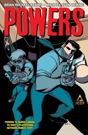 I'm kinda pushed for time this week, but I did want to mention two things about the second issue of the latest iteration of Powers.
It's amazing that, after all these years of Powers, Mike Oeming still finds great new perspectives in his storytelling. He brings his familiar brilliance to back and forth dialog sequences with Pilgrim and Sunrise kibitzing as they watch a TV interview with the murder victim, and a panoramic visit to a disturbingly-crowded morgue; but the issue's highlight is a sequence of Walker's nighttime encounter with a powers groupie that is as dark and intense as a Scorsese/Schoonmaker scene.
The various attempts to align the cinematic/TV and comic-book versions of the Marvel U have their good points, and bad, but it's fascinating that this version of Powers is making no concessions to the new Sony PS TV series, moving Walker off center stage and bringing Sunrise into full partnership with Pilgrim. Of course, there's no guarantee that Brian Bendis won't go all Nick Fury Jr on Sunrise at some point (kill off Deena and have Sunrise assume her identity to align with the cosmetics of the TV series), but for now, at least, it's nice to see Powers the comic not retreading itself for the purpose of chasing new readers from other media (not that that ever seems to work).
Jeb D. cannot believe Notre Dame's last few possessions. I mean, honestly…
Enjoyed this? Please share on social media!
Stay up-to-date and support the site by following Bleeding Cool on Google News today!