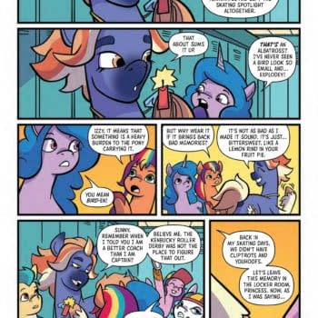
About
About 


By Spencer Ellsworth Nick Roche got his start as a comics artist at IDW Publishing, illustrating and soon writing the company’s incarnation of
Posted in: Comics, Recent Updates | Tagged: Comics, Curt Pires, dark horse, entertainment, Jason Copland, Pete Toms, pop, ryan ferrier
POP Comes To Psychotropic Trade This Week And POP #1 Is Free On Bleeding Cool
POP is four issue miniseries from Dark Horse, now complete, that's releasing in trade edition this week and what a trade it is. Seriously, the designer Dylan Todd might deserve some kind of award nomination for it. It's the kind of sensibility and elaborate attention to detail you might expect from some kind of high-end archival edition of a significant work in comic history, and yet it's light, brash, and a little bit acid like the comic itself. It's a white matte cover etched with glossy extras like a massive logo, horizontal glossy bands of color, and some of the asymetrical patterns that seem to suggest the acid trip and brainwashing elements of the comic. Though it always still works on me, the use of psychedelic artwork and colors is becoming popular these days, however, I'd argue that POP goes so far beneath the surface of that craze that it's psychotropic in its own right rather than merely psychedelic in its aesthetics.
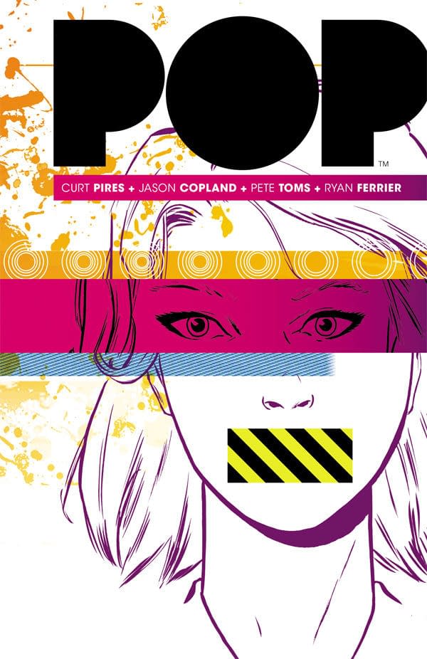 Written by Curt Pires, with art by Jason Copland, colors by Pete Toms, and letters by Ryan Ferrier, this is the kind of team book that sets the tone for creator-owned comics these days with each member placing their recognizable stamp on a work. The writing is as distinctive as the art as the colors etc. POP tells a Clockwork Orange-flavored social-industrial conspiracy about the clone-like manufacture of superstars with all the right quality to earn millions if not billions of dollars. They are grown in tanks by an evil corporation, watched over by gun-toting and sadistic muscle, and two incredibly vulnerable beings take center stage–a somewhat suicidal comic shop owner perpetually stoned out of boredom, and an escaped embryo superstar who's child-like and confused. I can say all that, but if you ask me what the story is really "about", I'd say something like: addictions, mental programming, visual media, escape. And that list goes on.
While the story reads just fine in four issues, it easily could have filled a few more just due to the scope of the ideas. Jason Copland's art, as I mentioned, is very distinctive, and suits the story well. In the backmatter to this collected edition, we learn that initial crisp and clear approaches were technology were dropped in favor of a messier style and though I'm speaking in hindsight, I say, "quite right". It's hard to imagine POP having the same impact without a sense of the alien, discursive, and alternately definite and indefinite linework as our two protagonists are on the run. POP also feels retro for reasons of both the art and characterization, as well as the colors. The clothing, too, is suggestive, with wide collars and loafer shoes, or at least not limiting, to make you unsure what time period you're perceiving. Many of these qualities are cinematic, as well, or suggest cinematic homage, which only enhances the ways in which the comic seems to tap into our collective cultural inheritance, which is the theme of the work after all.
If you missed POP in single issues, it's no step down to pick up the beautiful trade out this Wednesday, March 25th, in comic shops. To celebrate it's arrival and welcome new readers, the team have kindly agreed to give us the first issue free, here on Bleeding Cool:
Enjoyed this? Please share on social media!
Stay up-to-date and support the site by following Bleeding Cool on Google News today!