About
About 


By Spencer Ellsworth Nick Roche got his start as a comics artist at IDW Publishing, illustrating and soon writing the company’s incarnation of
Posted in: Comics | Tagged: Comics, dark horse comics, entertainment, frank miller, Robocop Versus The Terminator Gallery Edition, walter simonson
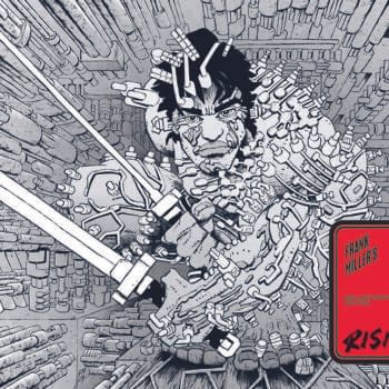
Get Rid Of Your Furniture And Get The Robocop Vs. Terminator Gallery Edition From Dark Horse
I don't recall ever having no alternative but to sit on the floor to look at a book or write about it in my life, though certainly in childhood that was a chosen effort. So there's something of childhood rekindled in the experience of Dark Horse's newly released Robocop Versus The Terminator Gallery Edition of the work of Frank Miller and Walt Simonson as first released 20 years ago. That's equally appropriate when you're dealing with two titans of comics, whose work makes you feel a little dwarfed anyway, but this experience is so immersive that it's no longer just a metaphor.
When the package arrived and I heard it was "really big", I thought that was an exaggeration. Once I saw the scope of the book, I had to carefully find a place to lean the box in my study until the great unwrapping of materials began. Maybe there's something a little ritualistic about approaching these Gallery Editions, and that isn't a bad thing.
First, there was the tightly fitted large box, seen here (and that's a rather giant coffee mug next to it for reference):

Then there was the unpackaging…
 And the trying to take in the fact that this feels like an art portfolio, but is in fact a book. It reminded me very distinctly of getting my first National Geographic Atlas, also as a kid, a book so large I had to use both hands to haul it around:
 What I immediately found really pleasing about the construction of the book was the fact that it was set in a brown paper effect, which was actually smooth, polished, and flush with the cover despite a layering of images. There's something about brown paper that makes you think of archival materials, with maybe a dash of the warehouse from Indiana Jones thrown in.
 I'm getting to the interiors, honestly, but all these steps are part of the unusual experience of this book, so it's impossible to leave them out. Next were the endpapers, which I'd like to think were chosen for their particular hand-drawn feel even when used ornamentally:
 And the table of contents where we can see a Foreword by Walter Simonson, the 4 parts of the original series, and an extra gallery:
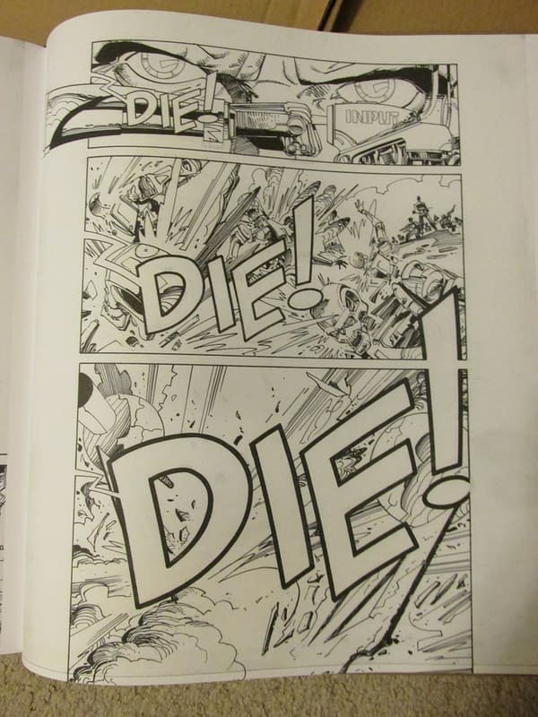
 And now, the main focus of the book, ostensibly, though the presentation of this material says a great deal about how it should be viewed and appreciated. In short, Walter Simonson's work on this series in this format becomes something so alive that it will knock you back in contemplation. It's not just beautiful, because the word "beautiful" can be taken in many ways, and some might mistake that for meaning slick, polished, perfectly balanced. This series is that in many ways, but it's also incredibly manual, hands-on, and human. Ironic given the subject matter?

Every page looks like you're getting a bird's eye view of Simonson inking at his drawing table, and you're able to pick up on the strokes he's making and the choices he's laying out. If you're a fan of indie comics, you know what that hands-on feel conveys, and it's part of the appeal of folded 'zines and self-published work, often in black and white at shows like SPX and MoCCA Fest. Now imagine you get to have that experience from the hands of a master like Walter Simonson and you have Robocop Versus The Terminator in this Gallery Edition.
 And it's hard to talk about the writing on this series when you're so distracted by the Giant Art of a giant like Simonson in this edition, but the concept behind the comic was always genius and yet something that could have gone wrong if it hadn't been in the right hands. And in this case the right hands are definitely Frank Miller's. This is a story where humanity is in question. And two ambiguous hero/antiheroes (you pick) are either going to save the world or destroy it forever. That makes humans feel small, but very important in the grand scheme of things, otherwise why are two titans the least bit concerned?

Miller and Simonson get to the core of these two characters and make them as archetypal as I've ever seen them, moreso even than the films because of this special focus and rendering in combination. And that tells us something about why they have impacted pop culture so much as ideas. We only manage to pick out the things that make humanity something of value by contrast, and the POV of this book is so "posthuman" that it provides the lens for us.
Regarding the actual presentation of these pages at "full size" as drafted, we do get to see some of the process involved with corrections, erasures, fine lines, pencil notes, and text laid in. But actually, there's not so much of this that it's distracting to the reader. It's the perfect accent to the "authentic" experience of being face to face with the first airing of this work near its publication date.
There's also the "gallery" at the end, which is particularly beautiful. Seeing Simonson's work hovering in white space gives it that extra epic sense of projection and here we do see the fully polished, fully balanced, more classic sense of beauty in comic art.
 Lest I sound too much like I'm trying to render this all a kind of vacuum-sealed experience of the artwork on a comic as first created, and trying to divorce that from the story and narrative necessary in any impressive comic, there's also this to keep in mind:
 This is an action comic, and in some ways a horror comic, and certainly a sci-fi comic. That adds to the strangeness of this experience of a Gallery Edition. Your mind is constantly moving between appreciating what you're seeing as fine art and appreciating it as a compelling adrenaline-filled story of struggle, combat, and uncertain outcomes. We, as comics readers know that those two things are not really at odds, but we probably spend a fair amount of our lives trying to explain to non comics readers how intricate and skilled comic art really is, and why it should be appreciated.
This book makes that argument, of course, but when it's just you, who know better, reading it, it's more of an amplification that's awe-inspiring since you get the feeling that you are experiencing the effect of this story at its genesis point, where everything is bigger, louder, and more overwhelmingly "serious" in its inception. It's impossible to look at the story in the same way again because you kind of feel like you were there when the story "happened" as a comics narrative. That's the best I can do to verbally convey what I'm talking about. But if you look at the way the book commands your attention, that's a hint, too. Get rid of your couch, or your bed, or a family member if you have too many, because this is a big book, but you'll gladly do so.
And this does make me wonder, of course, what the other forthcoming Gallery Editions are going to be like. I'm almost a little afraid, since I live in a small house, what's going out to the curb next. But one thing further, Dark Horse have also released a new "normal" sized format in hardback of the 4-part series for readers who are overly attached to their furniture.
Robocop Versus The Terminator Gallery Edition arrives today, July 9th, in shops, and July 22nd in bookstores.
Enjoyed this? Please share on social media!
Stay up-to-date and support the site by following Bleeding Cool on Google News today!