Posted in: Comics, Recent Updates | Tagged: Alex Spiro, Bill Kartolopoulos, building stories, chip kidd, chris ware, Comics, dan clowes, design, entertainment, Francoise Mouly, MoCCA Fest 2014, Nobrow Press, Pantheon Books, Rebus Books, Toon Books
Design In Comics: A History of Risky Business – Chip Kidd, Francoise Mouly, And Alex Spiro At MoCCA Fest
I've been reporting on comic related panels at shows and cons heavily for the past few years, and it was always very appealing to me to do so. Strangely, it has never occurred to me to ask the question, "What exactly do panels hope to accomplish for attendees? What's their purpose?" Maybe it seemed an obvious point that panels provide a massive educational resource for comics fans, often bringing in elements of history and process that would be very hard to research and learn about in other ways. The key, of course, is that people on panels are experts, with first-hand experience and the observations they provide transcend any type of codified history you might be able to find. MoCCA Fest this past weekend in New York had a hefty slate of panels running, bringing in key guests like Art Spiegelman, Alison Bechdel, and Fiona Staples to talk about comics, their own work, and in many cases the social and financial angles that help us understand comics in context.
For me, the "Comics and Design" panel was a particularly significant addition to programming, however, since I've been aware on several occasions of just how little focus and attention the design aspects of comics receive and the misconceptions or simply the invisibility of a highly visual craft in the history of comics culture. That is changing quite significantly and readers are becoming more aware of how design shapes our reading experience, but there's a long way to go to give this specific craft the appreciation it deserves.
Chip Kidd (Pantheon Books), Francoise Mouly (Toon Books), and Alex Spiro (Nobrow Press) were excellent representatives of design in comics to help set the record straight and generate the kind of informative experience that many fans would be delighted to have. Thankfully, the panel was even videoed by MoCCA Fest and will be available for wider audiences. The panelists were hosted by Bill Kartalopoulos (Best American Comics, Rebus Books), someone who has long been an advocate of appreciating the craft of design in comic and graphic novel production to judge from the numerous panels I've heard him moderate in the past.
Kartalopoulos opened by deeming the matter of design in comics "urgent" at the moment as we approach issues dealing with the status of print in an era of "revolutionary change in the way we use media". Designers, of course, are at the forefront of that transition and will influence the direction that print and digital comics take, but many of the positive aspects of their current position can be traced to people like Chip Kidd, who has done a lot to "reposition" the status of comics in North America via his work at Pantheon, Kartalopoulos said. He also described Alex Spiro's work in establishing Nobrow Press as "courageous", co-founding a publishing company "devoted to the book as a beautiful object" during a time when print is being "devalued".
Kidd was asked to recount the early days of graphic novel publication at Pantheon, and the nature of his role in bringing wider attention to design work. He related that he initially worked for Knopf, which Pantheon was a part of in the late 80's and early 90's, spearheaded by Art Spiegelman and Francoise Mouly. He desribed a "dry period" in the early mid 90's to late 90's in terms of graphic novel production after the initial success of Maus. Ben Katchor's Cheap Novelties and caught Kidd's attention, so he had a meeting with Katchor about his next book, which he recommended for publication, The Jew of New York. Kidd reached a point where he decisively wanted Pantheon to start "doing it again" when it came to graphic novels.
He recommended "two guys" to Pantheon, an unknown called Chris Ware and Dan Clowes, who had garnered success with Ghost World. In 2000, Pantheon "almost simultaneously" published David Boring and Jimmy Corrigan, and got the "recognition we were looking for", said Kidd. This "jump-started doing graphic novels at Pantheon". Thereafter Kidd thought of himself as the "in-house cheerleader and quasi-art director" as the company took risks with Ware's own designs for his works doing unheard of things like making the title on the cover difficult to immediately decipher. Now, of course, Ware takes even greater risks, like the format of Building Stories, but Kidd suggested that a certain amount of faith has to be placed in readers, since everybody "got it" regarding Building Stories, from reviewers to fans and book sellers who "just sort of figured it out".
Kartalopoulos pointed out that there's an increasing pressure on publishers of graphic novels to present a uniform format, a kind of one-size fits all approach that the wider "publishing world" seems to enforce, limiting diversity, resulting in "squeez[ing] graphic novels into certain formats". It's enough to make readers "cranky" and worried about the future. For Kidd, that's something to resist and not at all part of his ideology. We "concentrate on what we're doing", he said, "Pluralism makes perfect sense", like David Mazzucchelli's Asterios Polyp, and the work of Charles Burns that remain "unique" in format.
Francoise Mouly approached design from a position of working hands-on with book printing which has continued to shape Toon Books. "Not everyone had a printer in the house. Production was not accessible", she said of her early days in publishing. Print shops with "fast printing" only came about in the 1970's and were mostly used to produce flyers. She became "interested in the immediacy of making something printed". Her background in studying architecture, designing things that "never got built" contrasted with self-printing by hand where "within a day or two, you had 500 copies of something". Bringing that speed and quality to stories created a "relationship with reality that was exhilarating for me and I never stopped".
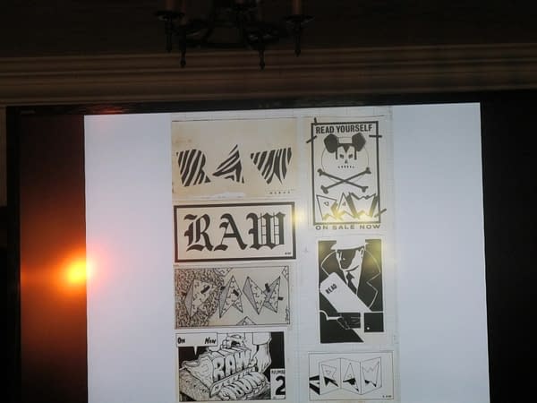
Her work on RAW magazine was prompted by the fact that it would "take years to build a whole library" of comic art, but if she "put it all in one place", the reader could experience a range of things "at once". The magazine needed to be "large but disposable" and she could produce the "right dimensions" with her equipment and on her press, but they insisted that they keep "something that you would do by hand" in each issue, hence the art inserts in the magazine.
Alex Spiro set off with the goal of recreating an "exhibition" feel in Nobrow's books. Nobrow initially hosted actual exhibits, and created something that attendees were able to take back with them, "creating an artifact from an experience and allowing people to take that". Spiro commented on the color-scheme and thematic design of Nobrow anthologies, where there is a "theme to riff on, and a color theme to unify work" for artists. He was inspired by RAW to create a "hands on" effect. Nobrow sets out to imitate the "feel" of screen print in books" and the way they accomplish that is by "separating out colors digitally" and "working with artists, teaching them how to use spot colors".
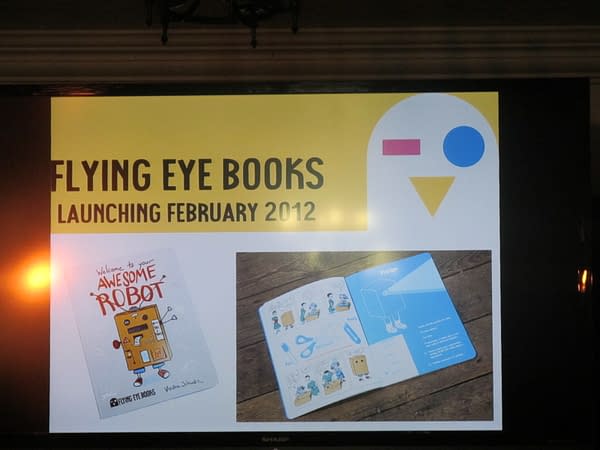
Though the Nobrow anthology now includes comics, its early focus on illustration was not exclusive, since they always intended to include the "narrative side of publishing", making it a goal within their first year, Spiro said. He felt that there was "not really a counterpart to Fantagraphics and Drawn & Quarterly in the UK" and so they started out with a 17x 23 size at 24 pages that was designed for economy. They needed to conceive of the "cheapest way to get a 24 page comic out of one sheet of paper", which resulted in their first narrative work in 2010. Since then, they've expanded into "accordion" books and launched a children's imprint, Flying Eye, partially spurred on by the success of Luke Pearson's Hilda books. The Flying Eye imprint meant a significant development in Nobrow's aesthetic, but Spiro said the change doesn't pose a problem since they "don't like to limit" themselves in terms of creative presentation.
Kartalopoulos pointed out that the field of children's book is "notoriously difficult to break into" and asked what Flying Eye brings that's unique to the world of children's books. Spiro said that he felt "like a lot of children's books were following formats and rules that we respected, but felt that we could offer a slightly different perspective and we jumped in feet first. We also felt that children's books that the low cost paperback approach to children's publishing is becoming irrelevant as digital takes a share of the market. Children like the tactile nature of children's books, as well as parents".
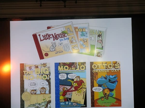
Of course, Toon Books faced exactly the same questions initially and continues to address them. From the earliest Toon Books, Francoise Mouly introduced a "very consistent set of constraints and cover design" based on the "publishing house" identities typical in Europe that determine the look and feel of a book. This "works well with kids book publishers", she said, because "kids are incredibly sensitive to design and haven't lost consciousness of that". She spoke about how young children immediately recognize similarities in color, size, and weight of books. But she has also resisted the "bland" in children's books, a tradition that leans towards conservative appearances and content.
The subject of children's books segued smoothly into a discussion of one of Chip Kidd's recent projects: Go: A Kidd's Guide to Graphic Design. When he was approached to create a book educating children of around the age of 10 and up about design work, he realized, " I don't have kids, don't relate to kids, don't know any kids, don't like kids", but joked that "the price was right", inspiring him to create the book. It was "a real challenge" and "outside of [his] comfort zone", trying to express "all the concepts" he personally didn't encounter until college. He does recognize, however that "now kids are dealing with design all the time" and can also create things on their own in ways previous generations couldn't. So introducing concepts like "form", and the difference between "beautiful" and more "immediate" communication will prepare them better to engage with the world around them.
Throughout the panel, the audience was presented with process shots, covers, and explanatory visual material that acted as a kind of tutorial in design work to illustrate the history of creating "beautiful books" that don't bow to conformity and consistently adapt in innovative ways to engage readers. Despite the challenges of print these days, the insights provided by the panelists seemed to suggest that one massive contributing factor in the survival of originality in comics will be a consistent front of resistance to cookie-cutter book design and a willingness to take "risks" in the design field when it comes to comics.
Hannah Means-Shannon is EIC at Bleeding Cool and @hannahmenzies on Twitter


