About
About 


By Spencer Ellsworth Nick Roche got his start as a comics artist at IDW Publishing, illustrating and soon writing the company’s incarnation of
Posted in: Comics, Recent Updates | Tagged: avatar press, charles soule, Clayton Cowles, Daniel Indro, david liss, dynamite, entertainment, Francesco Francavilla, Gabriel Rearte, Gravel: Combat Magician, image comics, Javier Pulido, joe infurnari, Josan Gonzales, Joshua Cozine, Joshua Hale Fialkov, Kel Symons, Kevin Wada, Marvel Comics, Matthew Reynolds, Mike Wolfer, Muntsa Vicente, oni press, Patt Brosseau, she-hulk, Sherlock Holmes: Moriarty Lives, the bunker, The Mercenary Sea
Live From The Comic Shop – She-Hulk, The Mercenary Sea, Gravel: Combat Magician, The Bunker, Moriarty Lives
I'm back writing live from my local comic shop, Conquest Comics, in New Jersey today and taking a first look at some of this week's comics. I was forewarned that this week is a very big week for comics, though I'm not personally geeking out about Batman: Eternal, but this week means tough choices on what to pick up, but we certainly can't complain. I settled on a wide range of different genres and comics, from checking out the new She-Hulk to apocalyptic storylines and a return to the proto-supervillain Moriarty. True to our needs, comics are getting us through a harsh winter and thank gods the publishers don't hold off during the winter months or we'd probably all develop seasonal-affective disorder. Also gearing up for the Toy Fair in New York this weekend, which should be plenty of craziness to get me start thinking about shows again and the coming spring.
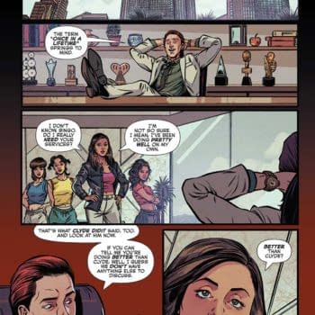
 First up, She-Hulk from Marvel, written by Charles Soule, with artwork Javier Pulido, colors by Muntsa Vicente, and lettering by VC's Clayton Cowles. It's an interesting cover for the first issue, dare I say a little more artsy than your typical Marvel book (aside from Hawkeye) and the side-vertical title is a nice touch as well as the water-colorish double persona tearing through the "paper" of the comic, all by the promising Kevin Wada. The attorney role of Jennifer Walters reminds me of Dare Devil, a plus, but also spotlights a strong role in non-superhero life for a female character, and I'm pleased by that. The opening one-page spread introducing Walters has some bold colors from Vicente, and an upbeat, playful attitude that appeals. We see her physical gusto as She-Hulk decking foes, raising a pint with Thor, and then, lastly, talking to a small child. The message is pretty obvious—she is all of these things—but it makes me curious as to whether a greater balance will be maintained in her characterization, or whether her more gentle nature will get equal billing with the brawn.
The narratorial "No one is only one thing" is a good nod in that direction. But wow—I have to say I'm impressed by how quickly the comic engages with Jennifer facing a double standard, that her powers as an attorney are being totally overlooked in favor of her "connections", peeling back the politics of big firms and their inability to treat her as a valuable asset. It's a layered commentary, writ larger than usual, on what would usually be the female employee in a big company being de-valued for being female, and her own abilities overlooked. Thank you, Mr. Soule. Jennifer is well-spoken, charming, smart, and at least the reader can see that. This also sets her up well as an underdog protagonist up against the world, not a bad strategy for a first issue. Fortunately, this obstacle turns her toward humanitarian work, which will no doubt prove more interesting a story, anyway. The artwork and colors on the book remind me of what I like about the comic series Batman '66. That series plays with the hues of the TV show, but in this case the comic takes those old Marvel colors and tunes them up a notch, never shying away from some glossy, solid-line inking to offset them. I'm favorable impressed by this first issue and will be following the series now. Give it a try and I'm sure it won't disappoint.
 New Image book The Mercenary Sea, is written by Kel Symons, with artwork by Matthew Reynolds, and lettering by Pat Brosseau. And it has a really striking cover with contrasts that seem almost cut-out and overlaid in its colors and elements. It suggests spy movies from the 60's and 70's, perhaps their movie posters, but also a dash of Tintin in the color choices. It opens with a full-page spread of a nicely misty affect, adding to my suspicion that Matthew Reynolds has a rather distinctive artistic voice, and turning further into the comic, I see that what he's creating is an interesting 3D like affect by sharply defining characters in the foreground in a cartoony way with very bold outlines and doing all kinds of alchemy on the backgrounds. It is a style I haven't seen anything like before, very distinctive, and therefore a win for comics. The pulp influence is coming to the fore with the setting—1938 in the Pacific, and in character choice—from stolid lead Captain Harper to crew members, but a little Indiana Jonesish in the addition of a tomboy female engineer Sam, complete with baseball cap. Still, it would be an all male cast without her, aside from incidental female connections Harper might have in ports of call, so a welcome addition. The adventure-comic pulp elements are taking shape in issue 1 as Harper learns of the existence of Koji Ra, a semi-mythological mysterious place with treasure abounding. And we get a peek behind the curtain of Harper's chequered history and just why he can't return to his native USA. This promises to be a book with a wide range of incidental characters and plot elements, and therefore have quite a sweep. A major selling point is Reynold's artwork, and pulp fans are going to be keeping a keen eye on it as the story develops.
 I've been a big fan of Avatar Press's Gravel series of comics from its Warren Ellis days with artist Mike Wolfer and now Wolfer has taken on the reigns of a comic he knows intimately over a long period of time to take the story in a slightly different direction in Gravel: Combat Magician. Issue one has arrived this week. The story picks up Gravel's military incarceration after he took on the magicians of the British Isles in a necessary house-cleaning measure that landed on his doorstep. Now we see Gravel reflecting on his military days as a ultra-special Black Ops agent and wondering what the future might hold. We know already that Gravel is a total hard-ass who doesn't flinch from violence in the least, but seeing him from the angle of his military career is particularly interesting.
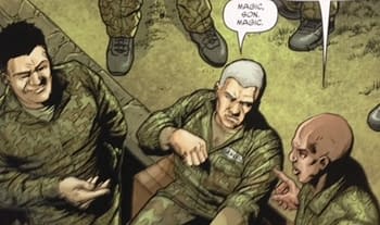
His opening monologue reminds us that he is not "burdened" by the ordinary memory and guilt of killing in the field that might affect other soldiers. But this new arc is going to take us into new territory, literally, with a Tokyo setting, and perceived environmental hazzards threat. In keeping with Gravel's mythology, things are going to get weird, disturbing, and plagued by monsters as well as rather sinister occult figures. But not before we see what Gravel gets up to in a military "corrective training center", card-tricks and semi-magical time-passing devices. He's "fucking bored with it all" and aware that real retirement would just make him a "target". It turns out the "Combat Magician" program still exists, with many changes, and so we're going to witness the old "war horse" taking on change, and no doubt doing things his own way. Mark Wolfer hands off art to Gabriel Rearte in this arc, and Rearte has a good sense for creating harmony with Wolfer's own past art on the comic and keeping that painterly feel readers are expecting while adding his own horror accent to the mix. The issue is well-paced for a substantial story-line and leaves the reader waiting to see that final jump of Gravel leaping into action once more, this time on a particularly international stage.
 I witnessed the digital launch of The Bunker and the much-deserved acclaim it received as a post-apocalyptic mystery where a group of characters with good intentions about time-travel gradually realize their own scary impact on the world. Written by Joshua Hale Fialkov, who knows how to handle suspense, and with tour-de-force art from Joe Infurnari, it's no surprise that The Bunker is back, this time in print from Oni Press, but now—bonus—in full color. Infurnari has always been an excellent colorist because he knows how to use color in purposeful moderation to great affect, and this has just given him a new tool to fully evoke the visual world he so intricately created in the digital version of the comic. The intentionally washed-out, chalky effects of his pastels here are perfectly balanced so as not to take away the impact of his already mood-evoking sketchy inked line-work. The colors add pathos to an already emotionally engaging comic with a heavy sense of doomed nostalgia and haunting images of mass destruction. Told through notes, maps, diaries, and reflections, The Bunker cues into some of our worst fears, like the kind of anxiety dreams people have where they're suddenly told their responsible for something catastrophic but have almost no memory of how they were involved.
The characters face the same crushing weight, but also pursue a very unlikely hope that they can somehow alter the destruction they've caused. And discover the ways in which their convoluted personal relationships may be to blame. This issue is dense, containing a great deal of storytelling in compact style, and therefore gives you a sense of having taken something valuable home, a coda about "the future" that you're still trying to piece together. The full color Bunker makes a beautiful comic, and it's going to make a beautiful collection that I can't wait to see play out. Needless to say, it takes a very strong comic to transform between formats into something different and nevertheless something the same, and that's what we have here: a comic that has its own viral qualities that keeps finding its way into the hands of readers with its own driving momentum. Though we shouldn't underestimate the "madness" Fialkov and Infurnari went through to create each iteration. Fialkov warns that the fragmented nature of the narrative left Infurnari creating "deranged file naming systems" and splitting up panels on "scraps of paper". Sounds like they couldn't escape the world of The Bunker once they had fallen in, either.
 Lastly, today I will take another stroll through the strangely skewed world of Sherlock Holmes: Moriarty Lives from Dynamite. Reality reality twists as we follow with some dread but also some admiration the foul hyper-intelligent mind of Holmes' nemesis Moriarty after the exaggerated reports of his death, with Holmes, in Switzerland in this second issue of the series. It's another luscious cover from Francesco Francavilla, casting Moriarty in red shadows under the looming angles of Big Ben, warning readers that Moriarty might he heading home to jolly old England to engage his nemesis again. Written by David Liss, illustrated by Daniel Indro, with colors by Josan Gonzales and letters by Joshua Cozine, the first issue set a smart tone with a degree of detailed realism in its artwork and period settings, and also hinted that Moriaty might be lured away from the dark side by feeling positive emotions for other human beings. Now to see what's up for Moriarty's troubled character development. His piqued sense of superiority finds being "lured" into protecting a dying woman's son "disagreeable", of course. An alchemical "illusion" of magic is also rubbing his honed intellect the wrong way, but he thinks that's the least of his worries. Readers, who have seen the alchemist Bombastus more fully in action know otherwise. Mysteriously crafted keys, an unlockable safe, and a metal magical device worn as a gauntlet that seems to shoot lightning build the pace of this issue and the intrigue.
Liss consistently sets up moments with greater human interest, focusing on relationships, that remind me of the backstory and human experiences that pop up as the texture and flavor of Sherlock Holmes cases in the hands of Conan Doyle. Here Bombastus semi-imprisoned and lovely wife becomes part of the character-spread of the plot, and we are reminded that this is a comic where bigger baddies than Moriarty are at work and Moriarty, by contrast, may well take on the role of a hero, though his savvy child companion may see right through his motives after all with lines like "You are manipulating me". This is a surprisingly detailed comic when it comes to the psychology of characters, and maintains this throughout the intricate storyline. The combination of elements in the series so far has a lot to recommend it to genre readers and those with a penchant for Sherlock Holmes spin-offs. If you haven't tried it yet, you might want to put it on your list as a well-crafted comic.
That's all from me this week Live From the Comic Shop, but I'd also recommend the Image series EGOs, now in its second issue, the stonking new Image series The Fuse which takes sci-fi cop elements where no comic has gone before. Bundle up and happy reading–why not comics-hibernate until March or so? We probably have enough for that long in this week's releases alone.
Hannah Means-Shannon is EIC of Bleeding Cool and @hannahmenzies on Twitter.
Special thanks to Conquest Comics in New Jersey. You can find their Facebook page here. They are currently offering a POP vinyl White Phoenix exclusive and Metallic Harley Quinn exclusive.
Enjoyed this? Please share on social media!
Stay up-to-date and support the site by following Bleeding Cool on Google News today!