About
About 


By Spencer Ellsworth Nick Roche got his start as a comics artist at IDW Publishing, illustrating and soon writing the company’s incarnation of
Posted in: Comics, Recent Updates | Tagged: anaglyph 3D, Boom! Archaia, Comics, david marquez, entertainment, Jon Adams, RJ Ryan, Tara Rhymes, The Joyners in 3D
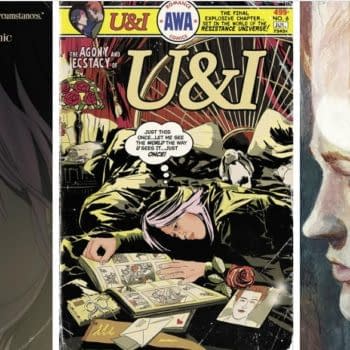
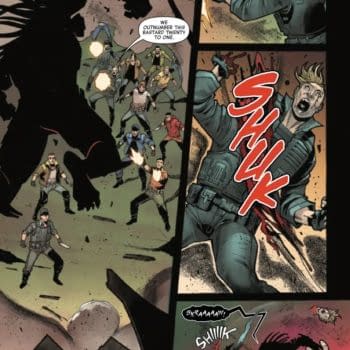
Bringing Sci-Fi Psychodrama The Joyners In 3D Into Focus – The Bleeding Cool Interview With RJ Ryan, David Marquez, Jon Adams
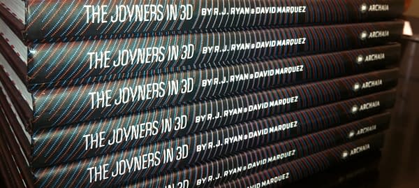
The Joyners in 3D is a lavish and striking book that experienced some delays in release, meanwhile building up anticipation and a certain degree of mystery concerning just what a reading experience of the work would be like. Written by R.J. Ryan, illustrated by David Marquez, with 3D work from Tara Rhymes, and lettered and designed by Jon Adams, the book is a large-format foray into anaglyph 3D whose contents often defies reader expectations and whose format often equally convinces the reader that they've entered a strange new world where things are often a bit more alien than they originally supposed. It's a story of pride, ambition, success, and explosive violence, all rotating around the family life of the Joyners in a futuristic setting. It has more than a little of American Splendor, and even Dexter, about it, and a seriousness in its dissection of human relationships that gives it a very distinctive accent as a graphic novel.

Delays in release were down to the intricacies of the anaglyph 3D process, which Boom! VP of Development Stephen Christy explains was challenged by the loss of 3D pioneers who could have helped advise the creators on the technology involved:
THE JOYNERS IN 3D was the most complicated post-production process we've ever gone through on an Archaia book. We were truly flying blind in that we were producing something in anaglyph 3D, which most printers have never been faced with before. Going into the post-production stage of this was when I truly realized the depth of the loss of 3D comics pioneer Ray Zone and 3D comics creator Joe Kubert was for our business. They were the only elder statesmen we could have called for guidance, and I wish they were still with us both to go to for support and to see the love letter that Josh and Dave and Tara created to their groundbreaking work.
The result, however, is a book which truly challenges the medium in format as well as in content, devising new methods of communicating internal struggles, the way in which human beings interact with their own environment, and establishing a sense of alienation that's bound to leave a mark on readers' imaginations. R. J. Ryan, David Marquez, and Jon Adams all spoke with Bleeding Cool about their experiences working on a book that may well become one of the most memorable of 2014.
Hannah Means-Shannon: Do new modes of empowerment just bring out the worst in human nature in The Joyners?
R.J. Ryan: That's an elegant way of putting it but not exactly the terms David and I use with each other while making the book. Going into this I was fascinated by the idea that somebody could cherish his wife, deeply love his children, be truly successful and innovative at work, and yet still be an awful, even misanthropic person. Everybody knows people like this, I bet. To your point, a big thing David and I did discuss is the idea that, sometimes, when you make something out of nothing you feel like you're entitled to everything, and how that is both a natural and ultimately destructive impulse. That fine line between innovation and self-destruction came up a lot.
HMS: Why does writing about family dynamics appeal to you? It seems like those relationships can be a pressure point for bad behavior as much as a source of betterment in The Joyners. Is it more realistic somehow to show the positives and negatives of these relationships?
RJR: "Bad behavior" in the context of a settled, prosperous family life is something we latched onto early—using those exact words, in fact. Talking about people like Mel Gibson and Tiger Woods and wondering what it would be like to be at the kitchen table the morning their marriages—and reputations—died because their wives had finally had enough. We see this stuff play out in the media but The Joyners in 3D is about getting uncomfortably intimate with that type of sequence of events—where a whole family just falls apart practically overnight and you, the reader, are sitting right there with the characters.
HMS: Like in the film 2001 and even in Gravity, sometimes a science fiction setting, particularly a spare one, can really make characters pop into the foreground (and especially here with 3D!). Is that part of the appeal for writing a science-fiction drama for you?
RJR: Dave and I originally conceptualized this book as something that would take place in the present, and it was only after really taking a close look at mid-20th century stuff like The Jetsons and Lost in Space that we decided a "family of the future" might be a fun framework for the kind of emotional and painful—but also graphically upbeat—story we wanted to tell. Right around that time, Dave was hired to do Fantastic Four: Season One at Marvel and that definitely pushed me in the direction of coming up with a "family story" you could never get published at Marvel. I'm not crazy about the "sci-fi" label but we do want people who read traditional science fiction comics to check us out. We have robots and flying cars!
HMS: A significant number of pages in The Joyners feature "wide-screen" panels that give a panoramic sense. Are you intentionally going for a cinematic effect here? How do you think wider panels help the reader experience the world of the story?
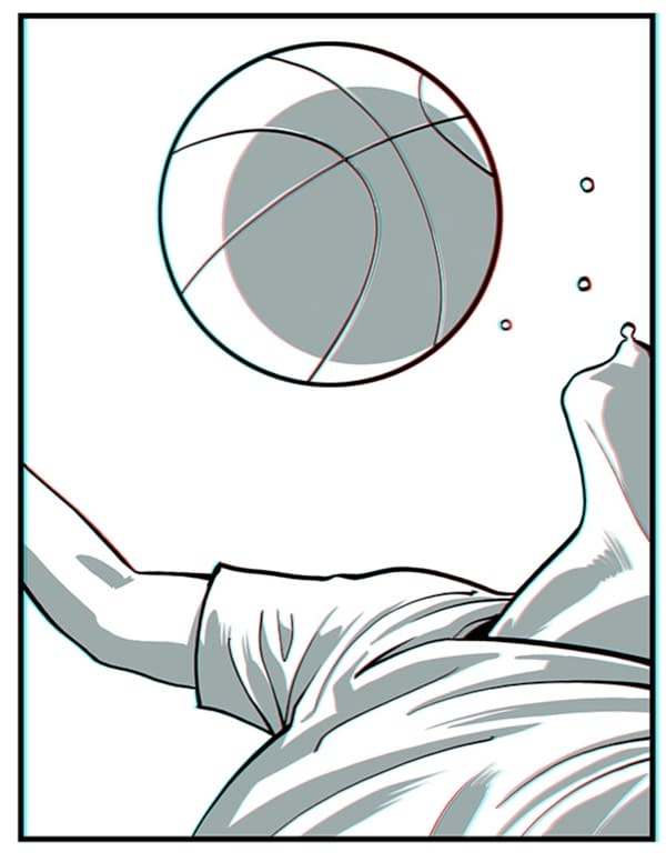
David Marquez: There are few things going on with the wide panels. First off, it's just an aesthetic that I really like. Maybe because a great deal of my artistic taste was formed reading comics in the early 2000s when "widescreen comics" were all the rage, I fell in love with how simply you can create beautiful compositions with a wide panel. But more specifically for The Joyners in 3D, these wide panels suit the story, script and overall concept of the book. The panel count on any given page is usually fairly small, and horizontal panels make good use of the space, while giving plenty of room to let all the characters and environments breathe. And this is doubly important due to the use of 3D imagery—by giving a wide swath for your eyes to take in, it creates more opportunities to play with depth in any given panel, really letting the reader feel as if they're peeking into (and in many cases falling into) the world of the Joyners.
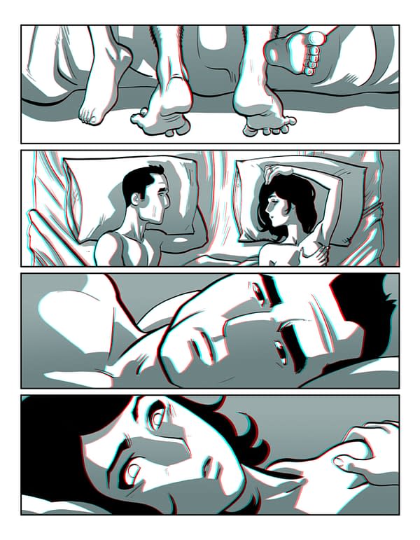
HMS: Though the panels in The Joyners are often large, people are really specifically the focus of many panels, often in close up, filling the space available and really emphasize that this book is about human life. What were some of your strategies to convey all the intense internal emotions going on for these characters in The Joyners?
DM: What's interesting about this question is that my answer becomes much more complicated for JI3D than it would be for my mainstream Marvel work. More than anything else in drawing comics, I really engage with making my characters emote, and normally that involves a very tight focus in the minutiae their body language and face. For JI3D, I developed an entirely new style—much more simple and graphic than my mainstream work, and couldn't rely on all the details I normally draw. Now, a character's face works much more as a symbol, and with fewer lines to play with, it was a challenge to nail just the right expression.
But in the end, it came down to the same basic principle on my end, as the artist: If I can understand how the character is feeling, I just needed to draw it so that I can see them feeling the same thing. I guess it's almost like what I'd imagine method acting into a mirror might be like: trying to dredge up the feeling you want, and using the page as a feedback mechanism, drawing until you see the same thing externally as what you're feeling internally.
Or something.
HMS: How did composing for 3D affect your choices when handling backgrounds and close-ups in the comic? Did you have to be very specific in your own mind about what aspects of each panel needed emphasis to convey the story clearly?
DM: It was very challenging, much more so that I had originally thought. Working digitally, I already tend to divide up layers of depth in a panel as a matter of my process – I draw the foreground, middleground and background separately. So whenever I was drawing a panel for JI3D, I was doing so conscious of the elements that I'd have to play with in terms of depth.
Perhaps the greatest discovery of using 3D as a visual storytelling tool, though, was something that was actually pointed out to me by Tara Rhymes, who worked with me to complete the 3D conversion of the book. In addition to greatly streamlining the entirely new and very labor-intensive conversion process that I had developed, making an impossible task much more manageable, she also introduced me to how the use of 3D could be used to really focus the reader's eye on certain elements.
As one example, any 3D element on a page will either appear to pop up out of the page, or recede behind it, depending on how the effect is applied. Elements that are pushed dramatically to either extreme (above or below), will be harder for a reader's eye to focus on. So, by placing the important elements in a nice goldilocks zone (not to far in the foreground or too far in the background), it becomes easier to for the eye to focus on, and naturally your eye will move to it. Think about how a rack focus in film will draw the eye (one element being out of focus, the other in focus), this works similarly. It was an absolute revelation, and only one of the many ways in which Tara really helped elevate the art to a much higher level.
HMS: Can you tell us a little bit about how you decided on the cover design for the book? Was working with red and blue a given considering 3D tradition?
Jon Adams: The cover design is the result of whittling down dreams to reality. Initially, I wanted to do a pop-up cover, where the reader opens the book to reveal a character or some other element in true 3D. Unfortunately, production costs for such elaborate presentations can be prohibitive. I think Stephen had suggested a die-cut cover as a compromise and we all agreed it seemed like a much more reasonable approach.
Yes, the red and blue was a given, especially since I like working with limited color palettes. The overall design is a play off of the human eye, with both the lead characters' eyes overlapping. Dave was super accommodating and did a great job turning my rough concept into a beautiful illustration. What appears to be a calm composition on the surface is revealed to be a noisy, fragmented scene when opened, echoing the disintegrating family relationships of the world Josh created.
HMS: What do you think that working with a larger format brings to the table in terms of presenting comics storytelling and even delivering the complete package of a visual experience?
JA: I generally think larger format comics are the way to go, but especially with something as immersive as 3D. When I go to the movies I want to sit closer to the screen than most people would prefer to make it as big as possible. I don't want little people-shapes getting up and moving around in front of me and taking me out of the experience. It's also a great way to show off Dave's art, which is beautiful. He and Tara put so much work into it, it would be a shame it have it shrunk down to the size of a standard comic.
HMS: Particularly with The Joyners, do you think that using 3D helps create a sense of the unfamiliar and therefore "different" in terms of the world of the future that readers are experiencing, or is it more about drawing the readers into a more visceral experience of the story?
JA: I think it definitely does. Like I said, it's certainly more immersive and much easier to get lost in. Plus, you look like a dork wearing 3D glasses, which means people will be less likely to talk to you and distract you from the story.
Hannah Means-Shannon is EIC at Bleeding Cool and @hannahmenzies on Twitter
Enjoyed this? Please share on social media!
Stay up-to-date and support the site by following Bleeding Cool on Google News today!