About
About 


By Spencer Ellsworth Nick Roche got his start as a comics artist at IDW Publishing, illustrating and soon writing the company’s incarnation of
Posted in: Comics, Recent Updates | Tagged: Barbra Dillon, Bryant Dillon, Fanboy Comics, Matt Jacobs, Michael Poisson, Oceano Ransford, Sam Rhodes, The Arcs
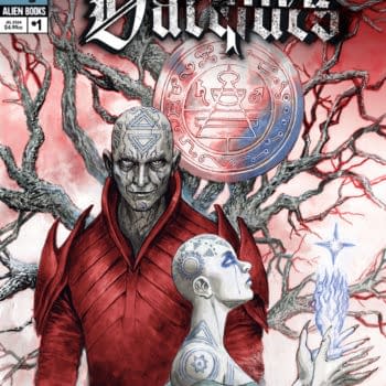
Archangels Engage In An Epic Struggle for Humanity – The Arcs Launches in LA
Michele Brittany, one of our West Coast correspondents, writes:
After a two-hour drive through Wednesday evening commute traffic through Los Angeles, it seemed to be an unusually quiet and dark night in downtown Burbank, California. With a copy of The Arcs tucked under my arm, I thought briefly about "what if" the story came to life – angels fighting for humanity against demons preying on humans who were lost and feeling hope slip with each breath they exhaled. The neon lights of the Emerald Knights Comics sign above my head brought my mind back to the present and the graphic novel release party I was attending.
 The two-story shop was abuzz with activity: customers milling through the aisles of comics and games on the lower level while the second story balcony hosted groups of gamers playing various board games. I ascended the creaky wooden stairs at the back of the store and came out to a table of refreshments and just beyond was a large banner of the scarred archangel Azrael struggling to rise up from a sea of gnashing, clawing metallic looking demons. Bryant Dillon and Sam Rhodes, two of the co-founders of Fanboys Comics and President and Creative Director respectively, welcomed me to the event as Barbra Dillon, Managing Editor and the third co-founder, was already taking sales for the 80-page graphic novel.
 At the furthest table, Bryant introduced me to creator/writer Michael D. Poisson, a graduate of Emerson College (Boston) and originally from Rhode Island but now living in Los Angeles for the past six years and working as a television scriptwriter. To Michael's left, artist Matt Jacobs completed the three-year program at the Joe Kubert School of Cartoon and Graphic Art (Dover, NJ) and has been working professionally the past 10 years in comics books and storyboarding projects such as the music video Olddfellow by the metal group Tomahawk. And to his left, Oceano Ransford completed the graphic design program at the Otis College of Art and Design and most recently created the logo in the opening credits of Repo Genetic Opera and the 12-issue series The Molting. Oceano completed the lettering as well as the masthead on the cover of the graphic novel. Carlos Badilla, who was not in attendance, was the cover colorist.
With several questions jotted in my notebook, I had the opportunity to chat with each one as they signed and chatted with their fans through the evening. What I discovered was a personal story that paralleled the literary search for faith and belief.
The soft-spoken Poisson has long been intrigued by angels and wanted to understand them better. With an upbringing in Catholicism, he looked to Dante Alighieri's Divine Comedy for source material, but he also looked to popular culture. He observed "the films I watched about angels addressed the concept of humanity, but the films were always from the human perspective rather than the angels." He decided to explore the theme of humanity from the point of view of the archangels instead.
 One of Poisson's biggest challenges was determining how the angels would speak. He decided that the angels' lexicon would be influenced by the degree of contact they had with humans. The head guardian angel Azrael tended to speak in a more casual way, but that didn't mean that what he had to say was of any lesser value than what the other angels had to say. Azrael's words are filled with his passionate belief in protecting humans and that each and every one was worth fighting for and saving. Poisson did a lot of rewrites with Azrael's character because he struggled to "understand where Azrael was coming from." And it was likely the crux of Poisson's own personal conflict as well. The head angel Michael, for comparison, used bigger words that created a sense of distance due to his lack of direct contact with humans. He appears cold and speaks in "bigger picture" terms; not surprising, conflict arises between the two angels.
Since Poisson is a television script writer by profession, he originally wrote The Arcs as a television pilot, however he believed his story was probably too fantasy oriented and too epic to fit within the confines of the small screen medium. He gave his script to a friend for their feedback and that person put him touch with Fanboy Comics.
In November 2011, Poisson met with Bryant Dillon, Barbra Dillon and Sam Rhodes at a local coffee shop in Los Angeles. Poisson brought his script and a few conceptual drawings his friend Andrew Huang rendered for him. Immediately, Barbra Dillon said of Poisson's script, "it was so exciting and gripping. We could visualize the story unfold before our eyes." She liked the characters, because they were flawed and readers would be able to identify with their struggles. The Fanboy Comics co-founders discussed several possibilities with Poisson that included publishing issue to issue, doing an exclusive digital release, or a graphic novel. Poisson decided to work with Fanboy Comics because they were just as passionate about his story as he was.
Poisson admitted that while he had read a lot of comics as a child, he needed to learn how to convert his script into panels. Bryant Dillon and Rhodes assisted with the script adaptation while Barbra Dillon worked on copyediting and managed the deadlines. In addition, Poisson picked up a copy of Scott McCloud's Understanding Comics (which he highly recommends), so he could teach himself the anatomy of comics so he could provide his story and panel instructions to the artist that was yet to be hired.
With Poisson underway transforming his script into workable panels and details, he started looking for an artist. He first started by putting an advertisement on Craigslist and once a week, he visited deviantART for potential artist. He had in mind angels that did not have magic: no, they wore countless scars from numerous battles fought since God had created humanity on Earth.
 Although he had a deviantART account and gallery, it was not until Matt Jacobs responded to Poisson's advertisement that they finally connected. Poisson had worked for Wildstorm on such series as Grunts, The Boys, and [Prototype] (based on the popular video game), and with rising excitement in his voice, Poisson revealed he had been "that" close to working on his favorite character, Jason Voorhees, until Wildstorm lost the license to the franchise. Matt had been working on storyboarding projects, but was anxious to work in comics again because he found he had more artistic freedom.
 Poisson sent Jacobs in depth character descriptions of the angels Raphael and Gabriel and the demon Asmodeus. Matt sent three very detailed drawings back – a style that spotlights his amazing attention to detail. Two of those original drawings – Raphael and Gabriel – have been included in the graphic novel as watermark images on the title and copyright pages. Jacobs had drawn exactly what Poisson was looking for and hired him.
Jacobs explained the creative process as he and thumbed through the novel. He and Poisson met a couple of times in person to go over the story concepts, but after that they exchanged panel instructions via drop boxes and text messages. Poisson started out with providing every detail possible to Jacobs and he would provide detailed pencil sketches back. Once they got comfortable with each other's style, Jacobs' sketches became more rough and free of fine details until the story was solidified.
 Rendering the story in black and white was always Poisson's idea, according to Barbra Dillon, who reiterated that Poisson felt that "the black and white lines denoted good and evil and grey would creep in more and more as the story documented the angels fall from grace." This worked well for Jacobs who found inspiration from Frank Miller, Simon Bisley, and Doug Mahnke. In addition, he mostly kept to drawing by hand, working over his rough pencil sketches with pen, layering details. He consciously limited computer renderings as much as possible to give more of a hand-drawn look to the novel, which harkens to an epic feel of the novel.
As Poisson and Jacobs grew accustomed to each other's working style, it was soon apparent that lettering needed to be added to the growing stack of completed panels that Poisson and Jacobs had finished. Poisson admitted he "felt a little lost when it came to lettering" and asked Jacobs if he could do it. Jacobs said they needed a professional and suggested Oceano Ransford to Poisson and they met.
Sporting a shaved head, a long goatee, and a colorful sleeve tattoo on his left arm, Oceano or "Ano" was laid back as he talked about his background. His fascination with and ability to grasp the subtleties to the art of lettering led Ransford to design the opening credits for Repo! The Genetic Opera and the masthead and lettering for the comic book series The Molting, both creations of Terrance Zdunich. The latter project is what Ransford believes brought Jacobs and Poisson to him.
 Ransford joined Poisson and Jacobs about six months into creating The Arcs. For Poisson, he chuckled as he related how he had trouble keeping straight where he was working in the story, but where Jacobs and Ransford were working, in case story related questions came up. Jacobs added, "I was sometimes concerned about incorporating too much detail and not leaving enough room for Oceano's lettering." To emphasis his challenge, he pointed out how in one particularly tight panel of action, Ransford had been able to massage and tuck his lettering into Jacobs' drawing with expert precision. However, it is his lettering that really shines in this novel.
I asked why Ransford used a different font for each character. Ransford confessed that perhaps his method was a bit unorthodox to use so many different fonts. He believed the intricacies of fonts could convey a different voice and gave each character "a proper feel to them." As for the masthead, Ransford kept reworking it until he incorporated the right amount of grittiness that would have been evoked from the passage of time, or as Ransford described as an "old world quintessential" for the angels.
 With Ransford now on board for lettering duties, all three men were passing panels back and forth digitally for feedback. Barbra Dillon states with pride that she, Bryant Dillon and Rhodes were "constantly in awe" of the visual story unfolding before their eyes. As she said, "we always had faith in them." And after a year and a handful of months, the creative team finished The Arcs.
In March 2013, all of the panels were digitally sent off to James River Press out of Virginia, the printer that Fanboy Comics utilized for their first two graphic novels. Barbra Dillon and Ransford worked through the proofs, making sure that the panel images were positioned on each page to eliminate any bleeding off the page in the final print run. It was at this time when the group was looking through the proofs that they decided to release the story in a graphic novel format, along with the planned exclusive digital release they had planned for San Diego International Comic Con. They also felt strongly about the potential of The Arcs that they chose to up the print run to 1,000 copies.
 At the end of the release party where about 100 guests had attended and the creative team had enduring my many questions, all three men smiled at me as I took their picture – stacks of The Arcs around each of them, ready for them to autograph. The books are the tangible result of a journey that began two years with that fortuitous meeting in a coffee shop in LA. They should be proud; it's an engaging original story told with incredibly detailed drawings and wrapped up with excellent font choices. But like the archangels story, Poisson's story doesn't end there. Poisson has already started outlining the second script that he'll begin next year. And happily, Matt Jacobs, Oceano Ransford, and Fanboy Comics have all expressed interest in teaming up again for volume two.
All photos are from Fanboy Comics with the exception The Molting cover and photos taken by Michele Brittany (as noted). Copies of The Arcs are available through the Fanboy Comics store accessed at www.fanboycomics.net.
Michele Brittany is an independent pop culture scholar and semi-professional photographer currently editing an upcoming anthology on the influence of James Bond on popular culture. She regularly posts reviews and analysis on the spy/espionage genre on her blog, Spyfi & Superspies.
Enjoyed this? Please share on social media!
Stay up-to-date and support the site by following Bleeding Cool on Google News today!