About
About 


DC Comics July 2024 Solicits & Solicitations For Absolute Power, Batman, Superman & Wonder Woman
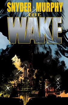
Posted in: Comics | Tagged: Comics, dc, Defy, scott snyder, vertigo, wake
Why The Wake Really Does Defy
 By Hannah Means-Shannon
As Rich Johnston reported recently, sales are up on the Vertigo series The Wake by Scott Snyder and Sean Murphy. Generally speaking, the series has been liked and noted among new series, especially because of the particularly strong team-up between two creators who have their own cult followings. When I read the first issue of The Wake, I was impressed, and wanted to see more, but I don't know that it initially floored me the way, for instance, Collider or Trillium have. I just knew that I would give the series more attention because it was a story I wanted to see brought to fruition. It made me curious, and it made me more aware of how expansive comics could be in terms of subject matter and execution. What I didn't fully realize was how the comic would stay with me, in the back of my mind, forming a kind of evolving impression of things that felt familiar but I hadn't seen done in combination in comics before. It would take me awhile to acknowledge that this comic does live up to the Vertigo "Defy" claims with all their possible objects, but especially "limits", "expectations", and even "genre" listed in the ads.
 When I tried to pin down the references I recognized, I came up with suspense films, particularly ones set at sea, monster films, adventure stories, pulp or otherwise, and science fiction in prose and films. In terms of comics comparisons, I was drawing nearly a blank, though there may be more parallels than I am aware of. It reminded me, of course, of Abe Sapien storylines in the Hellboy universe, and those Hellboy stories that seemed enamored of oceanic folktales. But all those reference points didn't quite account for the impact of the comic on my imagination. When I read that sales were up on The Wake, at its third issue, I knew there was a possibility that this phenomenon was happening to other readers, too. I wouldn't call The Wake a slow burn, but in keeping with the content, maybe a building high tide, the kind the moon's alignment causes heralding coastal warnings. By the time the tide is in, it's too late to brace yourself, just as the characters in The Wake discover in the most recent issue.
[*Though there are no direct spoilers below, if you would rather not know anything about the comic before reading it, best to stop here]
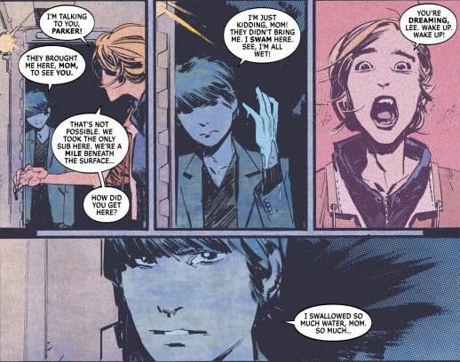
The most obviously original thing I noticed when reading the first issue was the characterization of Cetologist Lee Archer. Ironically, she's so original a creation because she's close to real life. But sometimes that equates to being original in comics where too much gets compressed into a single character in an effort to appeal to every reader and create a monumental heroic character. Archer rings true because she seems like at least a dozen scientists I've seen on channels like NatGeo working on marine studies and pushing the limits of scientific knowledge. She even looks like those kinds of people, real people with difficult lives but a fairly obsessive nature. She's poised between looking young and old, she's divorced and has a tween aged son, and she lights up when she's immersed in her work. I probably don't even need to add that she's a "she". We have a central female lead in The Wake, a tremendous breath of fresh air. Even better that she's active, compelling, and an easy subject for reader identification as she encounters the unknown and the frightening.
The second thing I noticed, initially in the first issue, and then building steadily as part of the tidal swell of the series, was that this is a very smart comic. It's not really en vogue to say that about comics, generally. It seems to suggest that a comic is too high-brow for mainstream appeal and therefore it's shutting out readers in an unfair way. That's not the case at all in The Wake, but I have no problem acknowledging just how smart a book this is. I mean that it's well researched, perhaps even copiously. That no doubt has contributed to the appeal of the Lee Archer character, but it goes beyond that into the detail included in Archer's work, as well as the complex circumstances that take her to Alaska. When we watch science fiction films we usually expect this kind of scientific detail thrown into the mix, whether it's Alien or the most recent Star Trek film.
Yet in comics, there's such a commodity of space and time to include detail that creators often, understandably, have to just pick out key points. Scott Snyder clearly does not subscribe to that policy here. He slots in terms, organizations, explanations, and references at every turn and yet when you look at a page, it is not overloaded with text. When Archer turns up to the underwater facility in Alaska where top secret oil drilling has been underway, we meet other specialists in the fields of engineering and anthropology and they bring their own terminology to the table, but that also is handled in a way that enables readers to stay on board. And, in fact, it becomes of central importance as the comic begins to explore the origins and features of the "mermaid" creatures haunting the series. What The Wake manages to do, in more exacting terms than many other comics, is establish plausibility. Snyder could have done that with less, and it still would have been an entertaining comic, but instead he goes further and leaves the reader feeling like they might have actually learned something. That's the equivalent of "talking up" to the reader rather than "talking down" to them and it's a laudable thing. That defies limits and expectations when it comes to the status quo.
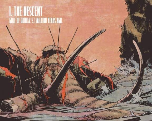
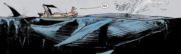
This entire discussion could easily focus on Sean Murphy's artwork, and the ways in which he's responsible for many of the aspects of the comic addressed above. For instance, he gives a solid impression of Archer as a strong female lead in her body language, facial features, and reactions. He also enables, through his layouts and even in panel content, the reader to "learn" and process the information they need to understand the comic. What Murphy also does is establish a sense of scale and awe necessary to really engage the reader in the wonder and suspense aspects of the story. From the first issue, when we see Archer suddenly encounter her Humpback Whale friend Quasimodo, and Murphy spreads into a double-page horizontal panel to do that, to an equally impressive move in the third issue during a hunting scene between aquatic beings and a giant, pre-historic shark, Murphy shows a mastery of space. In diametrically opposed situations, when he needs to create an intense feeling of claustrophobia on the extreme depth submarine, he is able to create extreme action exploding in cramped spaces that almost seems to push at the limitations of the panel boundaries.
But Murphy's biggest innovation is probably the remarkable exploitation of water as a visual element. Sure, there have been superhero comics, and even plenty of indie comics that have seemed to realize that water is an ideal element to portray action. It is ideal because it enables characters to move like superheroes. They don't have to fly, just swim. They become visually attractive immediately in a semi-gravity environment. If you take that to the next level and add superhuman creatures moving in water, they become even more dynamic. The same features can be true of sci-fi comics that use anti-gravity and space to create impressive backdrops. Some of Murphy's panels don't even bother to distinguish between air and water, leaving that up to applied color. Figures hover and glide, and move in areas of vast space around the underwater rig that looks like a small, overly industrial city in silhouette. This is one of the ways the comic defies "genre" among other things. Underwater adventures are not new to comics, but this kind of dynamic action puts the element first. Rather than portraying characters who simply happen to be in the water, Murphy makes them seem like trespassers in an alien environment with rules and features of its own. This reframes what we thought we knew about ocean-based adventure stories.
It would be remiss not to mention Matt Hollingsworth's colors, which have so much to do with the success of the book. In many ways, the color scheme on The Wake entirely defies expectations for the kind of story that we think we are reading. To be fair, he does this right away, and never lets up on this persistent challenge to familiarity. Because this is in some ways a horror comic, or even a kind of apocalypse comic, or maybe even a sci-fi comic, the last thing you expect is for it to be rendered in Floridian pastels. And once you see them, you're even less likely to expect them to become sinister, then menacing, and finally extremely disturbing. Pink is apparently the new black, but even so, Hollingsworth knows how to be subtle about it. His powder-blues balance remarkably well with Murphy's lightly brushed but detailed inking, particularly in the sub scenes. Issue two's use of orange and terra cotta red is probably the most striking departure that broadens the palette for the whole series, too. The colors become a trademark for the series from the first panel onwards, and without being garish they remind you that you are looking at something unique.
I'm sure it's clear by now that I will not be putting down the series anytime soon. It has 10 issues promised on the cover, and though I never really considered leaving this book on the rack as it progressed, its tidal pull has definitely gotten stronger issue by issue. Vertigo really make some strong claims in their ads with the Defy campaign, claims that books like the upcoming Sandman: Overture may well live up to, and Collider and Trillium are already suggesting they'll trounce. But The Wake is no slouch in reaching for those claims. It just has its own pace and way of doing that, again suggesting its originality. In hindsight readers may find The Wake represents a new high water mark for Vertigo.
Hannah Means-Shannon is a regular contributor at Bleeding Cool, writes and blogs about comics for TRIP CITY and Sequart.org, and is currently working on books about Neil Gaiman and Alan Moore for Sequart. She is @hannahmenzies on Twitter and hannahmenziesblog on WordPress. Find her bio here.
Enjoyed this? Please share on social media!
Stay up-to-date and support the site by following Bleeding Cool on Google News today!