About
About 


As Bleeding Cool scooped last week, Power Rangers is coming to an end at Boom Studios with Mighty Morphin Power Rangers: Darkest Hour #1.
Posted in: Comics | Tagged: Comics, dc, jeff lemire, manhattan projects, marvel, prophet, shadow, swamp thing, trillium, vertigo
Cammy's Covers – Manhattan Projects To Trillium
Cameron Hatheway writes;
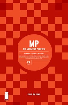 The Manhattan Projects #13 by Jonathan Hickman
Glad to know that several pairs of Vans checkered slip-ons were recycled into making this cover. It's not entirely checkered, which makes the overall design that much more intriguing and appealing. Is there a pattern, or is it all just random? If there is a method to Hickman's madness, I'm not sure I could nail it down. What I do know however is this cover is geometrically gorgeous, with its overall simple yet effective aesthetic.
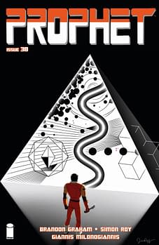 Prophet #38 by Jim Rugg
See, if Kirby Crackle was included in my geometry and algebra textbooks, I would have passed those classes without any problems. Instead, my experience with mathematics is much like this cover if you were to swap John Prophet with me, and that tiny pink Earth destination in the triangle with me passing the class. It wasn't an enjoyable journey, but I eventually overcame and conquered (barely). But enough about me; this Jim Rugg cover is absolutely splendid!
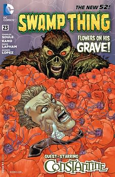 Swamp Thing #23 by Guillem March & Tomeu Morey
I don't know if Constantine ate one of Swampy's psychedelic roots, but it looks like he's having one hell of a bad trip. The vibrant colors of the tentacled poppies really catches the eye, as well as the tiny details for each flower with the shadowing and texture. Is this cover considered tentacle porn for botanists? Very creepy-yet-beautiful cover, and I find it enjoyable to see a new take on Swampy (what big white teeth you have!).
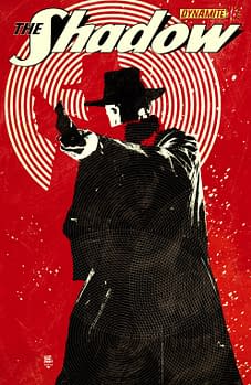 The Shadow #16 by Tim Bradstreet
With that Manhattan Projects cover it was squares, with Prophet it was lines and shapes, and now with The Shadow it's circles. I hope Bradstreet didn't have to rely on just a compass for this cover, otherwise it would have taken him all week. Black, red and white always work well together, and yet Bradstreet somehow makes it look more fantastic than usual. His red shadow in the main cluster of white rings is my favorite little aesthetically pleasing detail.
 Trillium #1 by Jeff Lemire
This is my favorite cover of the week, hands down. The mix of science-fiction and what appears to be a battle from World War I crossover exquisitely, enticing the viewer to pick-up and see what Lemire's latest series is all about. To add another layer of mystery, the symbols along the right-hand side of the cover appear to be Native American or Mayan or some ancient culture, which prompts me to wonder if time travel is somehow involved. The watercolor background is brilliant, and the watercolors in general are dazzling. Mr. Lemire, you once again have my undivided attention.
Cameron Hatheway is the host of Cammy's Comic Corner and Arts & Entertainment Editor of the Sonoma State STAR. You can follow his 800 mile move to Rohnert Park on Twitter @CamComicCorner.
Enjoyed this? Please share on social media!
Stay up-to-date and support the site by following Bleeding Cool on Google News today!